


.png)
A Practical Guide to Mobile First Design
- Nov 28, 2025
- 14 min read
Updated: Nov 29, 2025
Let's be honest: the first time most people will ever interact with your business is through the screen of their smartphone. That's just the world we live in now. Mobile-first design isn't some fancy industry buzzword; it's a design philosophy that builds your website for that small screen first, then scales the experience up for tablets and desktops. It’s the new rulebook for creating digital experiences that actually work.

Why Mobile-First Design Is Now Essential
Think about it like building a house. For years, designers would build a sprawling mansion (the desktop site) and then try to cram all its furniture and features into a tiny guest cottage (the mobile site). It was awkward, cluttered, and barely functional.
A mobile-first design approach completely flips that script. You start by building the perfect tiny home—every single element has a clear purpose and a designated spot. Only after you’ve perfected that efficient, core experience do you expand it into a mansion, thoughtfully adding more features as you gain more space.
This isn't just a trend; it's a direct response to how people actually behave. With over 55% of global web traffic now coming from mobile devices, your smartphone audience isn't a side project. They are your primary audience. Ignoring them means you're intentionally giving a bad experience to the majority of your visitors.
The Impact on User Experience and SEO
A clunky, slow-loading mobile site is a one-way ticket to frustration. When people have to pinch, zoom, and hunt for basic information, they don't stick around. They just leave, and they're probably not coming back. That bounce is a lost sale, a missed lead, and a tarnished first impression.
By focusing on the constraints of a small screen from the beginning, you are forced to prioritize what truly matters. This leads to cleaner, more intuitive designs that benefit users on every device, not just mobile.
And it’s not just users who care. Google has been paying close attention. The search engine now uses mobile-first indexing, which means it primarily looks at the mobile version of your site to determine its rankings. If your site isn’t built for mobile, you’re telling Google you don’t care about the majority of users—and your search visibility will suffer because of it.
Embracing mobile-first design goes hand-in-hand with essential website performance optimization techniques that keep your site fast and fluid. It’s a core part of our philosophy when building responsive website design services to boost conversions that get real results for our clients.
From Desktop Dominance to Mobile Priority
To really get why mobile-first design is non-negotiable today, you have to rewind the clock. Not too long ago, the internet was built for one thing: big desktop monitors. Websites were a fixed-width, landscape-oriented affair, giving designers a massive canvas to play with.
When smartphones first showed up, they were treated like an annoyance. Businesses would either slap together a stripped-down “m-dot” site or just let their desktop version shrink, leaving users pinching and zooming through a mess of microscopic text. This approach, called "graceful degradation," was all about taking away features to cram a big experience onto a small screen. It wasn't pretty.
The Smartphone Revolution Flipped the Script
Then, the smartphone explosion happened, and it changed everything. Suddenly, the internet wasn't just on a desk; it was in everyone's pocket. This wasn't just a tech shift—it was a seismic change in human behavior. People started using the web for instant, on-the-go needs: finding directions in West Hollywood, checking store hours in Pasadena, or comparing prices while standing in a shop in Santa Monica.
This new reality laid bare the fatal flaws of desktop-first thinking. Sites that were slow, clunky, or just plain broken on mobile were abandoned in seconds. A bad mobile experience became a brick wall between a business and its customers, a problem we still see businesses grappling with all across Los Angeles, from Burbank to Long Beach.
Responsive design was a clever fix, letting one website reflow its layout for different screens. But even then, the design process often started from the desktop and worked its way down. To truly give users what they wanted, the whole philosophy had to be inverted. If you want to dig into the technical nitty-gritty, you can learn more about the details of adaptive vs responsive design in our guide.
Google Made It the New Standard
The real turning point came when the giants of the industry saw that mobile wasn't just another channel—it was becoming the channel. This idea started gaining traction around 2010 when Google’s own leadership declared that mobile was the future. And they were right. As smartphone adoption went parabolic, reaching nearly 7 billion users worldwide by 2022, the evidence was undeniable.
On July 1, 2019, Google made it official. They rolled out mobile-first indexing for all new websites. This meant the search engine would primarily use a site's mobile version to index and rank it, instantly making a great mobile site a cornerstone of SEO. You can find more insights on this historic shift over at Appsflyer.
This evolution forced a complete reversal of the old design process. Instead of asking, "How can we shrink our desktop site for mobile?" the new question became, "What is the most essential experience for our mobile user, and how can we expand that for the desktop?"
That, right there, is the heart of mobile-first design. It's not just a technical workflow; it’s a strategic answer to how people actually live and shop today. It forces you to prioritize the absolute essentials—the core content and features users need on the move—ensuring a lean, fast, and intuitive experience from the jump. By building from the smallest screen up, you’re creating a rock-solid foundation that serves the vast majority of your audience first, a vital strategy for any business trying to connect with customers throughout Southern California.
Understanding the Core Principles
Getting mobile-first design right isn't about following a rigid checklist; it’s a disciplined mindset built on a few non-negotiable pillars. These principles guide every single decision, making sure the final website is lean, fast, and laser-focused on what the user actually needs from the moment they land on your site.
Think of it like packing for a long hike. You don't just throw everything you own into a massive trunk and hope for the best. You start with a small backpack and pack only the essentials for survival: water, a map, a compass. Everything else is a luxury. Mobile-first design applies that exact same logic to your website.
Start with Progressive Enhancement
The true cornerstone of this approach is progressive enhancement. This philosophy dictates that you begin by building a solid, functional baseline experience that works perfectly on the most restrictive device imaginable—a smartphone with a spotty connection. This barebones version must contain all the essential content and functionality.
Once that rock-solid foundation is in place, you "progressively enhance" the experience as more screen space and processing power become available on tablets and desktops. This is where you can add in more complex features, larger images, or more sophisticated layouts. It's the complete opposite of the old "graceful degradation" model, where a bloated desktop site was stripped down for mobile, often leaving behind a broken or clunky mess.
Practice Ruthless Content Prioritization
On a small screen, there is absolutely no room for clutter. Mobile-first design forces you to practice ruthless content prioritization. This means asking tough questions about every single element on the page: "Is this absolutely essential for the user to complete their main goal?"
If the answer is anything but a resounding "yes," it doesn't make the cut for the mobile version. This discipline ensures that only the most critical information—your business address for a customer in Sherman Oaks, your primary call-to-action, or your key services—gets top billing. This intense focus creates a much cleaner, more intuitive journey for the user.
A key takeaway here is that constraints breed creativity. By limiting yourself to the essential, you often end up creating a more powerful and effective user experience on every device, not just mobile.
To pull this off, designers and content strategists have to work together to map out a clear visual hierarchy. This involves using size, color, and placement to guide the user's eye to the most important information first, a critical part of our design process. Sticking to these and other core guidelines are among the 10 essential website design best practices for 2025 that we build into every client project.
Design for Touch and Optimize for Speed
Unlike desktops that rely on a precise mouse click, mobile devices are navigated with fingertips. This demands a totally different approach to interaction design. A core principle here is to create a touch-friendly interface from the ground up.
This goes way beyond just making buttons bigger. It means thinking about the ergonomics of how people hold their phones and ensuring interactive elements have enough breathing room to prevent accidental taps. Think about:
Large Tap Targets: Buttons, links, and form fields need to be big enough to be tapped easily without having to zoom in.
Ample Spacing: Interactive elements should have plenty of space between them to avoid the frustrating "fat finger" errors we've all experienced.
Intuitive Gestures: Lean into familiar mobile gestures, like swiping for image carousels or pinching to zoom on product photos where it makes sense.
Finally, remember that performance is a feature, not an afterthought. Mobile users are often on slower cellular networks and have zero patience for slow-loading pages. A mobile-first strategy prioritizes speed from day one by optimizing images, minifying code, and loading only the scripts that are absolutely necessary. Because you’re starting with a lean foundation, the site is inherently faster, which leads directly to lower bounce rates, better user engagement, and a significant boost in your SEO rankings.
A Step-by-Step Mobile-First Workflow
So, how do you actually do mobile-first design? It’s more than just a concept—it’s a practical, repeatable process. Think of it less like shrinking a big website down and more like building a solid foundation for a house, starting with the essentials before adding the decorative touches. This disciplined approach forces you to be intentional, resulting in a site that's lean, fast, and laser-focused on what your users truly need.
The whole idea is to start with a baseline mobile experience, enhance it for tablets, and then expand it for desktops.
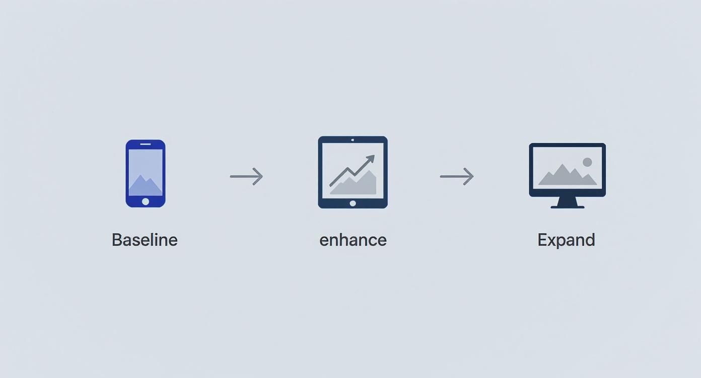
This progression makes sure your core functionality is rock-solid on a smartphone, with features and complexity added thoughtfully as you get more screen space to play with.
Phase 1: Content Inventory and Hierarchy
Before you even think about sketching a layout, you have to start with your content. This first step is arguably the most important because it forces you into a "less is more" mindset right from the jump. You have to figure out every single piece of information your user needs to accomplish their main goal—and cut out the rest.
This phase involves two key activities:
Content Auditing: Go through everything you have and decide what's absolutely essential. Be ruthless.
Defining Hierarchy: Structure that prioritized content in a way that makes sense on a tiny screen. What does the user need to see first? What comes second?
Nailing this down early gives you a clear blueprint. It prevents you from cramming in too many features later on and keeps the user's journey clean and simple.
Phase 2: Mobile Wireframing and Prototyping
With a clear content hierarchy locked in, it’s time to give that structure a visual form. Mobile wireframing is all about creating simple, low-fidelity sketches of the mobile interface. We’re not talking about colors or fonts here—this is purely about layout, navigation, and how the user moves through the site.
Think of it as the architectural plan for your website. You’re deciding where the doors and windows go before you even think about paint colors. This is where you map out the user’s path from the moment they land on your site to the second they complete an action, like booking an appointment.
By solving complex user flow problems on the smallest screen first, you ensure the core experience is seamless. Expanding a functional mobile design to a desktop is far easier than trying to cram a complicated desktop layout onto a mobile screen.
Once the wireframes feel right, they evolve into interactive prototypes. These are clickable mockups that let you test usability early on, catching friction points long before a single line of code is written. It’s a huge time and money saver down the road.
Phase 3: Visual Design and Development
After the structure and user flow have been tested and approved, the visual design phase kicks off. This is where the personality comes in—branding, color palettes, typography, and imagery are applied to the mobile wireframes. The goal is to create something that looks great and feels on-brand without adding unnecessary bloat.
At the same time, development can get started using the principle of progressive enhancement. Developers build the core experience for the mobile version first, making sure the HTML, CSS, and JavaScript are lightweight and perform beautifully.
Only after that mobile foundation is solid do they use media queries to add styles and features for larger screens. Using the right tools here can make all the difference. If you want to get a head start, you can explore mobile-first themes that already have this responsive philosophy baked in.
Phase 4: Testing and Optimization
The final phase is really a continuous loop of testing and tweaking. A mobile-first design is never truly "done." It needs to be rigorously tested across a ton of different devices, browsers, and even network speeds to make sure everyone gets a great experience.
This includes:
Device Testing: Making sure the layout and functionality hold up on popular iPhones and Androids.
Performance Testing: Checking load times and responsiveness, especially on slower 3G connections.
User Acceptance Testing (UAT): Getting feedback from real people to iron out any final usability wrinkles.
Following this workflow turns mobile-first from a buzzword into a practical, step-by-step process that consistently produces better websites.
Learning from Real-World Examples
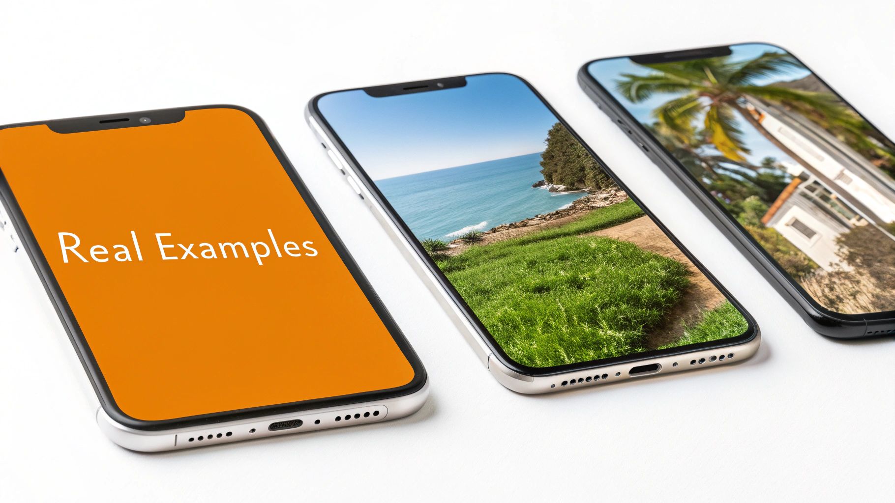
Theory and workflows are great, but the real "aha!" moment comes from seeing mobile-first design in the wild. When you look at how the big players put these principles into practice, you start to see just how powerful this approach is. Let's break down a couple of stellar examples to see how they nail the user experience, scaling it perfectly from a tiny screen to a widescreen monitor.
These aren't just random case studies. They show how different industries solve the same core problem, proving just how versatile mobile-first thinking can be. We'll zero in on how they handle essentials like navigation, content, and calls-to-action to show what starting small really accomplishes.
Example 1: Airbnb's Focused Booking Journey
Airbnb is a masterclass in ruthless prioritization. Their entire business lives and dies on how easily users can get from searching to booking, and their mobile site is built for exactly that.
Pull it up on your phone, and the experience is incredibly focused. The homepage gets straight to the point with three simple inputs: Destination, Dates, and Guests. That's it. All other distractions are stripped away, pushing you toward the one action that matters. The main navigation is neatly tucked into an icon-based menu at the bottom, holding only the essentials like "Explore," "Wishlists," and "Log in."
Now, watch what happens when you move to the desktop version. The core search is still front and center, but the extra space is used to add value, not noise.
On Mobile: The map is a secondary feature. You search first, then tap to see locations, keeping the initial view uncluttered.
On Desktop: A big, interactive map sits right alongside the property listings, letting you browse visuals and locations at the same time.
This is a textbook example of progressive enhancement done right. The essential booking function is flawless on mobile, and the desktop view simply adds a powerful, complementary feature for those with more screen real estate. It enhances the journey without ever getting in its way.
By perfecting the core booking flow on the smallest screen, Airbnb ensures its most critical conversion path is rock-solid for the majority of its users. The desktop experience is an expansion, not a complete rethink.
Example 2: The Guardian's Scannable News Feed
For a content machine like The Guardian, the challenge is completely different. How do you present a mountain of information on a small screen without overwhelming people? Their mobile-first design solves this with a clean, single-column layout that’s all about scannability.
On a phone, headlines are big and bold. Each story is presented in a self-contained card with a strong image and a quick summary. This creates a natural vertical rhythm that makes it effortless to scroll through the latest news and tap on what grabs your attention. The navigation is collapsed into a hamburger menu, which frees up the entire screen for what you came for: the content.
When the site scales up to a desktop, it smartly uses the new horizontal space to introduce more depth.
Mobile Hierarchy: A single, chronological feed of top stories. Simple and direct.
Desktop Hierarchy: A multi-column grid that showcases different news categories, featured articles, and other content blocks side-by-side.
This graceful transition from a simple vertical stack to a complex grid is a testament to the mobile-first approach. The fundamental experience—reading the news—remains intuitive, but the desktop view offers more opportunities for content discovery. By starting with a clean, scannable mobile feed, The Guardian makes sure its core product works perfectly, everywhere.
How Mobile-First Design Wins Local Customers
For any local business here in Southern California, mobile-first design isn't some abstract tech trend—it’s your most direct connection to new customers. The ideas we've covered aren't just theory; they translate straight into real-world revenue, especially in a sprawling, on-the-go region like Los Angeles.
Think about it. A tourist is walking down a street in Hollywood, searching for "best tacos near me." A homeowner in Sherman Oaks has a burst pipe and pulls out their phone to find an emergency plumber, fast.
In those critical moments, your website becomes your digital storefront. A seamless, quick-loading mobile experience is the difference between them calling you or hitting the back button to find your competitor down the block.
Connecting with Customers Across Southern California
A great mobile experience is non-negotiable for businesses trying to make a mark in our service area. Los Angeles is at the center of our service area, and we proudly support clients across a wide network of surrounding cities and neighborhoods throughout Southern California. Our reach includes every corner of L.A.—from Downtown Los Angeles, Hollywood, West Hollywood, Beverly Hills, and Santa Monica to the beach communities of Malibu, Venice, Marina del Rey, Hermosa Beach, Manhattan Beach, and Redondo Beach. We also extend service through the San Fernando Valley, including Sherman Oaks, Studio City, Encino, Van Nuys, North Hollywood, Burbank, Glendale, Pasadena, Woodland Hills, Chatsworth, Canoga Park, Reseda, Northridge, and Tarzana. In the San Gabriel Valley, we work with clients in Alhambra, Monterey Park, San Gabriel, Temple City, Rosemead, Arcadia, El Monte, South El Monte, West Covina, Covina, Baldwin Park, Azusa, Glendora, Duarte, and Monrovia. Farther southeast, we serve Whittier, Pico Rivera, Downey, Norwalk, La Mirada, La Habra, and Cerritos. We also support the South Bay—including Torrance, Carson, Gardena, Hawthorne, Inglewood, and Long Beach—as well as the Gateway Cities and communities throughout the I-10, I-5, 101, and 405 corridors. Whether you’re in a major metro area or a smaller surrounding neighborhood, our team delivers reliable, high-quality service anywhere in or around Los Angeles.
For a local business, every single search from a nearby customer is a high-stakes opportunity. Mobile-first design ensures you win that moment by giving them exactly what they need, right when they need it, with zero frustration.
This hyperlocal focus is what turns a casual search into actual business. When someone in a specific neighborhood like Encino or a bustling city like Torrance has a great experience on their phone, they are far more likely to become a customer.
We help businesses across the entire region, from the San Fernando Valley to the South Bay, build a dominant mobile presence. By focusing on mobile-first design, we make sure your website is perfectly positioned to capture that valuable local search traffic, get people through your door, and grow your business in the competitive Southern California market.
Got Questions? We’ve Got Answers.
Let's clear up a few common questions that pop up when businesses start thinking about a mobile-first strategy. This should help you get a better handle on what it all means for your website.
What’s the Real Difference Between Mobile-First and Mobile-Friendly?
It’s easy to get these two mixed up, but the difference is huge.
Think of "mobile-friendly" as taking your big, beautiful desktop website and shrinking it down to fit on a phone. It works, but it’s an adaptation. Things get rearranged, text gets smaller—it's a compromise.
Mobile-first design flips that script entirely. We start with the smallest screen and ask, "What is absolutely essential for the user on their phone?" We build that core experience first, making it fast, clean, and incredibly easy to use. Then, and only then, do we add features and expand the layout for tablets and desktops.
The key difference is the starting point. Mobile-friendly adapts a large experience for a small screen, while mobile-first builds a focused experience and expands it. This intentionality is what creates a superior user journey.
How Does Mobile-First Design Actually Affect SEO?
It has a massive, positive impact on your search rankings. A few years ago, Google switched to mobile-first indexing. In simple terms, this means Google now primarily looks at the mobile version of your website to decide how to rank you. Your desktop site has officially taken a backseat.
A well-built mobile-first site naturally loads faster and gives people a better experience on their phones—two things Google absolutely loves. By designing for mobile from the ground up, you're aligning your website perfectly with what search engines want to see, giving you a serious edge.
Is This Approach More Expensive to Implement?
Not necessarily, and in the long run, it's often more affordable. Why? Because it forces discipline.
When you start with a small screen, you have to prioritize what truly matters. This prevents the all-too-common problem of trying to cram a bloated, feature-heavy desktop site onto a phone, which is a messy and expensive process.
This focused approach leads to cleaner code, quicker development, and fewer headaches down the road. You’re not just building a website; you're making a smarter, more sustainable investment in your digital foundation.
Ready to build a website that wins over customers on every device? The team at DLL Studios specializes in creating high-performance, mobile-first websites that drive growth for businesses across Southern California. Start your project today.