


.png)
10 Essential Website Design Best Practices for 2025
- Nov 26, 2025
- 17 min read
Updated: Nov 27, 2025
Your website serves as your business’s digital storefront, primary sales engine, and the first handshake with potential clients. A visitor forms a critical first impression in less than a second, an instantaneous judgment that determines whether they stay or leave. This snap decision makes exceptional design a fundamental requirement for success, not just an aesthetic preference. Following established website design best practices is the key to capturing and holding that attention.
This isn't about chasing fleeting design fads. It’s about building a powerful, user-centric experience that systematically builds trust, encourages engagement, and ultimately converts visitors into loyal customers. A well-designed site anticipates user needs, provides clear pathways to information, and performs flawlessly across all devices. The difference between a site that thrives and one that fails often comes down to the strategic implementation of these core principles.
This comprehensive guide moves beyond vague tips to deliver a detailed roundup of the most crucial practices for building a high-performing website. We will explore essential concepts from user-centered design and mobile-first architecture to accessibility and performance optimization. You won't just learn what to do; you'll learn how to do it with actionable insights, clear checklists, and practical implementation notes for popular platforms like Wix Studio, Webflow, and WordPress. Prepare to transform your digital presence from a simple online brochure into a strategic asset that drives tangible business growth.
1. Responsive Web Design
Responsive web design is a fundamental approach that ensures your website provides an optimal viewing and interaction experience across a wide range of devices, from desktop computer monitors to mobile phones. Coined by Ethan Marcotte, this method uses flexible grids, fluid layouts, and CSS media queries to automatically adapt the content and layout to fit the user's screen size. This has become a non-negotiable standard, as mobile traffic now accounts for the majority of internet usage.
Implementing responsive design is a core tenet of modern website design best practices. A responsive site not only improves user experience but is also heavily favored by search engines like Google, directly impacting your SEO rankings.
Why It's a Best Practice
A responsive website provides a consistent brand experience regardless of how a visitor accesses it. This consistency builds trust and reduces bounce rates, as users are not frustrated by a broken or difficult-to-navigate mobile layout. For e-commerce businesses, a seamless mobile checkout process is crucial for converting sales. For service providers, it ensures potential clients can easily contact you from any device.
Actionable Tips for Implementation
Adopt a Mobile-First Strategy: Design for the smallest screen first, then work your way up to larger screens. This forces you to prioritize essential content and functionality.
Use Fluid Units: Instead of fixed pixel values (), use relative units like percentages (), , or for widths, margins, and padding to create a flexible layout.
Optimize Touch Targets: Ensure all buttons and clickable links have a minimum touch target size of 44x44 pixels to prevent accidental clicks and improve usability on touchscreens.
Test on Real Devices: While browser developer tools are useful for emulation, nothing beats testing your design on actual physical smartphones and tablets to identify real-world usability issues.
For a deeper dive into the technical differences, you can explore the nuances between responsive and adaptive design approaches.
Visual Guide to Responsive Design
2. User-Centered Design (UCD)
User-Centered Design (UCD) is a design philosophy that places the needs, behaviors, and preferences of the end-user at the heart of every design decision. Pioneered by figures like Don Norman, this iterative process involves extensive research, prototyping, and testing with real users to create products that are not only functional but also intuitive and genuinely useful. UCD ensures your website solves real-world problems for your specific audience, rather than just fulfilling a business objective.
Adopting a user-centered approach is a crucial component of website design best practices. It shifts the focus from "what we want to build" to "what our users need," resulting in a more effective and engaging digital experience that drives loyalty and conversions.

Why It's a Best Practice
A website built with UCD principles deeply resonates with its target audience. By understanding user motivations and pain points, you can create a seamless journey that guides them toward their goals, whether it's making a purchase, booking an appointment, or finding information. This approach reduces user frustration, increases time on site, and builds a stronger brand connection. Companies like Spotify and Netflix leverage continuous user research and A/B testing to refine their personalized experiences, making them leaders in their respective markets.
Actionable Tips for Implementation
Create Detailed User Personas: Develop fictional profiles representing your key user segments based on real data from market research and analytics. Give them names, goals, and pain points.
Conduct Usability Testing: Observe real users as they attempt to complete tasks on your website. This is the single best way to identify hidden friction points and usability issues.
Use Analytics to Understand Behavior: Dive into tools like Google Analytics or Hotjar to see how users actually navigate your site. Heatmaps and session recordings can reveal where users get stuck.
Implement Feedback Loops: Add simple surveys or feedback forms to your site to collect direct input from your users about their experience.
By focusing on these steps, you can start building a more effective and empathetic website. To further your knowledge, you can explore the principles of mastering digital experience design.
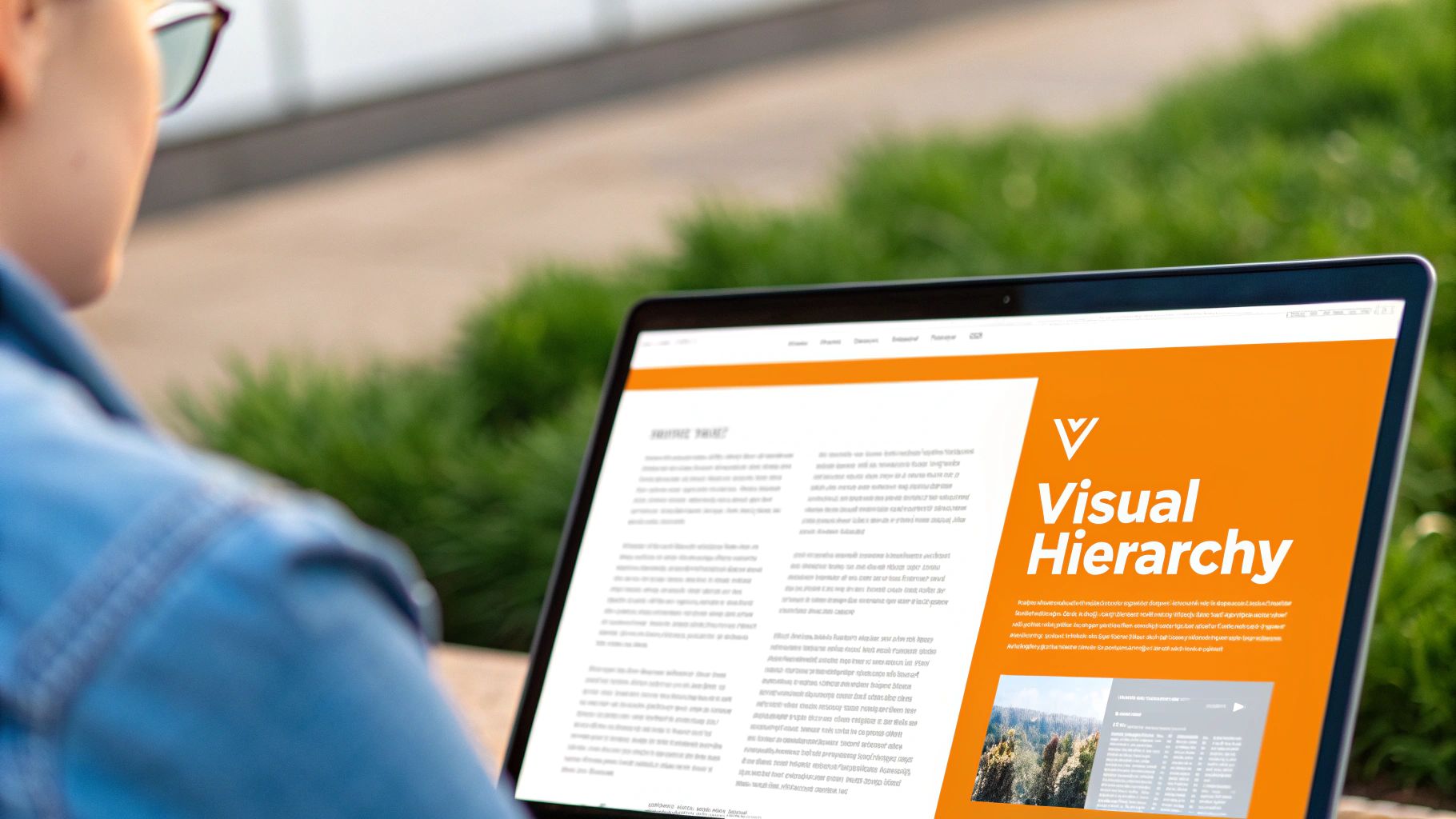
3. Clear Visual Hierarchy
Visual hierarchy is the principle of arranging design elements in order of importance to guide a user's attention naturally through a page. This technique uses size, color, contrast, spacing, and typography to establish relationships between elements and signal their significance. A strong hierarchy helps visitors quickly understand content, find what they are looking for, and navigate the site intuitively without conscious effort.
Implementing a clear visual hierarchy is a critical aspect of effective website design best practices. By strategically emphasizing key information like headlines, calls-to-action, and value propositions, you create a more scannable and user-friendly experience that supports business goals, whether it's generating leads or making sales.
Why It's a Best Practice
A website without a clear hierarchy forces users to work hard to find information, leading to confusion and high bounce rates. By organizing content logically, you make the user's journey effortless, which builds trust and improves engagement. For an e-commerce site, this means guiding a user from a product image to the "Add to Cart" button seamlessly. For a service provider, it means making your contact information or booking form impossible to miss.
Actionable Tips for Implementation
Establish a Typographic Scale: Use distinct sizes for your headings (H1, H2, H3) and body text. A common rule is to make the next level of heading at least 1.5x larger than the one below it to create clear separation.
Leverage Color and Contrast: Use bright, high-contrast colors for your most important elements, like primary call-to-action buttons, to make them stand out.
Utilize Whitespace: Strategic use of negative space around elements helps to separate different sections of content, reducing clutter and allowing key information to breathe.
Follow Reading Patterns: Design your layout to follow natural reading patterns, like the "F-pattern" or "Z-pattern," placing the most critical elements along these paths. For example, place your logo in the top-left and your main CTA in the top-right or center.
Limit Your Levels: Avoid creating a complex structure with too many levels of importance. Aim for 3-4 distinct hierarchy levels to keep the design clean and easy to follow.
For a masterclass in typography-driven hierarchy, study how content platforms like Medium structure their articles.
4. Fast Loading Speed and Performance Optimization
Website performance optimization is the practice of making your website load and respond as quickly as possible. This involves reducing file sizes, streamlining code, and optimizing server responses to ensure a smooth user interaction. A fast-loading website is critical for retaining visitors, as studies consistently show that even a one-second delay can drastically increase bounce rates. Google has also made page speed a direct ranking factor, underscoring its importance for SEO.
Implementing robust performance optimization is a cornerstone of modern website design best practices. A high-performing site not only satisfies user expectations for speed but also directly contributes to better engagement, higher conversion rates, and improved search engine visibility.
Why It's a Best Practice
A fast website provides a superior user experience, which builds credibility and keeps visitors on your site longer. For e-commerce stores, speed is directly tied to revenue; Amazon famously calculated that a 100-millisecond delay could cost them 1% in sales. For lead generation sites, a quicker load time means potential clients can access your contact forms and service information without frustrating delays, leading to more inquiries.
Actionable Tips for Implementation
Measure and Monitor: Use tools like Google PageSpeed Insights to analyze your current performance and identify specific areas for improvement. Regularly monitor your Core Web Vitals (LCP, FID, CLS).
Compress and Optimize Images: Use modern image formats like WebP and compress images before uploading them. Implement lazy loading so that images below the fold only load when a user scrolls to them.
Minify Code: Reduce the file size of your HTML, CSS, and JavaScript by removing unnecessary characters like spaces and comments. Additionally, optimizing your website's stylesheet by using a CSS minifier formatter can significantly improve loading times.
Leverage Browser Caching and a CDN: Configure browser caching so that repeat visitors can load your site faster. Use a Content Delivery Network (CDN) to distribute your assets across global servers, reducing latency for international users.
Visual Guide to Performance Optimization
5. Consistent and Intuitive Navigation
Consistent and intuitive navigation is the roadmap that guides visitors through your website. It involves designing a clear, predictable, and easy-to-use structure that allows users to find information with minimal effort. Great navigation helps users understand where they are, where they have been, and where they can go next, making their journey through your site feel seamless and logical.
This foundational element is one of the most critical website design best practices because it directly impacts usability and user satisfaction. When users can't find what they're looking for, they leave. As pioneered by usability experts at the Nielsen Norman Group, a well-structured navigation system reduces cognitive load and builds user confidence.
Why It's a Best Practice
Effective navigation is the backbone of a positive user experience. It reduces bounce rates by helping visitors quickly locate key information, such as your services, contact page, or products. For e-commerce sites like Zappos, clear, category-driven navigation is essential for guiding customers to the right products and boosting sales. For service-based businesses, it ensures potential clients can easily explore your offerings and find your call-to-action.
Actionable Tips for Implementation
Limit Menu Items: Keep your main navigation menu concise, ideally with 5-7 top-level options. This prevents overwhelming users with too many choices.
Use Descriptive Labels: Avoid vague or clever labels. Use clear, user-centric terms that accurately describe the destination page, like "Services" instead of "What We Do."
Implement a Sticky Header: A sticky or fixed navigation header remains visible as users scroll down the page, providing constant access to the main menu without needing to scroll back up.
Include Breadcrumbs: For websites with deep content structures, breadcrumb navigation shows users their current location within the site's hierarchy, allowing for easy backtracking.
Add a Search Function: A prominent search bar is a crucial backup, allowing users to find specific content quickly if they can't locate it through the primary navigation.
Maintain Consistency: Ensure the navigation menu's placement, style, and items are identical on every page of your website to build familiarity and predictability.
6. Accessibility and Inclusive Design
Web accessibility ensures that websites are usable by everyone, including people with visual, auditory, motor, and cognitive disabilities. This practice involves designing and coding sites so that all users have equal access to information and functionality. Inclusive design extends this concept, aiming to create a universally better experience by considering the full range of human diversity.
Implementing accessibility is a crucial component of modern website design best practices. It not only broadens your audience and demonstrates social responsibility but also improves overall usability and SEO, as many accessibility features overlap with search engine optimization signals.

Why It's a Best Practice
An accessible website is legally compliant, reducing the risk of lawsuits, and it also benefits all users. Features like high-contrast text are easier for everyone to read in various lighting conditions, and clear navigation structures help all visitors find what they need faster. For any business, from e-commerce to professional services, making your site accessible ensures you are not excluding a significant portion of the population from becoming customers.
Actionable Tips for Implementation
Start with Semantic HTML: Use proper heading tags (, , etc.) to structure content logically. Use tags like , , and for their intended purposes.
Provide Text Alternatives: Always include descriptive text for images so screen reader users understand the visual content. Provide captions and transcripts for all video and audio media.
Ensure Sufficient Contrast: Maintain a minimum color contrast ratio of 4.5:1 for normal text and 3:1 for large text to ensure readability, as recommended by WCAG 2.1 guidelines.
Enable Keyboard Navigation: Test your entire website to ensure every interactive element, including links, buttons, and form fields, can be accessed and operated using only the tab, enter, and arrow keys.
For a deeper look into the legal and ethical reasons for this approach, you can learn more about the importance of digital accessibility compliance.
7. Effective Call-to-Action (CTA) Design
An effective call-to-action (CTA) is a pivotal design element that directs users toward a specific, desired action, such as making a purchase, signing up for a newsletter, or requesting a quote. It combines persuasive copy, strategic placement, and compelling visual design to create a button or link that is impossible to ignore. A strong CTA bridges the gap between passive browsing and active engagement, making it a cornerstone of conversion rate optimization.
Implementing thoughtful CTAs is essential to any list of website design best practices. Without clear and motivating CTAs, even the most beautifully designed website will fail to convert visitors into customers, rendering your marketing efforts ineffective.
Why It's a Best Practice
Well-designed CTAs are the primary drivers of business goals on a website. They provide clear navigational cues, reduce decision fatigue for the user, and create a sense of urgency or value that encourages immediate action. For an e-commerce store, this means more sales. For a service provider, it translates to more qualified leads. Ultimately, CTAs transform your website from a digital brochure into a powerful conversion machine.
Actionable Tips for Implementation
Use Strong, Action-Oriented Verbs: Start your CTA copy with compelling verbs like "Get," "Start," "Join," or "Discover." For example, "Get Your Free Quote" is more powerful than "Submit."
Create Visual Contrast: Your CTA button should stand out from the rest of the page. Use a bold, contrasting color that draws the eye and ensure there is plenty of white space around it.
Strategic Placement: Place primary CTAs above the fold and at logical conclusion points in your content. For instance, place a "Buy Now" button directly after a compelling product description.
Provide Clear Value: The user should know exactly what will happen when they click. Instead of a generic "Click Here," use specific text like "Download Your Free E-book" to communicate the benefit.
Test and Iterate: A/B test different versions of your CTAs. Experiment with colors, copy, shapes, and placement to discover what resonates most with your audience.
For more inspiration on creating high-converting CTAs, you can study the landing page strategies from experts at Unbounce.
8. Trust Signals and Social Proof
Trust signals and social proof are critical design elements that build credibility and reduce a visitor's hesitation. Trust signals, like security badges and certifications, reassure users that your site is legitimate and safe. Social proof is a psychological concept, popularized by Robert Cialdini, where people assume the actions of others reflect correct behavior. This includes testimonials, reviews, and user-generated content that validate your product or service.
Integrating these elements is a core component of modern website design best practices, especially for e-commerce and service-based businesses where user confidence directly impacts conversions. A potential customer is far more likely to make a purchase or submit a form if they see that others have done so with positive results.
Why It's a Best Practice
In a crowded digital marketplace, trust is a valuable currency. Displaying social proof and trust signals effectively lowers perceived risk, making visitors feel more comfortable engaging with your brand. For a professional service provider, a compelling case study can be the deciding factor for a potential client. For an online store, seeing high ratings and reviews on a product page, like Amazon pioneered, can significantly boost sales and reduce cart abandonment.
Actionable Tips for Implementation
Feature Authentic Testimonials: Display customer testimonials prominently, including their full name, company, and a real photo to maximize credibility. Video testimonials are even more powerful.
Showcase Ratings and Reviews: Integrate platforms like Trustpilot or Google Reviews to display verified ratings. Show both the average score and the total number of reviews.
Use Trust Badges: Place well-recognized logos for security (SSL certificates), payment processors (Visa, PayPal), and industry awards near conversion points like checkout pages or contact forms.
Highlight Key Numbers: Display compelling metrics like "over 10,000 satisfied customers" or "featured in Forbes" to leverage the power of social proof and authority.
For more on leveraging customer feedback, you can explore strategies for collecting and using testimonials effectively.
Visual Guide to Social Proof
9. Mobile-First Design Approach
Mobile-first design is a strategic philosophy where you begin the design and development process on the smallest screen first, then progressively enhance the experience for larger screens like tablets and desktops. Popularized by Luke Wroblewski, this approach directly addresses the reality that the majority of web traffic originates from mobile devices. By starting with the constraints of a mobile screen, you are forced to prioritize the most essential content and functionality, leading to a cleaner, more focused user experience.
Adopting a mobile-first mindset is a critical component of modern website design best practices. This strategy not only caters to the largest segment of your audience but also aligns perfectly with Google's mobile-first indexing, where the search engine primarily uses the mobile version of your content for indexing and ranking.
Why It's a Best Practice
Designing mobile-first forces you to eliminate clutter and focus on what truly matters to your users. This results in faster load times and a more intuitive navigation system, significantly reducing bounce rates on mobile. For e-commerce stores, this means a more streamlined path to purchase. For service-based businesses, it ensures contact information and key services are immediately accessible, increasing the likelihood of lead generation. This approach doesn't just create a better mobile site; it leads to a better, more deliberate design across all devices.
Actionable Tips for Implementation
Start with Small Screens: Begin your wireframing and design process with a mobile viewport (e.g., 320px to 375px width) to establish your core content hierarchy.
Prioritize Ruthlessly: Identify the single most important action you want a mobile user to take on each page and design around that goal.
Design for Touch: Ensure all buttons, links, and interactive elements have a minimum touch target of 44x44 pixels to accommodate fingertips and avoid user frustration.
Consider Thumb Zones: Place primary navigation and key call-to-action buttons in areas of the screen that are easily reachable by a user's thumb.
Progressively Enhance: Once the mobile design is solid, build upon it for larger screens. Add secondary content, more complex interactions, and multi-column layouts that take advantage of the extra space.
10. Minimalist and Clean Design
Minimalist web design is an approach that strips away non-essential elements to focus entirely on the core message and functionality. Rooted in the "less is more" philosophy, this style prioritizes simplicity, clarity, and generous use of whitespace to guide the user's attention. By reducing visual clutter, you create a sophisticated, modern aesthetic that enhances readability and reduces cognitive load, allowing users to complete their tasks more efficiently.
Adopting a clean, uncluttered layout is one of the most impactful website design best practices for creating a professional and user-friendly experience. This approach is not about emptiness but about intentionality, ensuring every single element on the page serves a distinct purpose.
Why It's a Best Practice
A minimalist design enhances user focus by removing distractions, leading visitors directly to important content or calls-to-action. This clarity often results in higher conversion rates. Additionally, simpler designs tend to load faster, which improves both user experience and SEO performance. For brands like Apple or Google, minimalism communicates confidence, sophistication, and an unwavering focus on the product's function.
Actionable Tips for Implementation
Prioritize Ruthlessly: Start with a blank canvas. Add elements back one by one, and only keep what is absolutely essential for communication or user goals.
Embrace Whitespace: Use generous negative space (the empty areas around elements) to create a balanced, uncluttered layout and improve content legibility.
Limit Your Color Palette: Stick to a simple, intentional color scheme, often just two or three primary colors, to create visual harmony and avoid overwhelming the user.
Focus on Typography: With fewer visual elements, typography becomes a central design component. Choose one or two high-quality, readable font families to convey your brand's personality.
Simplify Forms: Reduce form fields to the bare minimum. Only ask for information that is absolutely necessary to decrease friction and increase completion rates.
For inspiration, observe how industry leaders use this approach on sites like Apple.com and the distraction-free reading experience on Medium.com.
Visual Guide to Minimalist Design Principles
Top 10 Website Design Best Practices Comparison
Technique | 🔄 Implementation Complexity | ⚡ Resource Requirements | ⭐ Expected Outcomes | 📊 Ideal Use Cases | 💡 Key Tips |
|---|---|---|---|---|---|
Responsive Web Design | Moderate → High; cross-device CSS & testing | Front-end devs, device QA, flexible assets | ⭐⭐⭐ Broad device reach, better SEO, consistent UX | Multi-device websites, marketing sites, content platforms | Start mobile-first; use flexible units; optimize images |
User-Centered Design (UCD) | High; iterative research & testing cycles | UX researchers, test participants, longer timelines | ⭐⭐⭐ Higher satisfaction, fewer reworks, better conversions | Complex products, enterprise apps, products needing adoption | Build personas, run usability tests, iterate on feedback |
Clear Visual Hierarchy | Moderate; design discipline required | UI/visual designers, typography assets | ⭐⭐↑ Improves comprehension and CTA clarity | Content-heavy pages, landing pages, editorial sites | Limit levels (3–4); use size, contrast, whitespace |
Fast Loading Speed & Performance | High; profiling, infra and code changes | DevOps, CDN, performance tooling, monitoring | ⭐⭐⭐ Lower bounce, SEO boost, higher conversions | E‑commerce, high‑traffic sites, mobile-first audiences | Measure Core Web Vitals, compress images, enable caching |
Consistent & Intuitive Navigation | Moderate; IA planning & testing | UX architects, content strategists, user testing | ⭐⭐ Better discoverability, longer sessions | Large sites, e‑commerce, documentation hubs | Limit top items, use breadcrumbs, test with new users |
Accessibility & Inclusive Design | Moderate → High; ongoing compliance work | Accessibility experts, assistive-tech testing | ⭐⭐↑ Legal compliance, wider reach, improved UX for all | Government, enterprise, public-facing services | Use semantic HTML, keyboard support, test with screen readers |
Effective CTA Design | Low → Moderate; iterative optimization | Designers, copywriters, A/B testing tools | ⭐⭐⭐ Significant lift in conversions when optimized | Landing pages, signup flows, pricing pages | Use action verbs, contrast, 1–3 primary CTAs; test variants |
Trust Signals & Social Proof | Low → Moderate; content curation | Customer assets, review platforms, moderation | ⭐⭐ Increases credibility and conversion confidence | E‑commerce, SaaS, service providers | Show real testimonials, verification, update frequently |
Mobile-First Design Approach | Moderate; requires mindset shift | Mobile testing, front-end devs, performance focus | ⭐⭐⭐ Better mobile UX, prioritized content, easier scaling | Mobile-dominant audiences, apps, on-the-go services | Design at 320px, consider thumb zones, minimize forms |
Minimalist & Clean Design | Moderate; strong editorial choices | Skilled designers, high‑quality content/images | ⭐⭐↑ Faster loads, clearer focus, premium feel | Portfolios, product pages, reading-focused sites | Remove nonessential elements, embrace whitespace, limit colors |
Turning Best Practices into Business Growth
You've just navigated a comprehensive roadmap detailing the essential pillars of modern web design. From embracing a mobile-first philosophy and optimizing for lightning-fast load times to building trust with clear signals and ensuring accessibility for all users, the journey is extensive. These aren't just isolated tips; they are interconnected components of a holistic strategy. A clean, minimalist design with a clear visual hierarchy isn't merely an aesthetic choice; it directly impacts user experience, guides visitors toward your calls-to-action, and ultimately, supports your business objectives.
Implementing these website design best practices transforms your site from a static digital brochure into a dynamic, hardworking asset. It becomes your 24/7 salesperson, your primary marketing channel, and a powerful engine for lead generation and customer conversion. The true value lies in understanding that a great website is never truly "finished." It's a living entity that requires continuous attention, testing, and refinement to adapt to evolving user expectations and technological advancements.
From Theory to Tangible Results
The critical next step is to move from understanding these principles to actively applying them. This transition is where a well-designed website begins to generate a real return on investment. Start by evaluating your current site against the checklists provided throughout this guide.
Audit Your User Experience: Is your navigation intuitive? Can a new visitor understand your value proposition within five seconds?
Test Your Performance: Use tools like Google PageSpeed Insights to identify what’s slowing down your site. Even a one-second delay can drastically increase bounce rates.
Review Your Accessibility: Are you using proper heading structures and alt text for images? An accessible site not only serves a wider audience but also benefits your SEO.
Analyze Your Conversions: Are your CTAs prominent and compelling? Do your trust signals effectively reassure potential customers?
This initial audit provides a baseline, highlighting the most urgent areas for improvement. As you implement changes, it's crucial to measure their impact. To truly understand the impact of your design choices and uncover areas for improvement, learning How to Perform an SEO Audit That Drives Growth is essential. A thorough audit connects the dots between your design elements, on-page SEO, and search engine ranking, giving you a clear path forward.
Your Website as a Strategic Advantage
Ultimately, mastering these website design best practices is about more than just having a beautiful site. It's about creating a seamless, engaging, and effective digital experience that respects your user's time and meets their needs. When you prioritize user-centered design, you build brand loyalty. When you ensure your site is fast and responsive, you capture mobile audiences. When you make it accessible, you demonstrate inclusivity and broaden your market reach.
Each best practice, from a well-placed CTA to a consistent branding element, contributes to a larger goal: building a powerful online presence that drives sustainable business growth. The effort you invest today in creating a strategic, high-performing website will pay dividends for years to come, solidifying your digital footprint and giving you a significant competitive edge in a crowded marketplace.
Ready to transform your website from a simple online presence into a powerful growth engine? The team at DLL Studios specializes in implementing these exact website design best practices on platforms like Wix Studio, Webflow, and WordPress to build high-performing, secure, and ADA-compliant sites that achieve measurable results. Contact DLL Studios today to learn how we can build a website that drives your business forward.