


.png)
How to improve ecommerce conversion rate: Simple steps that boost sales
- Feb 6
- 16 min read
To boost your ecommerce conversion rate, you have to systematically find and fix the friction points that make customers leave. This isn't about guesswork; it's about digging into user behavior data to see exactly where people are dropping off and then rolling out targeted fixes—like a simpler checkout, better product pages, or faster load times—to build trust and make buying a breeze.
Finding the Leaks in Your Sales Funnel
Before you even think about redesigning a page or changing a button color, you need to put on your detective hat. The first step is figuring out precisely where you're losing customers. Just looking at your overall conversion rate is like seeing the final score of a game without watching any of the plays—it tells you if you won or lost, but not why.
A data-first approach is non-negotiable. It ensures you’re creating a prioritized roadmap based on what your customers are already telling you with their clicks, not just chasing shiny objects.
The goal here is to get past vanity metrics and find the real roadblocks in your sales funnel. This diagnostic phase is critical because the most common conversion killers often hide in plain sight, and you'll only spot them by carefully analyzing user behavior. For instance, a high bounce rate on product pages could signal weak photos or confusing descriptions. A huge drop-off after the cart page almost always points to surprise shipping costs or a clunky form.
Pinpointing the Problem Areas
To kick off your diagnosis, you’ll need to set up clear goals and funnels in your analytics platform, like Google Analytics. This is how you visualize the customer's path from one step to the next and see exactly where the leaks are springing.
Here are the key areas I always investigate first:
Homepage to Product Page: Are people actually finding your products, or are they bouncing right from the homepage? This could mean your navigation is confusing or your site search is failing them.
Product Page to Add-to-Cart: Do shoppers check out products but never add them to their cart? This is a classic sign of unconvincing product details, pricing hesitation, or a lack of trust signals.
Cart to Checkout: This is one of the biggest drop-off points for most stores. High abandonment here usually means something is wrong with the checkout process itself, like forcing account creation or hitting them with sticker shock from hidden fees.
Device-Specific Drop-offs: Segmenting your data by device is absolutely essential. I’ve seen countless stores with strong desktop conversion rates that completely fall apart on mobile. That’s a massive red flag pointing to a poor mobile experience that needs immediate attention.
This simple, three-step methodology is the most reliable way I've found to diagnose and plug the leaks in any sales funnel.
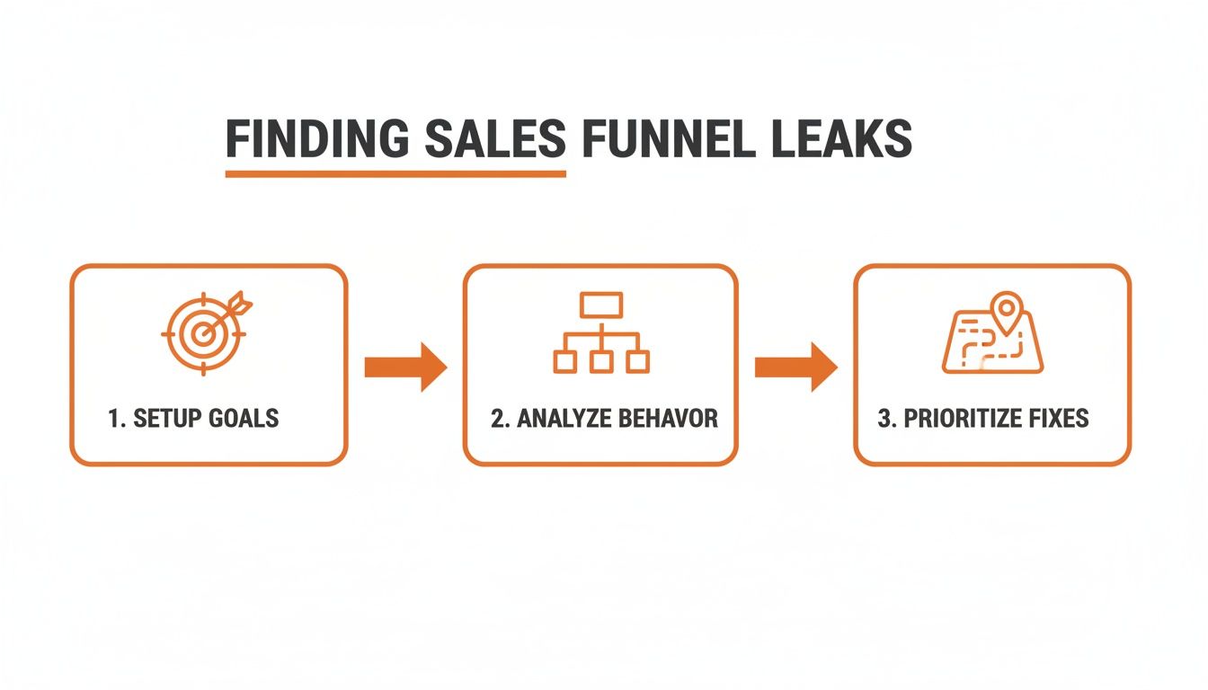
As you can see, a systematic approach—setting goals, analyzing behavior, and then prioritizing fixes—is the key to making meaningful improvements to your ecommerce conversion rate.
From Data to Actionable Insights
Once you have the numbers, the real work begins: translating that data into a story about your customer's experience. A behavior flow report in Google Analytics can be incredibly revealing, showing you the wild, winding paths users take right before they give up and leave.
Are they clicking back and forth between a product page and your shipping policy? That’s a dead giveaway that your shipping information isn't clear enough.
The most powerful insights come from understanding the why behind the data. Analytics tell you what is happening, but tools that provide session recordings or heatmaps can show you how it's happening, revealing user frustration in real-time.
For example, a local business serving clients from Downtown Los Angeles to Sherman Oaks in the San Fernando Valley might see high cart abandonment rates. The data might show the drop-off happens on the shipping page. But a heatmap could then reveal that users are hovering endlessly over the zip code field, signaling confusion about local delivery options.
That insight is infinitely more valuable than a generic abandonment statistic. It gives you a specific, actionable fix. By adopting this diagnostic mindset, you stop making random changes and start solving real customer problems.
Crafting Product Pages That Actually Persuade
Think of your product page as your best salesperson—it’s on the clock 24/7. When a potential customer lands here, they're no longer just window shopping; they are seriously considering a purchase. This is your make-or-break moment to convince them your product is the exact solution they’ve been looking for.
Unfortunately, this is also where so many online stores stumble. They treat product pages like a static inventory list: a couple of basic photos, a dry list of specs, and a price tag. If you really want to boost your ecommerce conversion rate, you have to transform these pages into compelling, trust-building experiences that answer a customer's questions before they even think to ask them.
Move from Features to Benefits
The single biggest mistake I see in product descriptions is focusing only on what the product is, instead of what it does for the customer. A feature is just a fact about the product. A benefit is the real-world, positive outcome a customer gets from that feature. And trust me, people buy outcomes, not specifications.
For example, don't just say a backpack has "water-resistant nylon." Instead, say it "keeps your laptop safe and dry during an unexpected downpour on your commute through Hollywood or Burbank." See the difference? That paints a picture and solves a real problem.
Here’s a simple way to put this into practice:
List Your Features: First, just jot down every technical feature of your product.
Ask "So What?": For every single feature, ask yourself, "so what?" Keep asking until you land on a clear, tangible benefit for the customer.
Lead with the Benefit: When you write your description, start with that compelling benefit, and then use the feature to back it up.
For a deeper dive on this, check out our guide on how to master how to write product descriptions to boost sales.
Harness the Power of Visuals
Online shoppers can't touch, feel, or hold your product, so your visuals have to do all the heavy lifting. Low-quality, single-angle photos are an absolute conversion killer. You need to replicate the in-store experience as much as you possibly can.
High-quality, professional photos from multiple angles are non-negotiable. Show the product in use, get some close-up shots of key details, and offer a 360-degree view if it makes sense for your product. This helps customers truly visualize owning and using it, whether they're shopping from a cafe in Santa Monica or their couch in the San Gabriel Valley.
And don't stop at static images. Short demo videos are incredibly powerful. A simple 30-second video can show off a product’s functionality, scale, and value far more effectively than a dozen photos ever could. Studies consistently show that adding a video to a landing page can increase conversions by over 80%.
Build Trust with Social Proof and Transparency
When a customer is sitting on the fence, the opinions of other people can be the final push they need. Social proof is a powerful psychological trigger that reassures buyers they’re making a smart choice.
Customer reviews are today's word-of-mouth marketing. In fact, one study found that just displaying reviews can increase conversion rates by as much as 270%. Don't bury them at the bottom of the page—integrate them right up near the product title and the "Add to Cart" button where they'll have the most impact.
This trust-building also applies to your store policies. Nothing creates hesitation faster than uncertainty about shipping or returns.
Shipping Information: Be upfront and clear about shipping costs and estimated delivery times. Surprise fees at checkout are one of the top reasons for cart abandonment.
Return Policy: Make your return policy easy to find and even easier to understand. A generous, hassle-free return guarantee reduces the customer's perceived risk, making them much more confident in hitting that "buy" button.
Personalize the Experience for Higher Conversions
In modern ecommerce, personalization is no longer a "nice-to-have"—it's a key driver of success. When you tailor the shopping experience to what a specific visitor is looking for, conversion rates naturally go up. You can discover more about these ecommerce conversion benchmarks to see just how much performance varies by industry, but the trend is clear.
Top-performing industries like beauty & personal care (4.94%) and food & beverages (6.22%) blow the global 2.95% average out of the water, largely thanks to tailored experiences. This could be as simple as showing "recently viewed items" or as advanced as recommending products based on their specific browsing behavior. Dynamic content can boost engagement by 20-30%, creating a more relevant journey that encourages repeat business.
Designing a Frictionless Checkout Experience

You did all the hard work. A customer found your site, fell in love with a product, and hit "Add to Cart." This is the moment of truth, the final step where an incredible number of sales are either won or lost.
The stats here are pretty sobering. The average cart abandonment rate is hovering around 70%. That means for every ten shoppers who start the checkout process, seven of them walk away without buying anything. These aren't just casual browsers; these are high-intent customers who were ready to pay until something stopped them cold.
So, what’s going wrong? Baymard Institute has been tracking this for years, and their data points to a few usual suspects.
As you can see, the biggest conversion killers are extra costs (like shipping and taxes), being forced to create an account, and a checkout process that’s just too long or complicated. Nailing this final step is the difference between a lost sale and a loyal customer, whether they're shopping from Venice or the South Bay.
Eliminate Surprise Costs at All Costs
The number one reason people abandon their carts is unexpected fees. A customer has a price in their head, and when the final total suddenly balloons with high shipping costs and taxes, it creates sticker shock and breaks their trust. It feels like a bait-and-switch.
The fix? Be transparent from the get-go.
Show Shipping Estimates Early: Don't make them wait until the final screen. Put a shipping calculator on the cart page or even on product pages.
Be Upfront About Taxes: If you can, display estimated taxes based on the user's location as soon as they enter a zip code.
Offer Free Shipping: This is a classic for a reason. Offering free shipping over a certain order amount is a powerful incentive that can boost both conversion rates and average order value.
Simplify the Path to Purchase
Every extra field they have to fill out, every unnecessary click, and every confusing step is another chance for a customer to get frustrated and leave. Your goal should be to make checkout as fast and painless as humanly possible.
A clunky, complicated process is pure friction. One of the worst offenders is forcing users to create an account just to buy something. People hate it. Always, always offer a prominent guest checkout option. You can invite them to create an account on the "Thank You" page after the purchase is complete.
Think of your checkout form like a conversation. You wouldn't ask a stranger for their life story right away. Keep it short, ask only for what you absolutely need, and make it feel effortless.
Offer Diverse Payment Options
The payment world has changed. Customers expect to pay with their preferred method, and if you don't offer it, that can be a dealbreaker. Simply having a field for a credit card number isn't good enough anymore.
Integrating digital wallets and other modern payment methods isn't just a nice-to-have; it's standard practice because it slashes friction.
Digital Wallets: Options like Apple Pay, Google Pay, and PayPal let customers buy with a single click, automatically pulling their saved shipping and payment info. It’s incredibly fast.
Buy Now, Pay Later (BNPL): For higher-priced items, services like Klarna and Afterpay can seriously boost conversions by letting customers split the cost into smaller, interest-free installments.
By catering to modern payment preferences, you make it easier for everyone from Beverly Hills to Pasadena to complete their purchase quickly and securely. You can learn more about crafting a high-converting final step by exploring these 10 ecommerce checkout best practices. This is a crucial area to get right if you want to improve your ecommerce conversion rate.
Winning Over the Modern Mobile Shopper

If your online store isn’t built for a mobile-first world, you're not just falling behind—you're actively turning away most of your potential customers. A fast, intuitive mobile site isn't a luxury anymore; it’s the absolute baseline expectation for shoppers everywhere, from Pasadena to Manhattan Beach.
This goes way beyond having a "responsive" design that just shrinks to fit a smaller screen. A truly optimized mobile experience is designed from the ground up for thumbs, small screens, and sometimes-spotty internet connections. It's about making every tap and scroll feel effortless.
The data tells a pretty stark story. While mobile traffic makes up a whopping 73% of all ecommerce visits, cart abandonment on mobile skyrockets to an eye-watering 77.2%. This huge gap highlights a massive opportunity. Desktop conversion rates average around 4.8%, but mobile lags way behind at just 2.9%, mostly due to frustrating usability issues like slow speeds and clunky navigation. If you're curious about these numbers, you can learn more about the latest ecommerce conversion rate data.
The gap between how many people shop on mobile versus how many actually buy is where fortunes are made or lost.
Mobile vs Desktop Ecommerce Performance
The table below breaks down the critical performance gap between mobile and desktop users. It's not just about traffic; it's about the friction that mobile shoppers face, which directly impacts your bottom line.
Metric | Mobile | Desktop |
|---|---|---|
Ecommerce Traffic Share | 73% | 27% |
Average Conversion Rate | 2.9% | 4.8% |
Cart Abandonment Rate | 77.2% | 69.8% |
This data isn't just a set of statistics—it's a clear signal. The reason for the lower mobile conversion and higher abandonment is almost always a poor user experience. Closing this gap is one of the biggest levers you can pull to increase revenue.
Make Speed Your Top Priority
On mobile, every single second counts. A one-second delay in page load time can torpedo conversions by 7% or more. Shoppers are impatient and will bounce from a sluggish site without a second thought. Your site needs to fly, even on a shaky 4G connection.
This means getting serious about performance. It's not just a technical task for your developer; it's a core part of your conversion strategy.
Compress Your Images: Large, unoptimized images are the #1 killer of mobile site speed. Use modern formats like WebP and compression tools to shrink file sizes without losing quality.
Leverage Browser Caching: This tells a user's device to store parts of your site, like your logo and navigation. When they click to another page, their browser doesn't have to reload everything, making the experience feel almost instant.
Minimize Code: Clean up your site’s CSS and JavaScript. Every unnecessary line of code or third-party script adds to the load time, creating friction.
Design For Thumbs Not Cursors
Think about how you use your phone. You’re probably holding it with one hand, navigating with your thumb. That requires a completely different design approach than a desktop site, where you have the precision of a mouse cursor.
A great mobile experience feels natural and easy. Every button should be large enough to be tapped confidently without accidentally hitting something else. Navigation menus need to be simplified, and forms should be a breeze to fill out on a tiny keyboard.
This is where a true mobile-first design philosophy comes in. Instead of designing for a big desktop screen and then trying to cram it all onto a smaller one, you start with the mobile layout. This forces you to prioritize what's absolutely essential, which almost always leads to a cleaner, more focused experience for everyone. If you want to go deeper on this, our team put together a practical guide to mobile-first design that breaks it all down.
Streamline Mobile Navigation And Search
When shoppers can't find what they're looking for quickly, they leave. Simple as that. On a small screen, clear navigation is even more critical. A complicated, multi-level dropdown menu that works fine on desktop can be a total nightmare on a phone.
Your job is to simplify. Pare down your main menu to only the most essential categories. A prominent, high-performing search bar is also non-negotiable. Make sure your search function offers autocomplete suggestions and can handle common typos, guiding users to the right products with minimal effort. This focus on easy discovery is what turns a frustrating hunt into a satisfying find.
Building a Foundation of Trust and Credibility
In the faceless world of online shopping, trust is everything. It's the currency that turns a hesitant browser into a paying customer.
Think about it. Someone lands on your site, finds a product they love, but then that little voice of doubt kicks in. Is this a real company? Is my credit card safe? Will this thing actually show up looking like the picture? Your job is to quiet that voice, and that starts with building a rock-solid foundation of credibility.
For any online store, especially if you're in a competitive area like Los Angeles, proving you're a legitimate, trustworthy business is the first and most important step. Without it, the slickest product pages and the smoothest checkout funnels won't matter.
Harness the Power of Social Proof
We are wired to look to others for clues. What should I buy? Where should I eat? Who can I trust? This is the simple idea behind social proof, and it's one of the most potent tools you have to boost conversions. When a shopper sees that other people have already bought from you—and had a great experience—their fear of making a bad decision drops dramatically.
But just collecting reviews isn't enough. You have to put them where they'll do the most good.
On Product Pages: This is an absolute must. Get those customer reviews and star ratings right under the product title, close to that "Add to Cart" button. It’s not just a nice-to-have; some studies show that displaying reviews can increase conversions by a staggering 270%.
On Your Homepage: Hand-pick a few of your best, most glowing testimonials and feature them prominently on your homepage. It builds instant credibility the second someone arrives.
During Checkout: A simple star rating or a short review snippet on the checkout page can be the final nudge of reassurance someone needs right before they pull the trigger.
A customer's words will always be more convincing than your own marketing copy. By showcasing authentic feedback, you're not just selling a product; you're building a community of trust that new customers want to join.
Imagine a shopper in Whittier looking for a niche item. Seeing a positive review from someone just down the road in La Habra makes the whole transaction feel safer and more real.
Display Visual Trust Signals
Beyond what other customers say, your website itself needs to visually scream "safe and professional." These small but powerful elements work on a subconscious level, signaling to visitors that you're a legitimate business they can feel good about buying from. So many stores miss these, but they're critical for building confidence.
A great example is a local business serving the San Gabriel Valley, from Alhambra to Azusa. Just by clearly showing a local phone number and address, they instantly feel more accessible and real than some anonymous online entity.
Here are the essential visual trust signals you need to have in place:
Security Badges: Make sure you're displaying well-known security seals. SSL certificate badges and payment logos (Visa, PayPal, Apple Pay) should be clearly visible in your site's footer and all over your checkout process.
Clear Contact Info: Don't make people hunt for a way to reach you. An easy-to-find "Contact Us" page with a phone number, email, and a physical address (if you have one) shows you're a real business that's not afraid to stand behind its products.
Professional Policies: Your Privacy Policy, Return Policy, and Terms of Service need to be easy to find and written in plain English. This kind of transparency shows you respect your customers and goes a long way in building trust.
High-Quality Design: A professional, modern, and bug-free website is a trust signal all on its own. Broken links, typos, and pixelated images make a store feel cheap and untrustworthy.
By weaving these elements of social proof and visual credibility throughout your site, you create an environment where customers feel secure. This is the foundation you need to overcome hesitation and guide shoppers all the way from discovery to purchase.
Your Top Ecommerce Conversion Questions, Answered
When you're digging into your ecommerce site's performance, a ton of questions pop up. It's totally normal to wonder what a "good" conversion rate even looks like or where you should put your effort for the biggest wins. Let's tackle some of the most common questions I hear from business owners.
What Is a Good Ecommerce Conversion Rate, Really?
This is always the first question, but there's no magic number. You'll see industry benchmarks floating around, suggesting a "good" conversion rate is somewhere between 2% and 4%, but that's a massive oversimplification. It changes dramatically depending on your industry, how much your products cost, and where your traffic is coming from.
A store selling high-end, custom furniture will naturally see a lower conversion rate than one selling cheap phone cases. It's just a different buying cycle. So instead of getting hung up on a universal average, focus on what actually matters:
Your Own History: The best benchmark is your own data. If you can consistently move your conversion rate from 1.5% to 1.8% month-over-month, that’s a huge victory.
Your Niche: Look at numbers specific to your industry. The beauty world, for example, tends to convert at a much higher rate than the electronics space.
The real goal here is steady, continuous improvement—not hitting some arbitrary number you read in an article.
How Much Do Product Pages Actually Matter?
They're everything. Your product pages are the most critical moment in the entire customer journey. This is where a casual browser decides to become a buyer. A weak product page is like having a salesperson who mumbles and can't answer basic questions—it kills the deal on the spot.
To get that conversion, your product pages have to do more than just list specs and features. They need to build trust and answer the "what's in it for me?" question with amazing photos, clear benefit-driven copy, and real social proof like customer reviews and photos.
Think of it this way: every unanswered question or flicker of doubt on a product page creates friction. Your job is to smooth that path by giving a customer everything they need to confidently click "Add to Cart."
What Are Some Low-Effort Ways to Boost Conversions?
You don’t always need a massive site redesign to see a difference. Often, the best results come from small tweaks that remove friction and build trust right where it counts.
The easiest wins are usually about clear, simple communication. Offering free shipping or a no-questions-asked money-back guarantee can make a massive difference by lowering the customer's perceived risk. Make sure these trust signals are visible right next to your "Add to Cart" or "Buy Now" buttons.
Simplifying your checkout is another quick win. In a famous case study, Expedia boosted their profits by $12 million just by removing one unnecessary field from their checkout form. That’s the power of making things easier for your customers.
How Do Technical Issues Hurt Conversions?
Broken links, 404 errors, and slow-loading pages are the silent killers of conversion. They create a clunky, frustrating experience that immediately erodes a visitor's trust in your brand. It’s the digital version of walking into a store with flickering lights and merchandise thrown all over the floor—you'd turn around and leave.
Google’s data shows that 53% of mobile visitors will leave a site if it takes more than three seconds to load. Those aren't just lost page views; they're potential customers who now have a bad taste in their mouth about your brand. Fixing these foundational technical glitches should always be at the top of your to-do list.
If you want to dig deeper into the core principles of improving online sales, exploring a comprehensive guide to Conversion Rate Optimization can offer a more holistic perspective.
At DLL Studios, we specialize in turning these insights into action, helping businesses across Southern California design and optimize websites that convert visitors into loyal customers. Los Angeles is at the center of our service area, and we proudly support clients across a wide network of surrounding cities and neighborhoods. Our reach includes every corner of L.A.—from Downtown Los Angeles, Hollywood, West Hollywood, Beverly Hills, and Santa Monica to the beach communities of Malibu, Venice, and Manhattan Beach. We also extend service through the San Fernando Valley, including Sherman Oaks, Studio City, Encino, Burbank, Glendale, and Pasadena. In the San Gabriel Valley, we work with clients in Alhambra, Monterey Park, West Covina, and Arcadia. Farther southeast, we serve Whittier, Pico Rivera, Downey, and Norwalk. We also support the South Bay—including Torrance, Carson, Gardena, and Long Beach—as well as the Gateway Cities and communities throughout the I-10, I-5, 101, and 405 corridors. Whether you’re in a major metro area or a smaller surrounding neighborhood, our team delivers reliable, high-quality service anywhere in or around Los Angeles. If you're ready to improve your ecommerce conversion rate and achieve measurable results, we can help. Contact our team today at (650) 260-4067 or visit us online at https://www.dllstudios.com.