


.png)
Responsive website design services to boost conversions
- Nov 27, 2025
- 13 min read
Updated: Nov 29, 2025
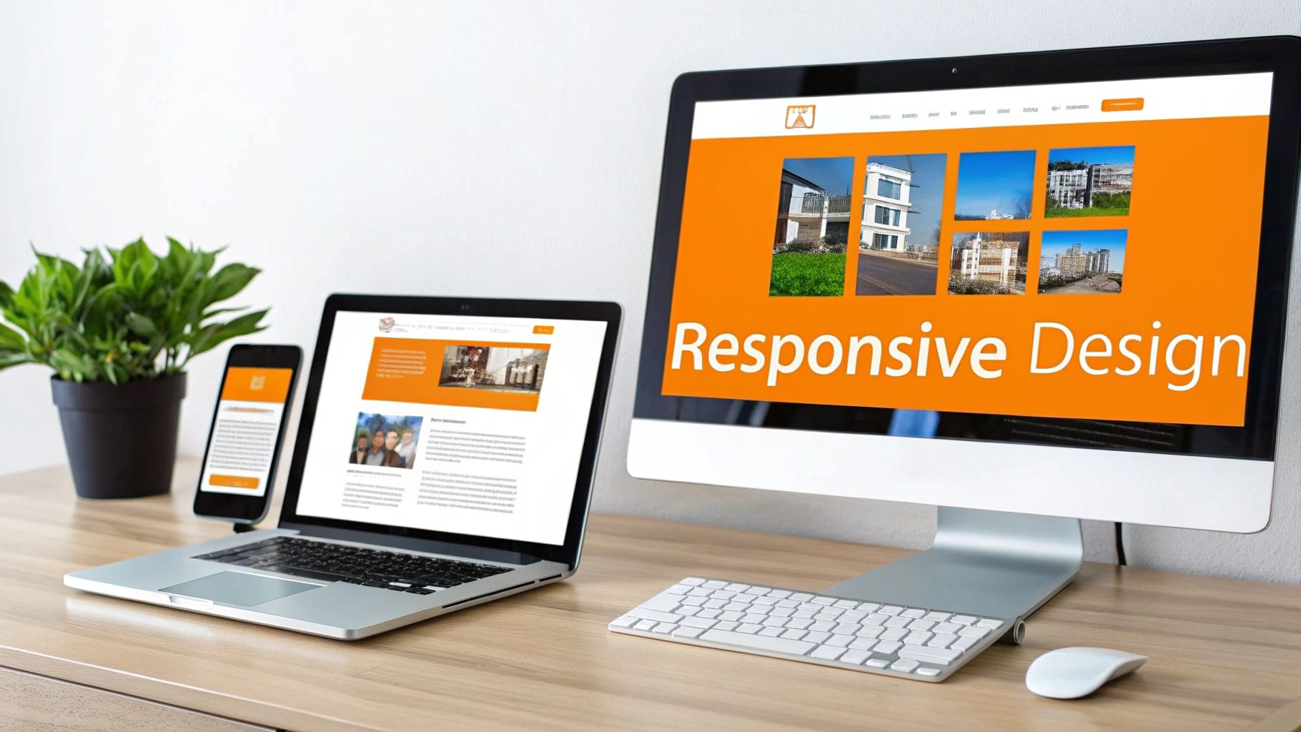
If you’ve ever pulled up a website on your phone and had to pinch, zoom, and scroll sideways just to read the text, you’ve experienced the pain of a non-responsive design. It’s frustrating, right?
Responsive website design services fix that. They make sure your website looks and works perfectly on any device, whether it’s a giant desktop monitor, a laptop, a tablet, or the smartphone in your pocket. Think of it as a one-size-fits-all solution that never looks sloppy. It’s a single, powerful website that gives every single visitor a great experience.
What Are Responsive Website Design Services Really?
Imagine your website’s content is like water. Pour it into a tall, skinny glass (a phone), and it fills the space perfectly. Pour it into a wide bowl (a desktop), and it spreads out to fit that shape, too. That’s the magic of responsive design. It uses a flexible grid system, fluid images, and clever code (specifically, CSS media queries) to automatically rearrange content for the best possible view on any screen.
This is a huge deal because your customers aren't just sitting at their desks anymore. They’re browsing on their morning commute, scrolling on the couch with a tablet, or checking out your services from a laptop at a coffee shop. A responsive site meets them exactly where they are, making everything feel intuitive and seamless.
It's Just How Modern Websites Are Built
Getting professional responsive website design services is about more than just the tech. It’s a whole strategy built around your user. It’s a process that includes:
User Experience (UX) Research: Digging into how your audience thinks and behaves to build a website journey that feels completely natural.
User Interface (UI) Design: Creating clean, intuitive layouts that guide visitors toward what they need without any friction or confusion.
Performance-Focused Development: Writing lean, efficient code to make sure your site loads fast and works flawlessly, no matter the device.
This approach has completely replaced clunky, outdated methods like building separate "m-dot" mobile sites. Those were a nightmare to manage, expensive to maintain, and a killer for your SEO. With a single responsive design, you manage one website that works for everyone.
It's no longer just a nice-to-have feature; it’s a fundamental part of a successful business. If you want to dig a bit deeper into the technical differences, we have a guide that breaks down adaptive vs responsive design in more detail.
This isn't just a trend; it's the standard. Today, responsive design isn’t an option—it's an expectation. Modern websites built with this approach can see an 11% higher conversion rate and a 15% jump in mobile user engagement. The results speak for themselves.
Responsive Design vs Older Web Approaches
To really see why responsive design is the only way to go now, let's put it side-by-side with older methods. The difference is night and day.
Feature | Responsive Design | Static Design (Fixed-Width) | Separate Mobile Site (m.domain.com) |
|---|---|---|---|
User Experience | Excellent on all devices. Seamlessly adapts for optimal viewing. | Poor on mobile. Requires pinching, zooming, and horizontal scrolling. | Inconsistent. Often a stripped-down version, creating a different experience. |
Maintenance | Simple. One site, one set of content to update. | Simple, but limited. One site, but doesn’t work well on mobile. | Complex & Costly. Two separate sites to manage and update. |
SEO Impact | Positive. Google prefers a single URL for all devices, boosting rankings. | Negative. Poor mobile experience hurts search performance. | Negative. Splits traffic and authority between two domains, hurting SEO. |
Cost | Efficient. Higher initial investment but lower long-term costs. | Low initial cost. But the cost of lost business is high. | Very High. You're essentially paying to build and maintain two websites. |
Future-Proofing | Excellent. Adapts to new screen sizes and devices as they emerge. | None. Becomes obsolete as new devices are released. | Poor. Requires new versions for different device types. |
The takeaway is clear. While static and separate mobile sites were once common, they just can't keep up with how people use the internet today. Responsive design is the only approach that delivers a consistently great experience for users and better results for your business.
Why Responsive Design Is a Core Business Investment
Thinking of responsive design as just a technical box to check is like seeing a new storefront as just bricks and paint. It misses the bigger picture. In reality, investing in professional responsive website design services is a strategic move that pays dividends across your entire business. It goes way beyond looks to directly impact your bottom line, and it all boils down to three key areas.
First and foremost, it creates an exceptional user experience. When someone lands on your site from their smartphone and finds it easy to read, navigate, and click around, you’ve instantly earned their trust. That positive first impression keeps them from hitting the back button and encourages them to stick around, deepening their connection with your brand.
Drive Growth with a Superior Digital Experience
A seamless experience isn't just about making things easy; it's about driving business. Picture a commuter browsing your online store on a crowded train. A responsive site lets them find a product, add it to their cart, and check out without any hassle. But a clunky, non-responsive site? They’d be forced to pinch and zoom, probably giving up in frustration and abandoning their cart.
This is where responsive design truly shines as a conversion tool. By knocking down the barriers between discovering a product and buying it—on any device—you directly increase sales and bring in more leads. To get a better handle on this, check out our guide on how to create a website that converts visitors.
Gain a Powerful SEO Advantage
Beyond making users happy, responsive design is absolutely crucial for getting found on Google. The search engine now operates on a "mobile-first" basis. In simple terms, it primarily looks at the mobile version of your website to decide how to rank you. If your site is a mess on mobile, you’re going to get buried in the search results, making it that much harder for new customers to find you.
Having a solid responsive design isn't a luxury anymore; it's a flat-out necessity for SEO. For a deeper dive, you can explore the intricacies of mobile-first indexing. Investing in a mobile-optimized site is one of the single most effective things you can do for your SEO today.
A responsive website isn't an expense; it's an asset that appreciates over time. It future-proofs your digital presence, boosts your search engine authority, and creates a reliable engine for customer acquisition and revenue growth.
The market trends back this up. More and more businesses are realizing just how vital this is. The responsive web design market, valued at around $11.5 billion in 2025, is on track to hit $20.3 billion by 2033. This growth isn't just a random number; it shows a clear industry-wide agreement that responsive design is a fundamental part of any modern business strategy.
Our Collaborative Design and Development Process
Bringing your vision for a new website to life shouldn't feel like a mystery. We believe the best results come from a transparent, collaborative partnership where you’re involved every step of the way. Our process for delivering exceptional responsive website design services is broken down into five clear phases, ensuring a smooth journey from our first conversation to a successful launch.
It all starts with getting to know your business on a deeper level. We don’t just ask what you want your site to look like; we explore what you need it to achieve.
Phase 1: Discovery and Strategy
Every great website is built on a solid strategy. During this initial phase, our team works closely with you to understand your business inside and out. We’ll nail down your key performance indicators (KPIs), map out your target audience’s needs, and scope out the competition to find opportunities for you to shine.
Think of this less as a meeting and more as a workshop. We align on project goals, establish a realistic timeline, and create a strategic roadmap that will guide every decision that follows. The outcome is a shared vision for what success looks like.
Phase 2: UX and UI Design
With a clear strategy in hand, our design team gets to work translating those goals into a tangible visual experience. This phase has two key parts:
User Experience (UX) Design: We start by creating wireframes—the architectural blueprints of your website. These are simple, no-frills layouts that focus purely on structure, navigation, and making sure the user’s journey is intuitive and completely seamless.
User Interface (UI) Design: Once the blueprint is approved, we bring it to life with high-fidelity mockups. This is where your brand comes alive. We apply your color palette, typography, and imagery to create a visually engaging interface that captivates visitors and reinforces your brand’s identity.
Your feedback is absolutely crucial here. We’ll iterate on the designs based on your input, making sure the final look and feel perfectly represents your business before a single line of code is written.
Phase 3: Development
This is where the magic happens. The approved designs are transformed into a fully functional, responsive website. Our developers are experts in writing clean, efficient code on modern platforms like WordPress, Webflow, and Wix Studio. They meticulously build each component, ensuring the site is not only beautiful but also technically sound and optimized for speed.
We stick to best practices to make sure your site is lightweight, secure, and built to perform. Throughout this stage, you’ll get to review our progress in a private staging environment so you can see it all come together.
Phase 4: Rigorous Testing
Before your website goes live, it undergoes a pretty intense testing process. We don’t leave anything to chance. Our quality assurance (QA) team meticulously tests every link, button, form, and feature across a whole range of devices and browsers.
We check for functionality, performance, and visual consistency on different screen sizes—from iPhones and Androids to iPads and large desktop monitors. This ensures that every visitor has a flawless experience, no matter how they access your site.
Phase 5: Launch and Support
After passing our tough QA process and getting your final sign-off, we handle the entire launch. This includes migrating the site to your live server, configuring your domain, and running final checks to ensure a seamless transition.
But our partnership doesn’t end at launch. We provide training on how to manage your new site and offer ongoing support and maintenance plans to keep it secure, updated, and performing at its best. We’re here to be your long-term digital partner, dedicated to helping you grow.
Choosing the Right Technology for Your Business Goals
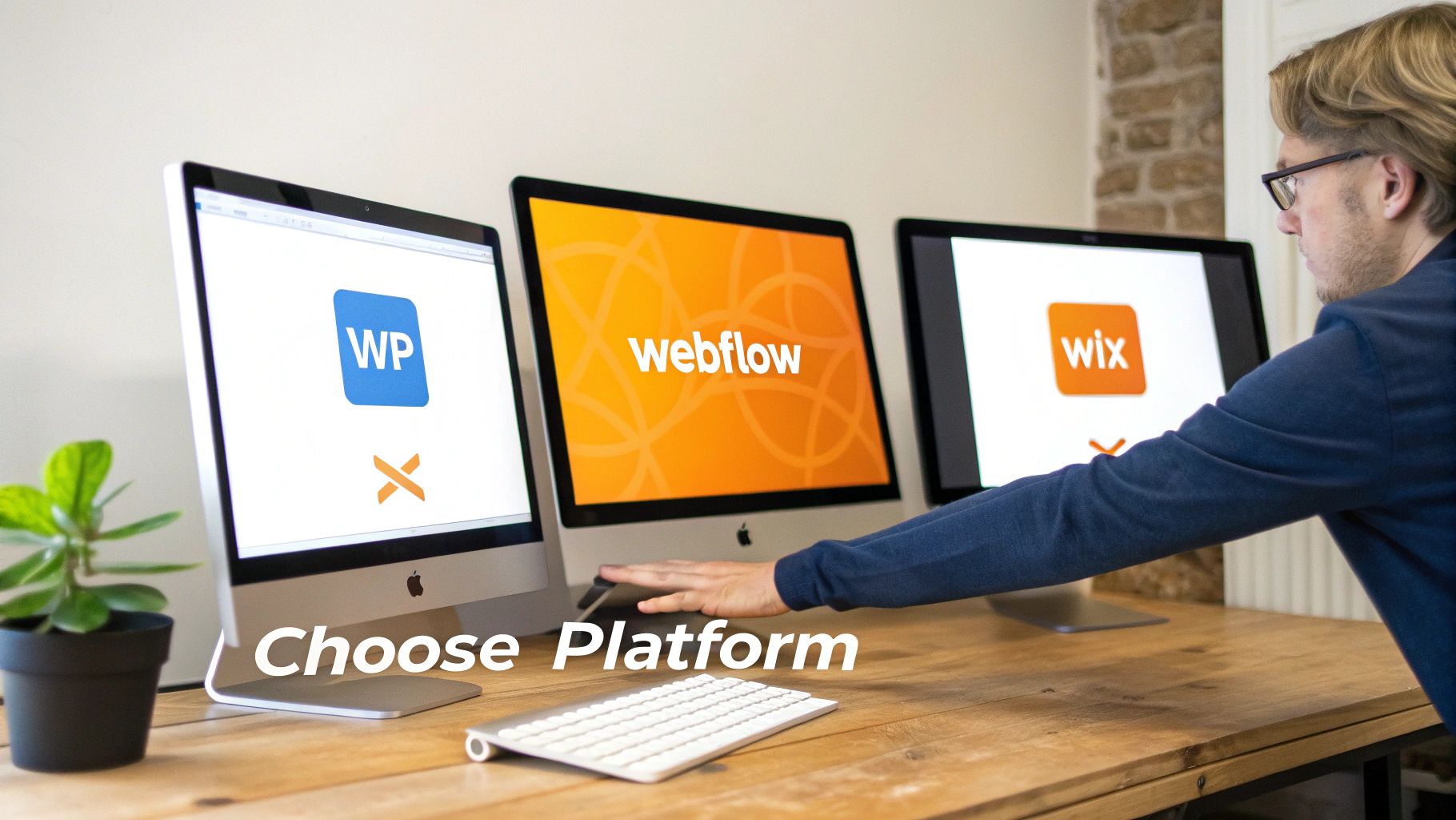
Once we've nailed down the strategy, the next big decision is picking the right tech. This isn't about chasing the latest trend; it's about finding the platform that clicks perfectly with your business goals, how you operate, and where you want to be in a few years.
Getting this right is a cornerstone of our responsive website design services. Each of the big players—WordPress, Webflow, and Wix Studio—brings something different to the table. Let's skip the jargon and look at why a business would choose one over the others.
WordPress The Scalable Content Powerhouse
There's a reason WordPress is the undisputed heavyweight of the web, powering over 43% of all websites. Its real magic lies in its incredible flexibility. With a massive ecosystem of plugins, you can add just about any feature you can dream up.
This makes it the perfect foundation for businesses with big content marketing plans or those that need complex, custom functionalities.
Best For: Content-heavy sites like blogs, news portals, and businesses that need deep integrations.
Key Advantage: Unmatched scalability. A WordPress site can grow from a simple five-page site into a sprawling e-commerce store or membership platform without a complete rebuild.
Webflow The Designer’s Dream
Webflow is where design-forward brands go when they refuse to compromise on creativity. It gives us the power to build visually stunning, highly custom websites with pixel-perfect control, all while generating clean code that search engines love.
If your brand is built on a unique, sophisticated look, Webflow provides the canvas to bring that vision to life without being boxed in by templates.
Webflow empowers businesses to create bespoke digital experiences. It’s the perfect fit for creative agencies, high-end portfolios, and brands where visual presentation is just as important as functionality.
Wix Studio The All-in-One Innovator
Wix Studio is a huge leap forward in web design, offering a secure, all-in-one environment for creating high-end websites. It blends advanced design freedom with the convenience of a managed platform, so hosting, security, and updates are all handled for you.
This makes it a fantastic choice for businesses here in Los Angeles—from Hollywood startups to established Beverly Hills firms—that want a beautiful, high-performing site without the headache of managing the technical side. To see how it stacks up, check out our deep dive on Wix Studio vs WordPress vs Shopify and which platform wins.
Choosing the right platform is a pivotal moment in your project. To help simplify the decision, here’s a quick breakdown of how these three platforms compare on the factors that matter most to businesses.
Platform Comparison WordPress vs Webflow vs Wix Studio
Aspect | WordPress | Webflow | Wix Studio |
|---|---|---|---|
Flexibility | Nearly limitless with plugins and custom code. Can do almost anything but requires more technical management. | High design flexibility with a visual canvas. Great for custom animations and interactions without code. | Combines a visual editor with advanced custom CSS and no-code animations for high flexibility in a managed environment. |
Ease of Use | Can have a steep learning curve, especially for beginners. Managing plugins and updates takes effort. | More intuitive for designers familiar with tools like Figma, but still has a learning curve for true beginners. | The most user-friendly of the three, with an all-in-one dashboard that simplifies hosting, security, and updates. |
Scalability | Extremely scalable. It can handle massive traffic and content libraries, making it ideal for long-term growth. | Scales well for most business and e-commerce needs, especially for visually rich, high-performance sites. | Built to handle enterprise-level needs with robust, managed infrastructure. Great for businesses that want to scale without managing servers. |
Ultimately, the best choice depends entirely on your specific needs. By understanding the strategic strengths of each, you're empowered to make a smart decision that will support your business not just at launch, but for years to come.
Finding Your Expert Web Design Partner in Los Angeles
Picking a partner for your responsive website design services is a big deal. In a market as dynamic and crowded as Los Angeles, having a local expert who actually gets the local scene isn't just a nice-to-have—it's a massive strategic advantage. A generic, cookie-cutter approach just won’t fly here.
When you work with an L.A.-based agency, you're getting a partner who understands the unique challenges and opportunities of doing business in Southern California. We know the trends shaping Hollywood, the mindset of shoppers in Santa Monica, and the hustle of the San Fernando Valley.
The Value of a Local Partnership
Teaming up with a local agency gives you an edge that a remote firm simply can't offer. It goes way beyond just being in the same time zone; it’s about a shared understanding and a much deeper, more personal partnership. Here's what that looks like in practice:
Face-to-Face Strategy Sessions: We can actually sit down together, whiteboard ideas, and dig into your goals. It’s how strong, personal working relationships are built.
Built-in Market Knowledge: We live and breathe the L.A. market every single day. That firsthand experience helps us build digital strategies that truly connect with your local customers.
Investing in Our Community: By choosing a local agency, you’re putting money back into the Southern California business community, strengthening the local economy we’re all a part of.
This local-first mindset is baked into everything we do. We’re not just some vendor on a list; we’re your neighbors, and we’re genuinely invested in seeing your business thrive right here in our community.
Partnering with a local agency transforms the client-vendor relationship into a true collaboration. It’s about building a website that not only performs well online but also speaks directly to the unique culture and energy of the Los Angeles market.
Proudly Serving All of Southern California
Los Angeles is at the center of our service area, and we proudly support clients across a wide network of surrounding cities and neighborhoods throughout Southern California. Our reach includes every corner of L.A.—from Downtown Los Angeles, Hollywood, West Hollywood, Beverly Hills, and Santa Monica to the beach communities of Malibu, Venice, Marina del Rey, Hermosa Beach, Manhattan Beach, and Redondo Beach. We also extend service through the San Fernando Valley, including Sherman Oaks, Studio City, Encino, Van Nuys, North Hollywood, Burbank, Glendale, Pasadena, Woodland Hills, Chatsworth, Canoga Park, Reseda, Northridge, and Tarzana. In the San Gabriel Valley, we work with clients in Alhambra, Monterey Park, San Gabriel, Temple City, Rosemead, Arcadia, El Monte, South El Monte, West Covina, Covina, Baldwin Park, Azusa, Glendora, Duarte, and Monrovia. Farther southeast, we serve Whittier, Pico Rivera, Downey, Norwalk, La Mirada, La Habra, and Cerritos. We also support the South Bay—including Torrance, Carson, Gardena, Hawthorne, Inglewood, and Long Beach—as well as the Gateway Cities and communities throughout the I-10, I-5, 101, and 405 corridors. Whether you’re in a major metro area or a smaller surrounding neighborhood, our team delivers reliable, high-quality service anywhere in or around Los Angeles.
Common Questions About Responsive Design Services
When you're ready to invest in your digital presence, it's natural to have a few questions. At DLL Studios, we believe in clear, straightforward answers to help you move forward with confidence.
Here are some of the most common questions we hear about responsive website design.
How Much Do Responsive Website Design Services Cost?
The honest answer? It depends. The cost of a new website can vary quite a bit, much like building a house. A simple informational site for a local business is like a starter home, while a large e-commerce platform with custom integrations is more like a custom-built mansion.
The final price tag comes down to a few key things: the level of custom design, the total number of pages, and any special features you need, like a client portal or an online booking system.
We provide transparent, project-based pricing tailored to your specific goals. This way, you know the full investment upfront—no hidden fees or surprises down the road.
What Is the Timeline for a New Responsive Website?
A typical responsive website project takes between 6 and 16 weeks from our initial kickoff meeting to launch day. We've fine-tuned this process to ensure top-notch quality at every stage without dragging things out.
Here’s a general breakdown of how that time is spent:
Discovery and Strategy: 1–2 weeks
UX/UI Design: 2–4 weeks
Development: 4–8 weeks
Testing and Revisions: 1–2 weeks
The biggest factor that keeps this timeline on track is timely feedback and content from your team. Don't worry, we manage the project proactively and communicate clearly at every milestone to keep everything moving smoothly.
Can You Use Our Existing Website Content?
Absolutely. We often migrate existing content to the new design as a starting point. More importantly, we see a redesign as the perfect opportunity to audit and improve your content for better SEO and to connect more effectively with your audience.
As part of our process, we’ll work with you to review everything you currently have. We’ll help identify what’s working, what needs a refresh, and where new content could better support your business goals, ensuring your message is just as powerful as your new design.
For businesses looking to get the most out of their digital ads, a responsive design is a non-negotiable for successful campaigns. You can learn more about best practices for optimizing landing pages that convert.
What Is the Difference Between Responsive and Mobile-Friendly?
While these terms sound similar, "responsive" is a far more advanced and effective approach to modern web design.
A site that's just "mobile-friendly" often crams a desktop layout onto a smaller screen. The result is usually tiny, unreadable text and navigation buttons that are impossible to tap with any accuracy.
A truly "responsive" design is intelligent. The layout dynamically reconfigures itself to provide the best possible experience on any device. Content reflows, images resize, and menus adapt, making the site feel like it was custom-built for the screen it's on. We exclusively build fully responsive websites to meet modern user expectations and deliver superior results.
Ready to create a website that delivers an exceptional experience on every device? The team at DLL Studios is here to help you build a powerful, responsive digital presence that drives results. Get in touch with us today to start the conversation.