


.png)
Your Essential ADA Website Compliance Checklist For 2025
- Dec 22, 2025
- 18 min read
In a digital-first economy, an inaccessible website is not just a missed opportunity; it's a significant legal and ethical liability. The Americans with Disabilities Act (ADA) extends its civil rights protections to the digital realm, mandating that websites and online services be accessible to people with disabilities. This isn't merely about avoiding costly demand letters and lawsuits. It’s about creating an inclusive digital experience for the one in four American adults living with a disability, a demographic with substantial purchasing power.
For businesses that understand the necessity of building a strong online presence, ensuring that presence is accessible to everyone is a foundational step. Users with vision, hearing, motor, or cognitive impairments rely on assistive technologies like screen readers and keyboard-only navigation. If your site isn't built to accommodate these tools, you are effectively closing your digital doors to a large segment of the population. From businesses in bustling hubs like Downtown Los Angeles and Santa Monica to those serving communities across the San Fernando Valley and the South Bay, digital accessibility is a universal requirement for modern commerce.
This comprehensive ADA website compliance checklist provides a prioritized, actionable roadmap. It is structured around the four core principles of the Web Content Accessibility Guidelines (WCAG): Perceivable, Operable, Understandable, and Robust. By following these steps, you will not only mitigate legal risks but also significantly improve your site's overall user experience, boost SEO performance, and reinforce your brand's commitment to inclusivity. This guide will give you the clear, concrete tests and remediation steps needed to make your website welcoming to all users.
1. Keyboard Navigation and Focus Management
Ensuring your website is fully operable with a keyboard is a foundational pillar of web accessibility. Many users with motor disabilities rely on keyboards, switch devices, or other assistive technologies that emulate keyboard input. For these individuals, a mouse is not an option, making keyboard accessibility a non-negotiable part of any . This principle guarantees that all interactive elements, like links, buttons, and form fields, can be reached and activated without a pointing device.

Proper implementation involves two key components: a logical navigation order (tab order) and a highly visible focus indicator. When a user presses the "Tab" key, the focus should move predictably through the page, typically from left-to-right and top-to-bottom, following the visual layout. Each interactive element must show a clear visual cue, like an outline or a change in background color, so the user always knows where they are on the page. Whether your business is in the heart of Downtown Los Angeles or serves communities like Pasadena and Glendale, ensuring this functionality is key to reaching all potential customers. A seamless keyboard experience is essential for a truly inclusive website.
Actionable Tips for Implementation
Test Manually: Before any launch, unplug your mouse and navigate your entire site using only the "Tab," "Shift+Tab," "Enter," and arrow keys. Can you access every link, fill out every form, and operate every menu?
Implement a "Skip to Content" Link: This is the first focusable item on a page. It allows keyboard users to bypass long navigation menus and jump directly to the main content, a critical time-saver.
Avoid Keyboard Traps: Ensure that focus can move into and out of all components. A common trap occurs in modals or widgets where a user can tab in but cannot tab back out to the main page.
Enhance Focus Indicators: Use the CSS pseudo-class to create a prominent and high-contrast outline or style change for focused elements. Avoid using without providing an alternative, as this makes keyboard navigation impossible for sighted users.
2. Alternative Text for Images (Alt Text)
Providing descriptive text alternatives for images is a cornerstone of digital accessibility. Known as "alt text," this brief, descriptive copy ensures that users who cannot see images, such as those relying on screen readers, can understand the content and purpose of visual elements on a page. This practice is a fundamental requirement in any because it bridges the gap between visual information and non-visual consumption, making your website accessible to a much broader audience. Without alt text, important context, product details, or navigational cues conveyed through images are lost.
Effective alt text is concise yet descriptive, conveying the essential information of the image. For an e-commerce site selling a product, it describes the item; for a news article, it explains what a photo depicts. This isn't just a technical task; it’s about providing an equivalent experience for all users. Whether your business serves clients in the San Fernando Valley, from Studio City to Burbank, or across the South Bay from Torrance to Long Beach, implementing proper alt text demonstrates a commitment to inclusivity and allows every visitor to fully engage with your brand.
Actionable Tips for Implementation
Be Specific and Concise: Describe the image's content and function clearly. For a picture of a red running shoe, write "Red Nike running shoe on a white background," not just "shoe." Aim for under 125 characters.
Skip "Image of...": Screen readers announce that an element is an image, so starting alt text with "image of" or "picture of" is redundant and clutters the user experience.
Use Empty Alt Text for Decorative Images: If an image is purely for decoration and provides no informational value (e.g., a background pattern or a stylistic border), use an empty alt attribute (). This tells screen readers to skip it.
Convey Context and Function: If an image is a link, the alt text should describe the destination or action. For example, if your company logo links to the homepage, the alt text should be "Company Name - Home," not "Company Logo."
3. Color Contrast Ratios
Text and interactive elements must have sufficient contrast against their backgrounds to be readable for everyone. This is a critical point in any , as it directly impacts users with low vision, various forms of color blindness, and even users viewing their screen in bright sunlight. Without adequate contrast, your content can become illegible, effectively blocking a significant portion of your audience from accessing information or completing tasks on your site.

WCAG (Web Content Accessibility Guidelines) provides specific ratios to meet this standard. Level AA requires a contrast ratio of at least 4.5:1 for normal text and 3:1 for large text (18pt or 14pt bold). By meeting these minimums, you ensure your website’s content is perceivable and usable. Whether your customers are in West Hollywood or Whittier, clear and readable text is a universal requirement for effective communication. Adhering to these standards not only improves accessibility but also enhances the overall user experience for all visitors.
Actionable Tips for Implementation
Use Contrast Checking Tools: Integrate tools like the WebAIM Contrast Checker or the Stark plugin for Figma and Sketch directly into your design and development workflow to test color combinations before they go live.
Don't Rely on Color Alone: Never use color as the only way to convey information or distinguish an element. For example, supplement a red error message with an icon and text to ensure all users understand its meaning.
Test Interactive States: Check the contrast ratios for all interactive states of an element, including hover, focus, and active states. A button might have good contrast initially but become unreadable when a user hovers over it.
Simulate Color Blindness: Use browser extensions or built-in developer tools to simulate different types of color blindness. This helps you understand how users with conditions like deuteranopia or protanopia experience your site's color palette.
4. Semantic HTML and Proper Heading Structure
Think of semantic HTML as the architectural blueprint for your website. It uses specific HTML tags like , , , and to define the purpose of different content areas. This structure provides critical context for screen readers and other assistive technologies, allowing them to interpret the layout and relationships between content sections. A well-organized heading hierarchy (H1 through H6) works in tandem, creating an outline that users can easily navigate. This is a vital item on any because it forms the very foundation of an understandable user experience.
Without this structural clarity, a webpage is just a jumble of text and elements to a screen reader. Proper structure allows a user to quickly understand the page layout, skip to the main content, or jump between sections using heading navigation. For businesses in competitive markets from Santa Monica to Pasadena, presenting information in a clear, logical manner is crucial for retaining visitors and ensuring your message is accessible to everyone. Implementing semantic HTML and a logical heading order is a direct investment in usability and universal access.
Actionable Tips for Implementation
Use One H1 Per Page: The tag should be reserved for the main title of the page. Think of it as the title of a book; there should only be one.
Maintain a Logical Hierarchy: Headings must be nested in a logical order without skipping levels. For example, an should always follow an , not an . This creates a coherent outline for assistive technologies.
Leverage HTML5 Semantic Tags: Replace generic tags with more descriptive elements wherever possible. Use for navigation links, for the primary content, for sidebars, and for footer information.
Validate Your Code: Use a tool like the W3C Markup Validation Service to check your HTML for errors. Clean, valid code is more likely to be interpreted correctly by browsers and assistive technologies alike.
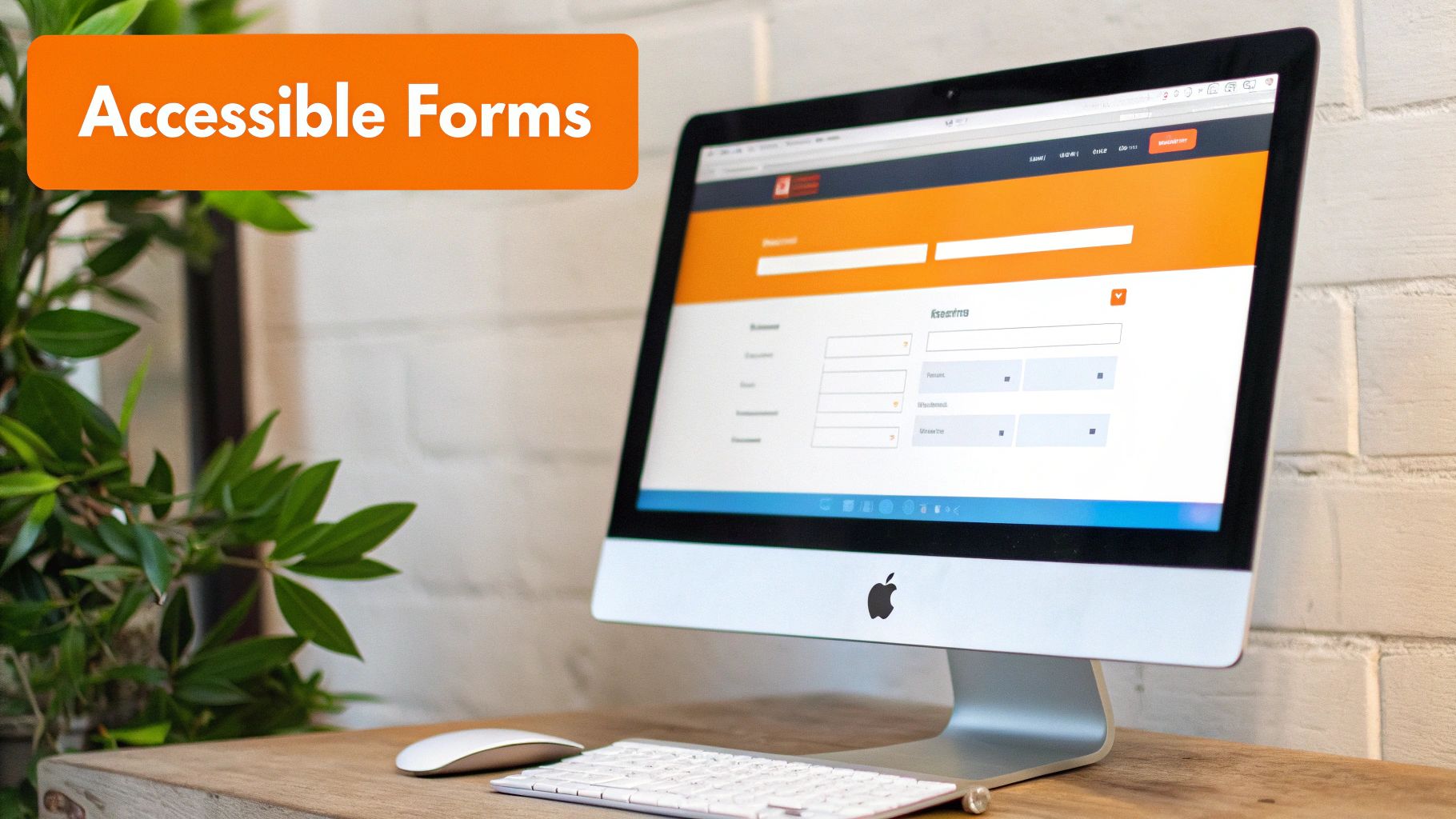
5. Form Accessibility and Labels
Accessible forms are the gateway to user interaction, lead generation, and e-commerce transactions. Ensuring that every form field is clearly labeled and easy to navigate is a critical component of any . For users who rely on screen readers or other assistive technologies, forms without proper labels are unusable puzzles. These technologies depend on programmatic associations between labels and their corresponding input fields (like text boxes, checkboxes, or radio buttons) to announce the purpose of each field, making it possible for all users to complete a purchase, sign up for a newsletter, or submit a contact inquiry.
Effective form accessibility extends beyond just labels. It includes providing clear instructions, marking required fields explicitly, and offering helpful, descriptive error messages when a user makes a mistake. For businesses across Los Angeles, from a retail shop in Santa Monica to a law firm in Glendale, an inaccessible form is a direct barrier to customer engagement and revenue. By implementing accessible design patterns like those seen on GOV.UK or Salesforce Lightning, you ensure that everyone, regardless of ability, can interact successfully with your business online.
Actionable Tips for Implementation
Use the Element Correctly: Every form input must have an associated . The most robust method is using the attribute on the label, which links it directly to the of the input (e.g., ).
Never Use Placeholders as Labels: Placeholder text disappears when a user starts typing, which can cause confusion. It should only be used for supplementary hints, never as the primary label.
Provide Clear Error Messages: When a user submits a form with an error, the message should be specific and easy to understand. Use to programmatically link the error message to the corresponding input field so screen readers can announce it.
Group Related Fields: For sets of related controls, like radio buttons or a mailing address, use the and elements. The acts as a caption for the entire group, providing essential context for users of assistive technology.
Mark Required Fields Explicitly: Indicate required fields with more than just a symbol like an asterisk. Include the word "(required)" directly in the label for maximum clarity. Ensure the form can be submitted using the "Enter" key for a seamless keyboard experience.
6. Video and Audio Captions and Transcripts
Multimedia content can significantly enrich the user experience, but it creates significant barriers if not made accessible. Providing captions for video and transcripts for audio content is essential for users who are deaf or hard of hearing. This practice also benefits individuals in sound-sensitive environments, non-native speakers, and anyone who prefers to consume information by reading. A comprehensive must account for all multimedia, ensuring that no user is excluded from accessing valuable information conveyed through video or sound.
Effective implementation goes beyond simple text. High-quality captions are synchronized with the audio and include not just spoken words but also important non-speech information like speaker identification and descriptive sounds (e.g., "[door closes]" or "[upbeat music]"). Similarly, transcripts provide a complete text equivalent of the audio content. For businesses from the San Fernando Valley to the South Bay, making video testimonials or promotional content accessible means every potential customer, including those in communities like Burbank, Torrance, or Long Beach, can fully engage with your message. This commitment to accessibility broadens your audience and demonstrates a dedication to inclusivity.
Actionable Tips for Implementation
Prioritize Accuracy: Use professional human-powered captioning services or meticulously review auto-generated captions (like YouTube's) for errors in spelling, grammar, and timing.
Include Non-Speech Audio: Ensure captions describe relevant sounds that impact context. Identify speakers by name or role, especially when it is not visually obvious who is talking.
Provide Full Transcripts: Offer a complete, easy-to-find text transcript on the same page as the audio or video content. This helps users of screen readers and those who prefer to read at their own pace.
Synchronize Captions Perfectly: Test your videos to ensure the captions appear precisely when the corresponding audio is spoken. Poorly timed captions can be more confusing than no captions at all.
Offer Audio Descriptions: For videos where important visual information is not conveyed through audio, provide an audio description track that describes the key visual elements for users with visual impairments.
7. ARIA Landmarks and Roles
While semantic HTML5 provides a strong foundation, modern web applications often contain complex, dynamic components that standard tags cannot fully describe. This is where ARIA (Accessible Rich Internet Applications) becomes essential. ARIA provides a set of attributes that enhance the semantic meaning of your content, allowing assistive technologies like screen readers to better understand the structure and purpose of different page sections. Using ARIA landmarks and roles is a key part of any for websites with custom widgets, complex forms, or single-page applications.
Implementing ARIA landmarks involves assigning roles like , , , and to the appropriate or section elements on your page. This creates a virtual map that screen reader users can use to quickly understand the layout and jump directly to key areas, much like a sighted user would scan a page visually. For businesses in areas like Burbank or the San Gabriel Valley, using ARIA correctly can make a complex, feature-rich website accessible to a wider audience, ensuring no potential customer is excluded. Proper ARIA usage turns an otherwise confusing interface into a navigable and understandable experience.
Actionable Tips for Implementation
Prioritize Semantic HTML: Always use native HTML elements (, , ) first. ARIA should be used to enhance semantics, not replace them. For instance, only add to a if you cannot use a element.
Define Key Page Regions: Use ARIA landmark roles to identify the main structural areas of your site. This includes (header), (primary content), (footer), and .
Announce Dynamic Changes: Use or on elements that update dynamically without a page reload (like search results or form error messages). This ensures screen readers announce the new information to the user.
Test with Screen Readers: You must test your ARIA implementation with actual screen readers like NVDA (free) and JAWS. This is the only way to confirm that your landmarks and roles are providing the intended experience for users. Understanding the nuances of these attributes is crucial to achieving compliance, and you can learn more about WCAG levels and their requirements to build a solid foundation.
8. Mobile and Responsive Accessibility
In an era where mobile devices account for the majority of web traffic, ensuring your website is fully functional and accessible on all screen sizes is paramount. Mobile accessibility means that standards are maintained across various devices and orientations, accommodating touch interfaces and mobile screen readers like VoiceOver and TalkBack. For a comprehensive , this element is non-negotiable, as it guarantees that users on smartphones and tablets receive the same quality of experience as those on a desktop.
Effective mobile and responsive design goes beyond simply resizing content. It involves ensuring that interactive elements like buttons and links are large enough to be easily tapped, text remains legible without horizontal scrolling, and all functionality is accessible, regardless of how a user holds their device. Whether your customers are in West Hollywood or browsing from the San Fernando Valley, a flawless mobile experience prevents frustration and abandonment. This commitment to a practical guide to mobile-first design ensures you connect with every potential customer, wherever they are.
Actionable Tips for Implementation
Ensure Sufficient Touch Target Size: All interactive elements should have a minimum touch target size of 44x44 CSS pixels to prevent accidental clicks and make navigation easier for users with motor impairments.
Allow for Zoom and Reflow: Users must be able to zoom in up to 200% without losing content or functionality. Content should reflow to fit the screen, eliminating the need for horizontal scrolling to read text. Never disable pinch-to-zoom functionality.
Test on Actual Devices: Emulators are helpful, but nothing replaces testing on real iOS and Android devices. Use built-in screen readers like VoiceOver (iOS) and TalkBack (Android) to identify accessibility gaps unique to the mobile experience.
Support All Orientations: Your website must be fully functional in both portrait and landscape modes. Do not lock the orientation, as this can create a barrier for users with devices mounted in a fixed position.
9. Link Text and Purpose Clarity
Clear and descriptive link text is crucial for user navigation, especially for individuals using screen readers who often scan a page by listing its links. Ambiguous phrases like "Click Here" or "Learn More" provide no context when read out of sequence, making it impossible to understand the link's destination. Ensuring every hyperlink clearly describes its purpose is a cornerstone of any effective , allowing all users to navigate your site with confidence and efficiency. This principle also requires that links are visually distinct from regular text through more than just color.
Proper implementation means writing link text that makes sense on its own. For example, instead of "To learn about our services, click here," the link should be embedded directly into the descriptive text, such as "Learn more about our web design services." This small change dramatically improves the experience for assistive technology users. For businesses serving areas from Santa Monica to Pasadena, clear links ensure potential clients can easily find information about services, locations, or contact details, turning a frustrating experience into a seamless one. Good link text benefits everyone, improving usability and even boosting SEO.
Actionable Tips for Implementation
Avoid Generic Phrases: Never use ambiguous text like "Click Here," "Read More," or "Learn More" without context. Instead, write descriptive text that explains the destination, such as "Read our full guide to ADA compliance."
Ensure Visual Distinction: Links must be visually different from surrounding text without relying solely on color. The best practice is to underline links in your body text, as this is a universally recognized convention.
Provide Context for New Windows: If a link opens in a new tab or window, clearly indicate this to the user. You can do this with text like "(opens in new tab)" or by using an icon with appropriate alternative text.
Use for Icon Links: For links that are only an icon (like a social media logo), use the attribute to provide a descriptive text equivalent for screen readers. For example: .
10. Page Language and Language Changes
Defining the language of your website is a fundamental aspect of accessibility that ensures assistive technologies can correctly interpret and pronounce your content. When a screen reader encounters a page, it needs to know which language's pronunciation rules to apply. Without this crucial information, the software may mispronounce words, rendering the content confusing or incomprehensible for users who rely on it. This makes proper language declaration a vital item on any , as it directly impacts understandability.
This principle extends to content that contains words or phrases in a different language. For instance, a Los Angeles restaurant website might feature an Italian menu, or a legal blog serving clients in Beverly Hills might quote a Latin phrase. By programmatically identifying these language changes, you instruct screen readers to switch pronunciation engines temporarily. This ensures an accurate and seamless listening experience for users, preventing jarring mispronunciations and supporting comprehension for individuals with cognitive or learning disabilities across diverse communities like Glendale and Pasadena.
Actionable Tips for Implementation
Set the Primary Language: Always declare the default language of the page by adding the attribute to the element (e.g., ). Use the correct two- or three-letter codes, like "en" for English or "es" for Spanish.
Identify Language Changes: For any text that deviates from the primary page language, wrap it in a or other appropriate element and add a attribute. For example: .
Use Regional Variants: When necessary, specify regional language codes to account for differences in spelling and pronunciation. For example, use "en-US" for American English and "en-GB" for British English.
Test with Screen Readers: Use a screen reader (like NVDA, JAWS, or VoiceOver) to listen to your pages. Verify that the primary language is announced correctly and that any foreign words or phrases are pronounced with the proper accent.
10-Point ADA Website Accessibility Comparison
Item | 🔄 Implementation Complexity | ⚡ Resource & Effort | 📊 Expected Outcomes | 💡 Ideal Use Cases | ⭐ Key Advantages |
|---|---|---|---|---|---|
Keyboard Navigation and Focus Management | Medium — requires planning and possible refactor for complex apps 🔄 | Moderate dev & QA time; keyboard testing | High — enables keyboard-only operation; improves efficiency 📊 | Interactive web apps, complex navigation, productivity tools 💡 | Ensures full keyboard operability; WCAG Level A compliance ⭐ |
Alternative Text for Images (Alt Text) | Low — content authoring effort; scale can be challenging 🔄 | Low–Moderate — manual writing or tooling for large libraries ⚡ | High — critical for blind users; SEO and fallback benefits 📊 | Content-heavy sites, news, e-commerce, social posts 💡 | Provides meaningful image access for screen readers; boosts SEO ⭐ |
Color Contrast Ratios | Low — objective measurements but may require palette changes 🔄 | Low — design iteration and contrast testing tools ⚡ | High — improves readability and compliance across users 📊 | Text-heavy interfaces, branding updates, dark/light themes 💡 | Measurable accessibility gains; better readability for low vision ⭐ |
Semantic HTML & Proper Heading Structure | Low–Medium — simple best practices but costly to retrofit 🔄 | Low — developer education and markup updates; validation tools ⚡ | High — better screen reader navigation and SEO 📊 | Documentation sites, blogs, long-form content, CMS-driven pages 💡 | Cleaner code, improved navigation and maintainability ⭐ |
Form Accessibility and Labels | Medium — needs explicit associations and validation handling 🔄 | Moderate — dev + UX + testing; accessible patterns required ⚡ | High — reduces errors and abandonment; usable with assistive tech 📊 | E-commerce checkout, signups, surveys, billing flows 💡 | Clear labels and error feedback improve completion rates ⭐ |
Video & Audio Captions and Transcripts | Medium–High — production, syncing, and live caption complexity 🔄 | High — captioning/transcription services and QA; ongoing cost ⚡ | Very High — essential for deaf users; aids SEO and engagement 📊 | Media platforms, training, marketing videos, podcasts 💡 | Inclusive multimedia access; legal compliance in many regions ⭐ |
ARIA Landmarks and Roles | Medium — requires ARIA knowledge and careful application 🔄 | Moderate — developer expertise and screen reader testing ⚡ | High — improves semantics for custom widgets and dynamic content 📊 | Complex web apps, custom components, dynamic UIs 💡 | Enhances assistive tech navigation when HTML alone is insufficient ⭐ |
Mobile & Responsive Accessibility | Medium — responsive + touch/accessibility tradeoffs 🔄 | Moderate–High — device testing, UX adjustments, touch target work ⚡ | High — accessibility across devices; better mobile usability & SEO 📊 | Mobile-first sites, commerce, apps, small-screen interactions 💡 | Broad device accessibility; improved touch usability and discoverability ⭐ |
Link Text & Purpose Clarity | Low — editorial discipline and consistency required 🔄 | Low — content audit and CMS updates; author guidelines ⚡ | High — clearer navigation for screen readers; SEO benefits 📊 | Content-heavy sites, link lists, navigation menus, docs 💡 | Reduces confusion; improves scanability and discoverability ⭐ |
Page Language & Language Changes | Low — set lang attributes; handle mixed-language sections 🔄 | Low — minimal markup updates; CMS template care ⚡ | Medium — correct pronunciation and multilingual support 📊 | Multilingual sites, international news, academic content 💡 | Better screen reader pronunciation; simple, high-impact fix ⭐ |
Partner with Experts to Ensure Your Website is Compliant and Inclusive
Navigating the complexities of digital accessibility is not a one-time task but an ongoing commitment. The comprehensive ada website compliance checklist we’ve explored, structured around the four pillars of WCAG (Perceivable, Operable, Understandable, and Robust), provides a powerful roadmap for creating a more inclusive online experience. From mastering keyboard navigation and providing descriptive alt text to ensuring proper color contrast and semantic HTML, each checkpoint is a crucial step toward dismantling digital barriers.
However, true accessibility transcends a simple checklist. It requires a fundamental shift in mindset, embedding inclusivity into every stage of your website’s lifecycle, from initial design and development to regular maintenance and content updates. This journey can feel daunting, especially for small businesses, ecommerce retailers, and professional service providers who are already juggling countless priorities. While automated tools can catch some issues, they often miss the nuances of human interaction that only manual testing and expert review can identify. This is where partnering with specialists becomes invaluable.
Key Takeaways and Your Path Forward
To translate this knowledge into action, let's distill the most critical takeaways from our checklist:
Accessibility is Not an Add-On: It must be integrated from the ground up. Retrofitting an inaccessible site is always more costly and complex than building an accessible one from the start.
Prioritize a Mixed-Testing Approach: Combine automated scanning tools to catch low-hanging fruit with rigorous manual testing to evaluate the real-world user experience for people using assistive technologies.
Embrace Continuous Improvement: Digital accessibility is not a "set it and forget it" project. Regular audits, team training, and a proactive maintenance schedule are essential for long-term compliance and usability.
Your immediate next steps should involve a thorough audit of your current website using the principles outlined in this guide. Start with high-impact areas like keyboard navigation, form labels, and alt text. Document your findings and create a prioritized remediation plan. To ensure your website is compliant and inclusive, partnering with professionals offering expert web design services can be a critical step, providing the technical and strategic support needed to implement these changes effectively.
A Critical Insight: "Compliance is the minimum requirement; true success lies in creating a digital experience that is genuinely welcoming and usable for every single visitor, regardless of their abilities. This commitment not only mitigates legal risk but also builds profound brand loyalty and expands your market reach."
Ultimately, mastering these concepts is about more than avoiding lawsuits. It's about demonstrating your brand's commitment to social responsibility and connecting with the estimated one in four adults in the U.S. who live with a disability. An accessible website is a high-performing website, one that delivers a better experience for all users, improves SEO, and strengthens your reputation.
Los Angeles is at the center of our service area, and we proudly support clients across a wide network of surrounding cities and neighborhoods throughout Southern California. Our reach includes every corner of L.A.—from Downtown Los Angeles, Hollywood, West Hollywood, Beverly Hills, and Santa Monica to the beach communities of Malibu, Venice, Marina del Rey, Hermosa Beach, Manhattan Beach, and Redondo Beach. We also extend service through the San Fernando Valley, including Sherman Oaks, Studio City, Encino, Van Nuys, North Hollywood, Burbank, Glendale, Pasadena, Woodland Hills, Chatsworth, Canoga Park, Reseda, Northridge, and Tarzana. In the San Gabriel Valley, we work with clients in Alhambra, Monterey Park, San Gabriel, Temple City, Rosemead, Arcadia, El Monte, South El Monte, West Covina, Covina, Baldwin Park, Azusa, Glendora, Duarte, and Monrovia. Farther southeast, we serve Whittier, Pico Rivera, Downey, Norwalk, La Mirada, La Habra, and Cerritos. We also support the South Bay—including Torrance, Carson, Gardena, Hawthorne, Inglewood, and Long Beach—as well as the Gateway Cities and communities throughout the I-10, I-5, 101, and 405 corridors. Whether you’re in a major metro area or a smaller surrounding neighborhood, our team delivers reliable, high-quality service anywhere in or around Los Angeles.
Don't let ADA compliance be a source of stress. The team at DLL Studios specializes in creating beautiful, high-performing, and fully accessible websites that open your doors to everyone. Contact DLL Studios today for a comprehensive accessibility audit and let us help you build a more inclusive digital future.
