


.png)
How to Reduce Website Bounce Rate and Keep Visitors Engaged
- Jan 22
- 17 min read
To really get a handle on your website's bounce rate, you first have to figure out why people are leaving so quickly. It's often a mix of issues, from painfully slow page speeds and confusing navigation to content that just doesn't hit the mark for what a visitor was expecting. Once you can pinpoint the real reasons, you can start making targeted fixes that actually encourage people to stick around and explore.
Diagnosing Your Website Bounce Rate
Before you can fix a high bounce rate, you have to play detective. Just looking at one sitewide number is like knowing you have a fever without any idea what’s causing it. It tells you there's a problem, but not where or how to fix it. A real diagnosis means digging into your analytics to understand the who, what, and why behind those single-page visits.
In Google Analytics 4, the definition is pretty clear: bounce rate is the percentage of sessions that weren't "engaged." A session counts as engaged if a visitor hangs around for more than 10 seconds, triggers a conversion, or clicks through to another page. If they don't do any of that, it's a bounce.
Identifying The Real Problem Areas
Here's the thing: a high bounce rate isn't automatically a catastrophe. Let's say a user lands on your contact page, finds your phone number, and calls your business. That visit was a total success, even though it technically counts as a bounce. Context is everything. The real problems are usually hidden in the details, which you can uncover by segmenting your data.
Instead of obsessing over the overall rate, slice it up to find patterns. I always start by looking at these key segments:
By Page: Are specific blog posts or landing pages the main offenders? A landing page with a 90% bounce rate is a massive red flag. On the other hand, a blog post with a 75% rate might be perfectly fine if it's a quick-answer type of article.
By Traffic Source: Do visitors from organic search bounce way more than those from your email list? That could mean there's a major disconnect between your meta description and what's actually on the page.
By Device: Is your bounce rate through the roof on mobile? This is a classic sign of a clunky mobile experience—think slow load times or buttons that are impossible to tap on a small screen.
By New vs. Returning Visitors: If new visitors are leaving right away, your site isn't making a great first impression. If it's returning visitors who are bouncing, maybe your content isn't fresh enough to keep them interested.
Common Causes of High Bounce Rates
Once you've segmented your data, the "why" usually starts to become a lot clearer. Most bounce rate headaches come down to a handful of common culprits. For a business serving clients across Southern California, a smooth experience for every single user is non-negotiable.
A high bounce rate is almost always a symptom of a deeper problem. It could be a technical glitch, a gap in your content, or a completely broken user journey. Fixing the bounce rate means fixing the core user experience.
Think of it this way: a visitor shows up with a mission. Maybe they’re searching for a specific service you offer. If your page takes forever to load, the navigation is a mess, or the content has nothing to do with what they expected, they're gone. It’s that simple. Their patience is thin, and your competitors are just a click away.
By pinpointing these friction points, you can stop guessing and start taking action.
To help you get started, I've put together a quick-reference table. It outlines some of the most common issues I see and the first steps you can take to address them.
Common Causes of High Bounce Rate and Their Solutions
This table is a quick reference guide to help you identify potential issues and the corresponding strategies to fix them, helping you prioritize your optimization efforts.
Problem Area | Potential Cause | Quick Fix |
|---|---|---|
Performance | Slow page load speed (over 3 seconds). | Optimize images, enable browser caching, and use a Content Delivery Network (CDN). |
User Experience (UX) | Confusing navigation or cluttered layout. | Simplify your menu, add a search bar, and use clear headings and whitespace. |
Content Quality | Thin, irrelevant, or poorly written content. | Update with in-depth information, add visuals, and ensure it answers the user's question. |
Mobile Friendliness | The site is not responsive or difficult to use on mobile devices. | Implement a responsive design and test usability on various screen sizes. |
Search Intent Mismatch | The page content doesn't match what the user was searching for. | Align page titles, meta descriptions, and content with target keywords and user expectations. |
Technical Errors | Broken links, 404 errors, or aggressive pop-ups. | Run a site audit to fix broken links and tone down or delay intrusive pop-ups. |
Use this as your starting point. By systematically checking off these potential problems, you can quickly move from diagnosing the issue to implementing a solution that works.
Supercharge Your Website Speed and Performance
Let’s be honest: in our world, speed is everything. A slow website is pretty much the fastest way to get visitors to hit the back button, sending your bounce rate through the roof. If someone has to wait more than a couple of seconds for your page to load, they're already gone—probably over to a competitor's site.
Think of your website’s performance as its first impression. A zippy, responsive site tells visitors you respect their time and that you run a professional operation. On the other hand, a sluggish one just creates frustration and makes your site feel clunky or out of date.

Tools like GTmetrix give you a clear picture of what's going on under the hood, highlighting the exact metrics that shape user experience and, ultimately, your bounce rate.
Master Your Image Optimization
Nine times out of ten, the biggest drag on your site's speed is large, unoptimized images. They’re bandwidth hogs that force users to wait while visuals slowly render, which is a surefire recipe for a bounce.
The trick is to find that sweet spot between image quality and file size. You don’t have to settle for pixelated photos. Just be smarter about how you handle them.
Compress Images Before Uploading: This is non-negotiable. Use a tool like TinyPNG or ImageOptim to slash file sizes without a noticeable drop in quality. A simple compression can cut image weight by 50-70%.
Choose the Right File Format: Don't just save everything as a JPG. Use JPEGs for photos, PNGs for graphics needing a transparent background, and look into WebP for a modern format that delivers incredible compression.
Implement Lazy Loading: This is a fantastic technique that only loads images as a user scrolls down the page. Instead of loading everything at once, images appear just in time. This makes that initial page load feel way faster, especially for a visitor scrolling on their phone.
Leverage Browser Caching and Minification
Images are the usual suspect, but your site's code—the CSS, JavaScript, and HTML—can also be bloated and slow things down. Two of the most effective ways to tackle this are with browser caching and minification.
Browser caching is like giving a returning visitor a VIP pass. It stores parts of your site on their device after the first visit. When they come back, their browser pulls from this local cache instead of re-downloading everything, making the site load almost instantly.
Minification is essentially a spring cleaning for your code. It strips out all the unnecessary characters—like spaces, comments, and line breaks—that developers use to make code readable. The result is a much smaller file that browsers can download and process faster.
Page load speed isn't just a "nice to have"—it's a dealbreaker. Data consistently shows that sites loading in 2 seconds have an average bounce rate of just 9%. But wait 5 seconds, and that number skyrockets to 38%. It's even more critical on mobile, where 53% of users will ditch a page that takes longer than 3 seconds to load.
Use a Content Delivery Network (CDN)
If you have customers from all over, a Content Delivery Network (CDN) is a game-changer. It doesn't matter if they're in one corner of L.A. or on the other side of the country; a CDN ensures everyone gets a fast experience.
Here’s how it works: a CDN creates copies of your site's static files (images, CSS, etc.) and distributes them across a global network of servers. When someone visits your site, the content is delivered from the server closest to their physical location.
This one move can drastically reduce latency and slash load times. A faster site means happier visitors who are far more likely to stick around, which is exactly how you reduce your website bounce rate.
Enhance User Experience and Site Navigation
Once you've tackled site speed, the next big battleground for lowering your bounce rate is user experience (UX). Think of it this way: a fast site gets people in the door, but a great UX makes them want to stick around. If your website is confusing, cluttered, or just plain hard to use, even the most interested visitor will throw in the towel.
A stellar user experience is all about creating a smooth, frictionless journey. From the second someone lands on your page, their path should feel obvious and intuitive. They should be able to find what they're looking for without having to think too hard about it.

Simplify Your Site Navigation
Your navigation menu is the roadmap to your entire website. If that map is a mess or leaves out key destinations, your visitors are going to get lost and frustrated. Fast. The goal is to make it so simple that a first-time visitor instantly knows where to click.
Start by cleaning up your main menu. Keep it lean—stick to 5-7 top-level items that cover the absolute essentials, like "Services," "About Us," and "Contact." Drop the clever jargon and use clear, descriptive labels that anyone can understand.
For more complex sites, logical dropdown menus are your friend for grouping related pages. But don't go overboard. Nobody enjoys wrestling with endless nested sub-menus. A clean, well-organized menu guides users deeper into your site, turning a potential bounce into a genuine, engaged session.
Make Your Content Easy to Read
Ever landed on a page that's just a giant, unbroken wall of text? It’s intimidating. It screams "this is going to be a lot of work," and most people will just hit the back button. Readability is a massive—and often overlooked—part of a good user experience.
Breaking up your content makes it scannable and much more inviting. Here's how:
Use Clear Headings: Subheadings (like the one you're reading now) chop your content into logical chunks and help readers find exactly what they need.
Keep Paragraphs Short: Aim for 1-3 sentences per paragraph. This creates valuable white space that gives the text room to breathe and makes it way easier on the eyes.
Choose a Readable Font: Pick a clean, simple font and make sure it's big enough to read comfortably on any device. A font size of at least 16px is a solid starting point.
These small formatting tweaks can be the difference between someone actually reading your content or bouncing off to find something less daunting.
Craft Compelling Calls to Action
So, a visitor loves your content. Great! But if you don't tell them what to do next, they'll probably just leave. A call-to-action (CTA) is your chance to guide them toward a specific goal, like "Get a Quote," "Learn More," or "Sign Up."
The best CTAs are clear, concise, and stand out visually. Use action-oriented words and make your CTA buttons pop with a contrasting color. And don't just stick one at the very bottom of the page; sprinkle relevant CTAs throughout your content where they feel natural.
Your bounce rate is a direct reflection of your user experience. Industry data shows a strong correlation, with a 30% bounce rate considered excellent performance. While the average website sees rates between 40-60%, optimized retail sites often achieve 20-40% by creating seamless user journeys.
Ensure a Flawless Mobile Experience
With most web traffic now coming from phones, a responsive, mobile-friendly design isn't just a nice-to-have; it's a must. If your site looks amazing on a desktop but is a jumbled disaster on a smartphone, you’re slamming the door on a huge portion of your audience.
Responsive design means your site's layout automatically adjusts to fit any screen, creating a consistent, positive experience for everyone. This is more than just shrinking your desktop site. It means making sure buttons are big enough to tap, text is readable without pinching and zooming, and navigation is simple enough for a small screen.
Fine-tuning your site to better engage the visitors you already have is key for boosting conversions. A recent case study showed how one business dramatically increased leads by implementing smart strategies to increase lead generation from current website traffic. To really nail this, you have to embrace mobile-first principles. We've put together more actionable tips in our practical guide to mobile-first design. When you focus on the mobile user from the start, you almost always end up with a cleaner, more efficient design that benefits everyone.
Align Your Content with Search Intent
Even the fastest, most beautiful website on the planet will fall flat if the content doesn't give visitors what they came for. It's a simple truth. When someone clicks through from a search, they have a mission—an answer they need, a problem they want to solve, or a product they're ready to buy.
If your page misses that mark, they’re gone in a flash. That disconnect between their expectation and your reality is called a search intent mismatch, and it's a notorious bounce rate killer.
Aligning your content with search intent is really about mastering the art of giving people exactly what they're looking for, right when they arrive. It’s about getting inside their head and understanding the "why" behind their search. Someone Googling "emergency plumber" has a completely different—and far more urgent—need than someone looking up "DIY plumbing tips."
Uncover What Your Audience Is Really Asking
To nail search intent, you first have to figure out what your audience is actually asking. Don't guess. You need to step into their shoes and see the search results from their perspective, and keyword research is how you do it.
Tools like AnswerThePublic are brilliant for this. It takes your core topics and visualizes all the questions people are punching into search engines.
This kind of visualization shows you the specific "how," "what," and "why" questions your potential customers are asking. It basically hands you a content roadmap on a silver platter.
Armed with these insights, you can create content that directly answers those questions. This tells the visitor, "You're in the right place," building instant trust and giving them a reason to stick around.
Craft Headlines That Confirm They've Arrived
Your page title and main H1 headline are the first things a visitor sees. You've got about three seconds to convince them they've found what they need. A vague or misleading headline is a surefire way to earn an instant bounce.
Your headline needs to be a big, bright signpost that confirms the user's intent.
Be Specific: Don't just say "Our Services." Go with "Expert Web Design for Small Businesses."
Use Keywords Naturally: If someone searched for "best coffee shops in Silver Lake," your headline better reflect that.
Promise a Benefit: A title like "5 Simple Ways to Lower Your Energy Bill" tells the reader exactly what value they're about to get.
Think of your headline as a promise. If the content on the page delivers on that promise, you've earned their attention. If it doesn't, they'll feel duped and hit the back button without a second thought.
This alignment builds confidence from the first click. A user searching for a high-end service should land on a page that immediately screams quality and expertise, not some generic, one-size-fits-all message.
Make Your Content Irresistibly Engaging
Matching intent isn't just about the topic—it's also about how you present it. A giant wall of text, even if it’s perfectly on-topic, is overwhelming. It practically begs people to leave. Your content has to be scannable, digestible, and genuinely engaging.
Here are a few proven ways to hold their attention:
Embed Relevant Videos: Video is an engagement powerhouse. A visitor might spend several minutes watching a quick explainer, which crushes the chance of a bounce. A short client testimonial video is way more powerful than another paragraph of text.
Use High-Quality, Relevant Images: Break up your text with compelling visuals. Ditch the generic stock photos and use custom graphics, charts, or real photos of your team or your work.
Incorporate Internal Links: Don't let the journey end on one page. Guide users deeper into your site by strategically placing internal links to related articles or service pages. This provides a clear next step and can turn a potential bounce into a multi-page session.
When you focus on what your customers actually need, your website stops being a simple online brochure. It becomes a valuable resource that keeps them clicking.
Platform-Specific Fixes to Lower Your Bounce Rate
Knowing the what and why behind bounce rate is great, but the how often comes down to the tools you have. The platform your site is built on—whether it's WordPress, Webflow, or Wix Studio—has its own unique ways of tackling performance and user experience.
If you’re smart, you’ll tailor your approach to the platform you’re using. It’s the fastest path to meaningful improvements. Let's break down how to get it done on the big three.
Taming WordPress to Keep Visitors On-Page
WordPress is the king of the web for a reason: its plugin ecosystem is massive. That’s a double-edged sword. The right plugins can make your site fly, but a few bad ones can bring it to a grinding halt. The secret is knowing which tools to trust.
A top-tier caching plugin is your first line of defense against a slow site. I'm talking about plugins like WP Rocket or W3 Total Cache. They serve up static, pre-built versions of your pages, which takes a huge load off your server and gets content in front of your visitors in a snap. It’s a non-negotiable for any serious WordPress site.
Next up: your images. Heavy, unoptimized images are one of the most common speed killers I see. Get a plugin like Smush or ShortPixel to automatically compress and optimize every image you upload. It’s a simple, set-it-and-forget-it fix that delivers huge performance gains.
How to Leverage Webflow’s Built-In Power
Webflow gives you a huge advantage right out of the box with its clean code and incredible design control. You’re not fighting a bloated plugin library, so your focus shifts to making smart optimizations directly within the platform.
First, master Webflow’s responsive design tools. A frustrating mobile experience is a one-way ticket to a bounce, and Webflow makes it almost effortless to create a site that looks and works perfectly on any device. Test it on a phone, a tablet, and a desktop—make sure it’s flawless everywhere.
From there, dial in your asset management:
Native Lazy Loading: Make sure this is enabled for your images and videos. It stops them from loading until a user actually scrolls to them, which makes that initial page load lightning-fast.
Asset Compression: Webflow does a good job of optimizing assets automatically, but you can squeeze out even more speed by compressing your images before you upload them. Every kilobyte counts.
Lean Interactions: Webflow’s interactions are incredibly powerful. You can create silky-smooth animations that don’t rely on clunky, heavy JavaScript. Keep it clean and your pages will stay light.
Using Wix Studio for All-in-One Performance
Wix Studio is built as a complete ecosystem where performance is a top priority. Instead of hunting for third-party plugins, you get a whole suite of powerful, built-in tools designed to make your site fast and engaging from the get-go.
Start with the performance dashboard. It gives you clear, actionable advice on what’s slowing your site down and how to fix it. The platform also takes care of a lot of the heavy lifting for you, like implementing advanced caching and automatically converting images to modern, fast-loading formats like WebP.
If you're weighing your options, our complete breakdown of Wix Studio vs. WordPress vs. Shopify can help you decide which platform’s toolkit is the best fit for your specific business goals.
Every platform has its own set of rules and tools. The real secret to cutting your bounce rate isn't just following generic advice—it's mastering the features your chosen platform gives you.
Before you dive deep into platform-specific tweaks, though, make sure your fundamentals are solid. The infographic below shows how everything starts with aligning your content with what your users actually want.
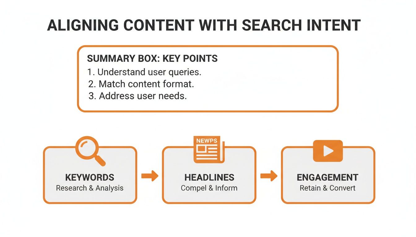
This process is universal. It doesn't matter where your business is located—if your headlines, keywords, and content don’t match what people are searching for, they're going to leave.
Bounce Rate Reduction Tools by Platform
Choosing the right tools for your platform can make all the difference. Here’s a quick-glance table comparing some of the go-to solutions for tackling performance and UX issues on WordPress, Webflow, and Wix Studio.
Platform | Performance Optimization Tool | UX Enhancement Feature |
|---|---|---|
WordPress | WP Rocket or W3 Total Cache (Caching plugins) | Elementor or Beaver Builder (Page builders for intuitive layouts) |
Webflow | Built-in Asset Optimization and Lazy Loading | Native Responsive Design Controls and Interactions tool |
Wix Studio | Integrated Performance Dashboard and Auto-Caching | Built-in AI-powered Responsive Editor and Animations |
While each platform offers a unique toolkit, the goal remains the same: create a fast, seamless experience that encourages users to stick around. Mastering these platform-specific features is your most direct path to reducing bounce rate.
Common Questions About Bounce Rate
Even with a solid plan, a few questions about bounce rate always seem to surface. It’s a metric with a lot of quirks, so let's clear up some of the most common points of confusion. Think of this as your go-to guide for the finer details.
Getting these concepts right helps you interpret your data correctly and set realistic goals for your site, whether you're serving clients in a single neighborhood or across a wide region.
What Is a Good Bounce Rate?
There's no magic number here. A "good" bounce rate is all about context and depends heavily on your industry and the specific page a visitor lands on. For an e-commerce site, aiming for anything below 40% is a great goal—it means people are sticking around to browse multiple products.
But what about a blog post? If it thoroughly answers a specific question, it might have a bounce rate of 70% or higher, and that’s perfectly fine. The visitor got exactly what they came for and left satisfied. The real key is to figure out your own baseline and focus on improving it over time.
As a general rule of thumb:
26-40% is typically considered excellent.
41-55% is about average for most websites.
56-70% is on the higher side but can be normal for content-heavy pages.
Does a High Bounce Rate Hurt SEO?
This is a big one, but the short answer is no—bounce rate is not a direct ranking factor in Google's algorithm. That said, it can be a symptom of underlying issues that absolutely hurt your SEO. A high bounce rate often points to a poor user experience, sluggish page speed, or a mismatch between your content and what the user was actually searching for.
Those user experience signals are what tell search engines if your page is a good match for a query. If people consistently hit your page and leave, it suggests your content isn't satisfying their search intent. Over time, that can indirectly lead to lower rankings as Google prioritizes pages that deliver a better overall experience.
How Long Does It Take to See a Lower Bounce Rate?
Patience is a virtue here. The timeline for seeing results depends entirely on the kinds of changes you make.
Technical fixes, like optimizing your images or enabling browser caching to boost site speed, can show an impact pretty quickly. Sometimes you'll see a difference within a few days to a week, especially once search engines re-crawl your now-faster pages.
On the other hand, changes to your content or user experience take longer to pay off. You’ll need to let enough data roll in—often over several weeks or even a month—to spot a clear, statistically significant trend. It's so important to track your changes methodically. Use annotations in Google Analytics to connect your actions to the results you see.
Don’t panic if your bounce rate doesn’t drop overnight. Focus on making steady, data-driven improvements. A 5% reduction over a month is a significant win that proves your strategies are working.
Is a 100% Bounce Rate Always Bad?
Surprisingly, no. While a 100% bounce rate on your homepage or a core service page should set off alarm bells, it's not always a disaster on other types of pages. Again, context is everything.
Think about your "Contact Us" page. A visitor might land there, find your phone number, and close the tab to make a call. In Google Analytics, that counts as a bounce. But for your business? That's a successful conversion. The page did its job.
The same logic applies to a simple blog post that answers one direct question. If the user finds the answer and leaves, the page was a success. The time to worry is when you see high bounce rates on pages designed to pull users deeper into your site, like a key landing page or a product category page.
At DLL Studios, we help businesses across Southern California turn bounces into conversions. Los Angeles is at the center of our service area, and we proudly support clients across a wide network of surrounding cities and neighborhoods throughout Southern California. Our reach includes every corner of L.A.—from Downtown Los Angeles, Hollywood, West Hollywood, Beverly Hills, and Santa Monica to the beach communities of Malibu, Venice, Marina del Rey, Hermosa Beach, Manhattan Beach, and Redondo Beach. We also extend service through the San Fernando Valley, including Sherman Oaks, Studio City, Encino, Van Nuys, North Hollywood, Burbank, Glendale, Pasadena, Woodland Hills, Chatsworth, Canoga Park, Reseda, Northridge, and Tarzana. In the San Gabriel Valley, we work with clients in Alhambra, Monterey Park, San Gabriel, Temple City, Rosemead, Arcadia, El Monte, South El Monte, West Covina, Covina, Baldwin Park, Azusa, Glendora, Duarte, and Monrovia. Farther southeast, we serve Whittier, Pico Rivera, Downey, Norwalk, La Mirada, La Habra, and Cerritos. We also support the South Bay—including Torrance, Carson, Gardena, Hawthorne, Inglewood, and Long Beach—as well as the Gateway Cities and communities throughout the I-10, I-5, 101, and 405 corridors. Whether you’re in a major metro area or a smaller surrounding neighborhood, our team delivers reliable, high-quality service anywhere in or around Los Angeles. If you're ready to create an online experience that captivates your audience, let's talk about what we can build together.