


.png)
How to Improve Website Conversion Rate Actionable CRO Strategies
- Jan 17
- 16 min read
You can't improve what you don't measure. Before you start tweaking headlines or changing button colors, you have to know your starting point. This initial audit is the bedrock of any successful CRO strategy, making sure every change is purposeful and backed by data.
Jumping straight into tactics without a baseline is like trying to find a specific address in Los Angeles without a map—you might get lucky, but you'll probably just waste time and money.
This foundational step gets you past vanity metrics like total traffic and zeroes in on what actually drives results. For a local service business, this is even more critical. Understanding how users from different neighborhoods—from Santa Monica to Pasadena or from the San Fernando Valley to the South Bay—interact with your site can unlock massive opportunities.
Define What a Conversion Actually Is
First things first: what does a "conversion" even mean for your business? It’s not always a sale. A meaningful conversion is any valuable action a user takes that moves them one step closer to becoming a customer.
Your conversion goals might look something like this:
For E-commerce: A completed purchase is the obvious one, but adding an item to the cart is a key micro-conversion.
For Service Businesses: A submitted contact form, a click-to-call from the website, or a booked appointment.
For Lead Generation: A downloaded whitepaper, a newsletter signup, or a demo request.
Once you’ve nailed these down, set them up as goals in your analytics platform, like Google Analytics 4, to track them accurately. If you need a deeper dive, this comprehensive guide on improving ecommerce conversion rates is a great place to start.
Pinpoint Your Most Valuable Traffic Sources
Not all traffic is created equal. Knowing where your best customers come from lets you double down on what’s working. Traffic source has a huge impact on conversion rates. For instance, email newsletters can convert at an impressive 5-5.4%, while organic search hovers around 2.1% and social media often struggles to break 1%.
This simple process lays the groundwork for a smart CRO strategy. You analyze your data, define your goals, and then identify the real opportunities.
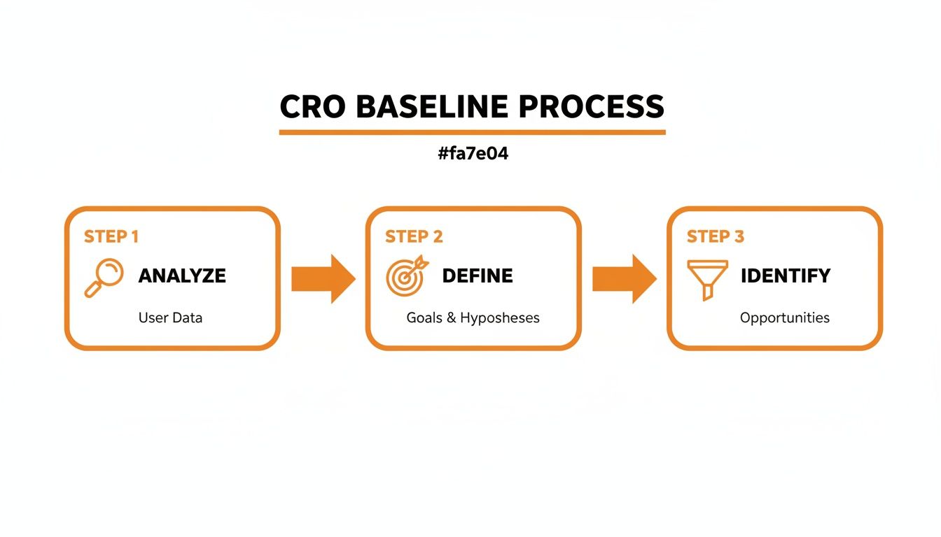
This structured approach stops you from making random changes and instead focuses your efforts where they’ll have the biggest impact.
Key Conversion Rate Optimization Metrics to Track
To get a clear picture of your baseline performance, you need to track the right KPIs. This table breaks down the essential metrics for any CRO audit, explaining what they measure and why they're so important for your business.
Metric | What It Measures | Why It Matters for CRO |
|---|---|---|
Conversion Rate | The percentage of visitors who complete a desired goal (e.g., purchase, form submission). | This is your primary success metric. A higher rate means your site is more effective at persuading visitors. |
Bounce Rate | The percentage of visitors who navigate away from the site after viewing only one page. | A high bounce rate can indicate poor landing page experience, irrelevant traffic, or confusing navigation. |
Average Session Duration | The average amount of time users spend on your site during a single visit. | Longer sessions can signal high engagement, but they need to be paired with conversions to be meaningful. |
Pages per Session | The average number of pages a user views in one session. | This helps you understand how deeply users are exploring your site. Low numbers might point to UX issues. |
Exit Rate | The percentage of views on a specific page that were the last in the session. | High exit rates on key pages (like a checkout page) are a major red flag, showing where users are dropping off. |
Click-Through Rate (CTR) | The percentage of users who click on a specific link or CTA compared to the total number of users who view it. | CTR on internal links and buttons shows how effective your on-page messaging and design are. |
Customer Lifetime Value (CLV) | The total revenue a business can reasonably expect from a single customer account. | CLV helps you understand the long-term value of acquiring a customer, justifying your CRO investments. |
Tracking these metrics gives you the hard data you need to identify weaknesses and prioritize your optimization efforts effectively.
Think of this initial analysis like a health check-up for your website. A doctor runs tests before prescribing treatment, and you need to run diagnostics on your site to figure out what’s working and what isn’t. This is where a deep dive into your analytics becomes non-negotiable, a process that shares a lot of DNA with conducting a comprehensive SEO audit. This data-first approach gives you the clarity to make smart decisions that will genuinely move the needle.
High-Impact UX and Messaging Fixes

So, your analytics have shown you where the leaks are. Now it's time to get your hands dirty and actually plug them.
The good news? The most glaring conversion killers usually aren't buried in complex code. They're often straightforward problems with your user experience (UX) and messaging that create friction and make people hesitate.
Fixing these core elements is where you’ll see the biggest bang for your buck. Even the most qualified lead won't stick around if they can’t figure out how to use your website. This is where we roll up our sleeves and make the immediate, tangible improvements that help visitors find what they need and trust you enough to take the next step.
Simplify Your Website Navigation
Confusing navigation is a one-way ticket to a high bounce rate. If a potential customer can't figure out where to find your services or products in a few seconds, they're gone—probably straight to a competitor. The goal is to make their journey feel effortless.
Start with your main menu. Is it a cluttered mess of options? Could a first-time visitor instantly understand where to go for pricing, services, or contact info?
Limit Your Menu: Aim for seven or fewer main navigation items. Anything more can feel overwhelming.
Use Obvious Language: Ditch the jargon. "Our Work" is clearer than "Portfolio," and "Contact Us" beats "Get in Touch" every time.
Add an Internal Search Bar: If you have a lot of pages or products, a search bar is non-negotiable. People who use site search are often ready to buy.
Imagine a local construction company. Their navigation should be dead simple: "Residential Services," "Commercial Projects," and "Request a Quote" right at the top. This removes all the guesswork.
Write Compelling Headlines and CTAs
Online, your words do the selling. A weak headline won't grab attention, and a bland call-to-action (CTA) won't inspire anyone to click. The data doesn't lie: up to 80% of people read headlines, but only 20% read the rest of the copy.
Your headline needs to scream your unique value. It has to answer the visitor's first question: "What's in it for me?"
For instance, a family law firm shouldn't settle for a generic headline like "Legal Services in Los Angeles." Something benefit-driven like "Protect Your Family's Future with Compassionate Legal Guidance" connects emotionally and speaks directly to a visitor's deepest concerns.
Your CTAs need that same punch. Drop passive phrases like "Submit" and use action-oriented language that communicates value.
A simple change from "Contact Us" to "Inquire Now" on a real estate form was found to increase clicks by over 44%. The word "inquire" clarifies the user's action, and "now" adds a sense of urgency.
It’s also crucial to understand what each page on your site is for. Are you trying to sell a product, generate a lead, or just provide information? Our guide on the differences between a landing page vs homepage will help you sharpen your focus and write more effective CTAs.
Build Trust with Social Proof
In the faceless world of the internet, trust is currency. Visitors need proof that you’re a legitimate, reputable business before they’ll part with their money or personal details. Social proof is one of the most powerful tools you have to improve your website's conversion rate.
You need to sprinkle these trust signals throughout your site, especially near conversion points like contact forms and checkout pages.
Customer Testimonials: Feature quotes from happy clients. Add a name and photo if you can—it makes them feel more real.
Case Studies: Show, don't just tell. Walk visitors through a success story that details how you solved a real problem for a customer.
Reviews and Ratings: Embed your reviews from trusted sites like Google or Yelp.
Trust Badges: Display logos of well-known clients, industry awards you’ve won, or security seals (like your SSL certificate).
For an e-commerce store, showcasing product reviews with user-submitted photos can dramatically boost "add to cart" clicks. For a local service provider, a video testimonial from a client in a neighboring town adds a layer of authenticity that text just can't match.
Driving Conversions with Technical Health

You can have the most persuasive copy and a beautiful design, but it all falls apart if your website is slow, buggy, or just plain frustrating to use. The technical health of your site is the invisible foundation supporting every other conversion effort you make. A clunky, slow-loading page is a guaranteed way to lose a potential customer before they’ve even had a chance to see what you offer.
Think of it like a brick-and-mortar shop. It doesn't matter how amazing your products are if the front door is stuck or the lights are flickering inside. These technical optimizations are about making sure your digital front door is wide open, welcoming, and easy for everyone to walk through.
Page Speed Is Non-Negotiable
In a world of instant gratification, patience is a resource your customers just don't have. A slow website isn't just a minor annoyance; it's a direct hit to your bottom line. People expect pages to load in the blink of an eye, and every second of delay pushes them closer to hitting the "back" button and heading to a competitor.
This is especially true for businesses serving a wide area like Los Angeles, where customers from Hollywood to Hermosa Beach are likely browsing on their phones while on the go. Mobile users are notoriously less patient. The data is crystal clear: you can boost conversions by up to 2% for every single second you shave off your page load time.
And in today's mobile-first reality, where 73% of traffic comes from phones but converts at a much lower rate than desktop, slow sites are absolute sales killers. In fact, studies show that 53% of mobile visitors will leave a page if it takes longer than three seconds to load. You can discover more insights about e-commerce benchmarks on SpeedCommerce.
The good news is you can get a quick report card on your site's performance using free tools like Google's PageSpeed Insights. It gives you specific, actionable feedback on both mobile and desktop, pointing out the exact culprits, like slow server response times or massive, unoptimized images.
Your page speed isn't just about conversions; it's also a confirmed ranking factor for search engines. A faster site not only keeps users happy but also helps you rank higher, creating a powerful cycle of visibility and performance.
Actionable Steps to Boost Loading Times
Improving your site's speed doesn’t require a complete overhaul. You can get noticeable results quickly by starting with these high-impact technical fixes.
Compress Your Images: Large, high-resolution images are one of the biggest offenders when it comes to slow load times. Use tools like TinyPNG or image compression plugins to shrink file sizes without sacrificing visual quality. It's a simple change with a massive impact.
Leverage Browser Caching: Caching essentially tells a visitor's browser to "remember" parts of your website, like images and CSS files. When they come back, the site loads way faster because their device doesn't have to re-download everything from scratch.
Choose the Right Hosting: Your web host plays a huge role in your site’s speed. That cheap, shared hosting plan might be saving you a few bucks, but it's likely slow and unreliable. Consider upgrading to a better plan or a managed host that specializes in performance for your platform, whether it's WordPress or Webflow.
Minimize Code: Unnecessary code, plugins, or third-party scripts can seriously weigh your site down. Do a regular audit of your plugins and get rid of any you aren't actively using. If you can, work with a developer to clean up bloated CSS and JavaScript files.
Ensure Accessibility and Fix Broken Links
Technical health is more than just speed. A website that is accessible to all users and free of broken links builds trust and shows a level of professionalism that's crucial for improving your website conversion rate.
ADA compliance is about making sure people with disabilities can navigate and interact with your website. This isn't just about doing the right thing; it’s about opening your business to a wider audience. Simple fixes like adding alt text to your images and ensuring your site can be navigated with a keyboard are great places to start.
Finally, make it a habit to regularly check for and fix broken links. Hitting a 404 error page is a dead end for a user and a red flag to search engines that your site might be neglected. A seamless, error-free experience tells visitors you care about the details, which goes a long way in reinforcing their confidence in your brand.
Winning with a Mobile-First Experience
A website that simply "works" on a phone isn't going to cut it anymore. Let’s be real—the majority of your customers are finding you on their phones, so a “mobile-friendly” site is just the price of entry. A true mobile-first strategy is how you actually win.
Ignoring this is one of the fastest ways to kill your conversion rate before you even get started.
Think about your customers across Southern California. Someone in a Downtown Los Angeles office, a shopper in Beverly Hills, or a homeowner in Sherman Oaks is going to pull out their phone first. Your website has to be built for that exact moment of need, optimized for their thumb and their fleeting attention span.
The Great Mobile Conversion Gap
The data tells a pretty stark story. While phones drive the lion's share of traffic, they consistently convert at a much lower rate than desktops. This is where your opportunity lies.
Desktop still crushes mobile, with conversion rates of 3.9-4.8% versus a meager 1.8-2.9% on phones, even though phones drive 73% of all traffic. This gap isn't a problem; it's a massive opening for businesses that get the mobile experience right. You can explore detailed ecommerce conversion rate data on Blend Commerce to see the benchmarks for yourself.
This isn't just an abstract statistic. For a dental practice in Pasadena, a construction firm in Glendale, or a boutique in Santa Monica, a clunky mobile site means lost appointments and abandoned carts. Every ounce of friction on that small screen costs you a customer.
Beyond Responsive Design: Optimizing for Context
A mobile-first approach goes way deeper than a responsive design that just shrinks to fit a screen. It means designing the entire experience around the unique context of a mobile user—they're often on the go, distracted, and need information now. We take a much deeper look at this in our practical guide to mobile-first design.
Here are the key areas I always tell clients to focus on first:
Thumb-Friendly Navigation: Put your most important interactive elements—like the menu, CTA buttons, and search bar—within easy reach of a user's thumb. This simple ergonomic detail makes your site feel intuitive instead of frustrating.
Simplified Forms: Nobody wants to type their life story on a tiny keyboard. Cut your forms down to the absolute essentials. Use larger input fields, enable auto-fill, and swap typing for dropdowns or steppers wherever you can.
Click-to-Call and Click-to-Map: For any local business, this is non-negotiable. Make sure every phone number is a clickable link that opens the phone's dialer. Your address should link directly to Google Maps or Apple Maps, making it seamless for customers from the San Fernando Valley to find you.
Streamlined Mobile Payments: If you're running an e-commerce store, integrating options like Apple Pay, Google Pay, or PayPal is critical. These one-tap solutions obliterate the friction of a traditional checkout and can have a huge impact on slashing cart abandonment.
A mobile-first mindset isn't a technical task; it's a strategic decision. It's about acknowledging that your customer's primary digital touchpoint is the phone in their pocket and building an experience that respects their time and context.
By obsessing over the mobile experience, you aren't just catering to a segment of your audience; you're catering to the majority. Whether your customers are in West Hollywood, Studio City, or Redondo Beach, a fast, intuitive mobile site is your single most powerful tool for turning traffic into real business.
Putting a Testing and Personalization Strategy into Play
You've patched the obvious leaks with UX fixes and given your site's technical engine a much-needed tune-up. Now it's time to shift gears. We're moving from fixing what's broken to discovering what truly motivates your customers. This is where the most successful businesses pull away from the pack—they stop guessing and start testing.
Building a strategy around testing and personalization is how you evolve from a one-size-fits-all website into a dynamic experience that actually adapts to your visitors. Think of it as a continuous cycle of learning and improving that transforms your site into a powerful conversion machine. A data-driven approach like this is the only way to systematically improve your website conversion rate over the long haul.

Making Sense of A/B Testing
At its heart, A/B testing (also called split testing) is a simple experiment. You create two versions of a single element on a page—like a headline or button color—and show them to different segments of your audience to see which one performs better. It's a direct way to let your customers tell you what they prefer, not with words, but with their actions.
The whole process kicks off with a solid hypothesis, which should be based on the data you’ve already been digging into. For example, if your analytics showed a ton of people bouncing from a specific service page, your hypothesis might be: "Changing our generic 'Learn More' button to a benefit-driven 'Get My Free Quote' will boost form submissions because it clarifies the value and the next step."
From there, you’ll use a testing tool to run the experiment. The tool will send half your traffic to the original page (the control) and the other half to the new version (the variation). The whole point is to see which version gets you a higher conversion rate with statistical significance.
How to Prioritize Your Tests for Maximum Impact
You could test almost anything on your website, but let's be realistic—your time and traffic are limited. The key is to prioritize tests that have the highest potential to actually move the needle. You simply can't test everything at once, so focus your energy where it counts.
A simple framework can help you decide what to tackle first. It boils down to weighing the potential impact of a change against how easy it is to implement. High-impact, easy-to-implement tests should always be at the top of your list.
Prioritizing Your A/B Tests: A Simple Framework
Use this framework to decide which website elements to test first for the highest potential return on your efforts.
Test Idea (Element) | Potential Impact (High/Medium/Low) | Ease of Implementation (Easy/Medium/Hard) | Priority Score |
|---|---|---|---|
Main Headline | High | Easy | High |
Primary CTA Button | High | Easy | High |
Hero Image | Medium | Easy | Medium |
Form Layout | Medium | Medium | Medium |
Page Layout | High | Hard | Low |
This method helps you zero in on the quick wins—like testing headlines and calls-to-action—before you dive into more complex experiments like redesigning an entire page layout.
The most powerful insights often come from the simplest tests. I've seen a change as small as tweaking a single word in a headline or CTA produce double-digit lifts in conversions. Don't overcomplicate it.
Getting Started with Personalization
While A/B testing is all about finding the single best experience for everyone, personalization takes it a step further by creating different experiences for different user segments. It’s about delivering the right message to the right person at the right time.
This might sound complex, but you can start with simple, powerful tactics.
Location-Based Personalization: For a business serving Southern California, this is a game-changer. Imagine showing a visitor from Santa Monica a testimonial from a client in a nearby beach community. Suddenly, your service feels more local and relevant.
Traffic Source Personalization: Tailor the experience based on how a visitor found you. Someone who clicked a Google ad for "emergency plumbing" should see a completely different headline than someone who arrived from a blog post about kitchen remodels. One is urgent, the other is aspirational.
Behavioral Personalization: Show returning visitors a different offer than first-timers. If someone has already downloaded your free guide, greet them with a message about scheduling a consultation on their next visit.
Personalization makes visitors feel seen and understood, which is a massive driver of trust and, ultimately, conversions. To keep refining your approach, it’s vital to incorporate essential user experience testing methods to get a better handle on user behavior and spot new areas for improvement. This ongoing process of testing and iterating is the real engine of sustainable growth.
Common CRO Questions Answered
As you start digging into conversion rate optimization, you're going to have questions. It’s totally normal. This isn't about one-time fixes; it's a process of continuous learning. Let's tackle some of the most common questions we hear from business owners across Los Angeles and beyond.
What Is a Good Website Conversion Rate?
This is the million-dollar question, but the truth is, there's no single magic number. A "good" conversion rate depends entirely on your industry, where your traffic is coming from, and even what device someone is using.
For instance, the average e-commerce site might pull in a 2-3% conversion rate. But a local service business running a super-targeted Google Ads campaign could easily see rates well above 3%. And don't forget email marketing—with a warm, engaged audience, it’s not uncommon to hit 5% or even higher.
Instead of getting hung up on a universal benchmark, focus on your baseline. A good conversion rate for your business is one that’s consistently ticking upward because of the improvements you’re making.
How Long Does It Take to See Results from CRO?
The timeline really depends on what you change and how much traffic you have to work with. Some simple, high-impact fixes can start showing results surprisingly fast.
Quick Wins (Weeks): Things like boosting your site speed, rewriting a confusing headline, or making your main call-to-action button pop can produce a noticeable lift in just a few weeks. These are the low-hanging fruit that remove obvious friction for your visitors.
Testing and Iteration (Months): For more structured efforts like A/B testing, you need time to collect enough data to be sure the results are legit. If your site has lower traffic, a single test might need to run for a month or more to be statistically significant.
CRO is a marathon, not a sprint. The real power isn't in a single change but in building a system of continuous improvement that delivers compounding gains over time.
Think of it as an ongoing process of refinement. Every test you run gives you new insights that fuel the next round of optimizations, creating a powerful cycle of growth.
What Are the Biggest Conversion Killers on a Website?
While every site is unique, most of the things that tank conversions fall into a few common buckets. If you’re just starting to figure out how to improve your website's conversion rate, hitting these areas first will give you the biggest bang for your buck.
Poor Performance: A slow-loading page is the absolute number one killer. More than half of mobile users will bounce if a site takes longer than three seconds to load. A slow, buggy website just feels unprofessional and frustrates people before they even get a chance to see what you're offering.
Confusing User Experience (UX): This covers everything from a cluttered menu that’s impossible to navigate to a checkout process with way too many steps. Long, complicated forms are another classic. If you make it hard for people, they'll just give up and go somewhere else.
Lack of Trust: People are naturally skeptical about handing over their credit card info or personal details online. A lack of trust signals—like no customer reviews, hidden contact information, or an insecure site (no HTTPS)—makes visitors nervous. And a nervous visitor is not a buying visitor.
By methodically improving performance, simplifying the user journey, and building trust, you’ll knock down the biggest barriers standing between you and your next customer.
At DLL Studios, we help businesses across Southern California design, build, and optimize websites that turn visitors into customers. Los Angeles is at the center of our service area, and we proudly support clients across a wide network of surrounding cities and neighborhoods throughout Southern California. Our reach includes every corner of L.A.—from Downtown Los Angeles, Hollywood, West Hollywood, Beverly Hills, and Santa Monica to the beach communities of Malibu, Venice, Marina del Rey, Hermosa Beach, Manhattan Beach, and Redondo Beach. We also extend service through the San Fernando Valley, including Sherman Oaks, Studio City, Encino, Van Nuys, North Hollywood, Burbank, Glendale, Pasadena, Woodland Hills, Chatsworth, Canoga Park, Reseda, Northridge, and Tarzana. In the San Gabriel Valley, we work with clients in Alhambra, Monterey Park, San Gabriel, Temple City, Rosemead, Arcadia, El Monte, South El Monte, West Covina, Covina, Baldwin Park, Azusa, Glendora, Duarte, and Monrovia. Farther southeast, we serve Whittier, Pico Rivera, Downey, Norwalk, La Mirada, La Habra, and Cerritos. We also support the South Bay—including Torrance, Carson, Gardena, Hawthorne, Inglewood, and Long Beach—as well as the Gateway Cities and communities throughout the I-10, I-5, 101, and 405 corridors. Whether you’re in a major metro area or a smaller surrounding neighborhood, our team delivers reliable, high-quality service anywhere in or around Los Angeles.
Ready to improve your website's performance? Learn more about our data-driven approach.