


.png)
How to Build a Responsive Website That Wins Customers
- Feb 15
- 17 min read
When we talk about building a responsive website, we're talking about creating one site that works beautifully everywhere. It's a single, smart design that fluidly adjusts to fit any screen, from the phone in your pocket to the widescreen monitor on your desk. The entire point is to give every visitor a seamless, intuitive experience—no pinching, no zooming, no frustration.
Why Responsive Design Is a Business Essential
Let's cut to the chase: your website is your digital storefront, and it's open 24/7. In today's mobile-first world, a non-responsive site is like locking the front door for more than half your potential customers. It's not just a minor inconvenience; it actively turns people away and damages your sales, credibility, and brand.

Picture a potential client browsing your services on their phone while commuting. If they have to fight with your site—pinching to read text, struggling to tap a tiny button—they're gone. They'll just hit the back button and find a competitor. That first impression is shot, and you've lost a lead before you even knew you had one.
A responsive website ensures this journey is smooth and professional at every single touchpoint.
The Real-World Impact on Your Bottom Line
A clunky mobile experience isn't just annoying; it's a direct hit to your revenue. User experience is a massive differentiator when customers have endless choices. The data tells a compelling story.
I've gathered some key industry stats below that really highlight how much is at stake. These aren't just abstract numbers; they represent real customers, real sales, and real growth opportunities.
Responsive Design Impact on Key Business Metrics | ||
|---|---|---|
Metric | Impact of Responsive Design | Statistic |
User Retention | 74% of users are more likely to return to a site if it's mobile-friendly. | |
Conversion Rates | Businesses see an average 11% increase in conversions with a responsive site. | |
Sales Growth | 62% of companies reported a significant increase in sales after adopting responsive design. | |
User Engagement | Mobile-friendly sites can boost user engagement by as much as 20%. |
These figures make it clear: responsive design isn't a cost—it's an investment that delivers tangible returns. For any business trying to capture a local market, a flawless mobile site is simply non-negotiable.
Building Trust and Gaining a Competitive Edge
A website that works perfectly on any device sends a powerful, unspoken message: you are professional, modern, and you care about your customers. It builds instant trust and credibility. Think of it as your digital handshake—a firm, confident one inspires a lot more confidence than a weak, awkward one.
This is especially true for local searches. A customer looking for a plumber in Santa Monica or a contractor in the San Fernando Valley is almost certainly on their phone. If your competitor’s site is a breeze to use and yours is a mess, you've already lost.
Responsive design isn't just a technical checkbox. It's a core part of your business strategy that directly influences how customers see your brand and whether they choose you or the other guy.
Ultimately, responsiveness is about meeting your audience wherever they are. Whether they're on the 101 freeway checking their phone or at a desk in Pasadena, the experience has to be consistent and effortless. A huge piece of this puzzle is ensuring your calls to action are effective on every screen, which is why it's so important to understand how to design landing pages that actually convert. It's an investment that pays for itself in customer loyalty, higher conversions, and a stronger bottom line.
Laying the Groundwork for Your Responsive Site
Before you touch a line of code or even glance at a template, the most important work happens. Building a solid plan is what separates a website that actually works from one that just causes headaches and costs more down the line. This is the foundation, and skipping it is a recipe for a site that misses the mark entirely.
So, where do you start? The very first thing you need to pin down is simple: what is this website actually for? Are you trying to get leads for your service business, sell products online, or just show off your portfolio to land freelance gigs? Your answer to that one question will shape every single decision you make from here on out.
Define Your Audience and Their Needs
Once you know your why, you need to get crystal clear on your who. Don't just think about a generic "user"—that's too vague to be helpful. Instead, create detailed user personas that feel like real people.
Let’s say you're building a site for a local contractor. Picture a potential customer. Maybe it's a homeowner in their late 30s in Encino, busy with work and kids, looking for someone reliable. What device are they using to search? Almost certainly their phone, probably while multitasking. What do they need to see right away? Clear service info, photos of finished projects, and an easy way to ask for a quote. No fluff.
Ask yourself these questions to flesh out your audience:
Who are they? Think about their age, job, and how comfortable they are with technology.
What device are they on? Don’t guess. Look at the data. Over half of all web traffic comes from mobile, and that number climbs even higher for local searches.
What problem are they trying to solve? Are they looking for your phone number, comparing prices, or reading customer reviews?
What’s the most critical piece of information for them? Make sure that info is front and center, impossible to miss.
Nailing this down ensures you’re building a site that serves your audience, not just your own preferences.
Embrace a Mobile-First Design Philosophy
For a long time, the standard practice was to design a big, beautiful desktop website first and then try to cram it all onto a smaller screen. That old model, known as "graceful degradation," is completely backward. The modern, and frankly better, way to do it is with mobile-first design.
This means you start the design process on the smallest screen: the smartphone.
Why? Because it forces you to prioritize. When you only have a few inches of screen to work with, you have no choice but to focus on the absolute essentials. All the clutter, the nice-to-haves, and the secondary features get stripped away, leaving you with a lean, fast, and highly focused user experience.
Starting with mobile constraints isn't about limitation; it's about clarification. It forces you to identify what truly matters to your users, resulting in a cleaner, faster, and more effective design across all devices.
Once that core mobile experience is perfect, you can then "progressively enhance" the design for larger screens like tablets and desktops. This is where you can start adding back some of those extras—more complex navigation, bigger photo galleries, or secondary content that improves the experience but isn't critical. A local restaurant in Long Beach, for example, might show its core menu and a "Call Now" button on mobile, but the desktop version could add an interactive map, event calendars, and a full gallery. This approach leads to a better-performing site that puts the user first, no matter how they access it.
Choosing the Right Tools for the Job
Alright, you’ve got your plan nailed down. Now comes the big question: how are you actually going to build this thing?
There’s no single "best" way to build a responsive website. The right choice really boils down to your project's needs, how comfortable you are with technology, and of course, your timeline and budget. This decision sets the stage for your entire workflow, so let's break down the main paths you can take.
Platform Comparison for Building a Responsive Website
To give you a quick overview, here's a side-by-side look at the most popular methods for building a responsive site. This should help you figure out the right fit for your business.
Platform | Best For | Technical Skill Required | Flexibility |
|---|---|---|---|
Custom Code (HTML/CSS/JS) | Unique, high-performance sites and web apps with specific branding or features. | High (Requires skilled developers). | Maximum. Total creative freedom and control. |
CMS (e.g., WordPress) | Scalable sites, from blogs to complex corporate portals, needing content management. | Medium. User-friendly for content, but customization requires some technical know-how. | High. Limitless customization through themes and plugins. |
No-Code/Low-Code (e.g., Wix Studio, Webflow) | Entrepreneurs, startups, and SMBs needing a professional site launched quickly. | Low to None. Visual, drag-and-drop interface. | Medium to High. Great design control, but within the platform's ecosystem. |
Each of these paths has its own strengths. Let's dig a little deeper into what each one entails.
The Custom Coding Route: HTML, CSS, and JavaScript
If you're aiming for something truly unique—think custom functionality, blazing-fast performance, or a design that completely breaks the mold—then custom coding is your best bet. This means building your website from the ground up with the core trio of web technologies: HTML for the structure, CSS for the style, and JavaScript for all the interactive bits.
Going this route gives you unparalleled control. Every pixel, every animation, every user interaction can be crafted exactly to your vision. It’s the gold standard for flexibility and usually results in the leanest, fastest-loading websites because there’s zero bloat from pre-built themes or plugins you don't need.
The trade-off? This level of power demands serious technical expertise and a longer development timeline.
Best For: Unique, high-performance sites, web applications, or businesses with very specific branding and feature requirements.
Pros: Total creative freedom, optimal performance, and clean, efficient code.
Cons: Requires skilled developers, is more time-consuming, and can be more expensive upfront.
Flexible Content Management Systems like WordPress
A Content Management System (CMS) like WordPress offers a fantastic middle ground. There's a reason it powers a massive chunk of the internet—it blends a user-friendly interface for managing content with nearly endless customization through themes and plugins.
With WordPress, you can start with a responsive theme and then tweak it to perfectly match your brand. The huge ecosystem of plugins means you can add features like e-commerce, contact forms, and advanced SEO tools without having to code them from scratch. This makes it an incredibly scalable option, perfect for everything from a simple blog for a Glendale-based consultant to a complex corporate site for a company in Downtown Los Angeles.
While a CMS makes content updates a breeze, building a truly secure and effective responsive website still requires a bit of technical knowledge. Choosing the right theme, optimizing plugins for speed, and staying on top of security are all mission-critical.
Modern No-Code and Low-Code Platforms
The newest kids on the block are visual development platforms like Wix Studio and Webflow. These tools have been a complete game-changer for entrepreneurs and businesses that need to get a professional, fully responsive website live fast—often without touching a single line of code.
These platforms give you a visual canvas where you design your site by dragging and dropping elements. All the complicated code gets generated in the background, so you can just focus on the look and feel. The rise of AI in web design is also accelerating this trend. Low-code platforms are seeing explosive growth at a 37.7% CAGR, with 81% of companies now seeing them as strategically important. It's a clear sign that the barrier to entry for building a sophisticated site is dropping fast.
For many small businesses, these platforms strike the perfect balance between design control and ease of use. You can start with professionally designed templates, like these Wix Studio templates that can kickstart your project, and customize from there. They empower you to create a beautiful, functional site that looks great on every device, making them an excellent choice for businesses all over Southern California, from the beach communities like Malibu and Venice to the San Gabriel Valley.
7. Mastering Core Responsive Design Techniques
Now that you've got a solid plan and your tools lined up, it's time to get into the fun part—the core techniques that make a website genuinely responsive. This is where the real magic happens, transforming a rigid design into a fluid experience that looks fantastic on any screen.
Whether you're writing the code yourself or working with a developer, getting a handle on these concepts is non-negotiable.
At the very heart of responsive design are modern CSS layout models. Think of them as the architectural blueprints for your webpage. The two most powerful tools you'll be using are Flexbox and Grid.
This diagram breaks down the different paths you can take to bring a site to life, from hand-coding it to using sophisticated visual platforms.
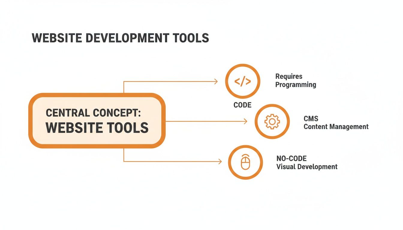
Each path—Code, CMS, and No-Code—strikes a different balance between creative control, development speed, and the technical skill required.
Flexbox and Grid: The Power Twins of Layout
Imagine Flexbox as your go-to for arranging items in a single line, either horizontally or vertically. It’s perfect for things like lining up navigation links, centering a logo, or making sure a row of service cards distributes itself evenly. It absolutely excels at one-dimensional layouts, giving you pinpoint control over alignment, spacing, and order.
CSS Grid, on the other hand, was built for two-dimensional layouts—we're talking rows and columns. It’s like having a spreadsheet for your webpage, letting you create complex, magazine-style structures with surprising ease. You can define a grid and place items exactly where you want them, making it the ideal choice for the overall page structure.
Here’s a simple way to think about it:
Flexbox: Use it for individual components and smaller layout tasks, like aligning buttons inside a header.
Grid: Use it for the main page layout, creating the foundational structure that holds all your components together.
When used together, Flexbox and Grid form an unstoppable combination that can tackle pretty much any layout challenge you can dream up.
Fluid Grids and Relative Units
The real secret to making these layouts scale gracefully is to ditch fixed pixel values. Instead, you'll need to embrace fluid grids and relative units.
A fluid grid uses percentages (%) or fractional units (fr) instead of static pixels. This allows your columns and other elements to resize proportionally based on the screen size.
Think of it this way: instead of telling a column to be exactly wide, you tell it to take up 30% of its parent's available space. As the screen gets bigger or smaller, that column will always occupy its designated portion of the layout, preventing those ugly horizontal scrollbars or awkward empty gaps.
By using relative units for everything from widths to font sizes, you're not just designing for a few specific devices; you're creating a truly elastic system that looks good at any size.
This same principle extends to other elements, too:
Font sizes: Use or units so text scales based on the browser's base font size, which is a huge win for accessibility.
Padding and Margins: Using percentages or viewport units (, ) ensures spacing stays consistent and proportional to the screen.
Media Queries: The Rules of Adaptation
So how does a website know when to change its layout? The answer is media queries.
These are simple rules you write in your CSS that apply different styles based on the device's characteristics—most often, its screen width. A media query is basically a conditional check. It says, "If the screen is wider than 1000 pixels, use this three-column layout. But if it's narrower than 750 pixels, switch to a single-column layout and show a hamburger menu."
The points where the design "breaks" and changes are called breakpoints.
The old way of thinking was to set breakpoints for specific devices like iPhones or iPads. Don't do that. Instead, let your content be your guide. Resize your browser window and look for the exact moment your layout starts to feel crowded or just looks wrong—that’s your breakpoint. That’s where you need to add a media query to fix it. For a deeper dive into platform-specific approaches, there are some great guides on building responsive layouts.
It's also important to understand the difference between this fluid approach and more rigid methods. To get a better grasp of these philosophies, check out our guide on responsive versus adaptive design. Mastering these techniques is what ensures your website delivers a seamless, professional experience for every single visitor, no matter where they are.
Optimizing for Speed, Accessibility, and SEO
A responsive site that just looks good isn't enough; it has to perform. Once your layouts are adapting beautifully across devices, the next critical step is to fine-tune your website for speed, accessibility, and search engine visibility.
These three pillars aren't separate tasks—they're deeply interconnected. A slow site makes people leave, an inaccessible one excludes a huge audience, and one that's not optimized for search engines might as well be invisible.

Boosting Performance for Instant Gratification
In a mobile-first world, speed is everything. Users expect pages to load almost instantly, and their patience wears thin after just a few seconds. In fact, a delay of just 1 to 3 seconds can increase the probability of a user bouncing by 32%.
This makes performance optimization a non-negotiable part of the process. Your primary focus should be on minimizing the amount of data a browser has to download and process.
Here are a few high-impact strategies I always implement:
Optimize Your Images: Large, uncompressed images are the most common cause of slow websites. Use modern formats like WebP, correctly size images for their containers, and implement lazy loading so images below the fold only load as the user scrolls to them.
Leverage Browser Caching: Caching tells a visitor's browser to store static assets like your logo, CSS files, and JavaScript. On their next visit, the browser doesn't have to re-download everything, making the site load much faster.
Minify Your Code: Minification strips all unnecessary characters from your code (like extra spaces and comments) without changing how it works. This shrinks your HTML, CSS, and JavaScript files, speeding up download times.
These technical tweaks make a massive difference, especially for users on slower mobile connections.
Web Accessibility and Its SEO Superpowers
A truly responsive website is one that’s usable by everyone, including people with disabilities. This is the core principle of web accessibility, often discussed in the context of ADA (Americans with Disabilities Act) compliance.
But building an accessible site isn't just about compliance; it's about good design, and it comes with a huge SEO bonus.
For example, using semantic HTML—like , , and tags—does more than just structure your content. It provides crucial context for screen readers that assist visually impaired users. At the same time, it gives search engine crawlers a clear roadmap of your site's hierarchy and importance.
An accessible website is inherently a more SEO-friendly website. Practices like adding descriptive alt text to images, ensuring high color contrast, and providing clear link text help both users with disabilities and search engine bots understand your content.
Making your site accessible expands your audience and strengthens your technical SEO foundation. If you need a deeper understanding, our article on the fundamentals of ADA compliance provides a great starting point.
Connecting Responsive Design to Search Rankings
Google officially switched to mobile-first indexing years ago. This means the mobile version of your website is what Google primarily uses for ranking and indexing. A poor mobile experience directly hurts your visibility, no matter how great your desktop site is.
This is why responsive design has become a fundamental pillar of modern SEO.
To ensure your new site is built for visibility from day one, integrate on-page SEO best practices into your workflow. Create unique, descriptive title tags and meta descriptions for every page, use header tags to structure your content logically, and ensure your site has a clean, crawlable URL structure. By aligning your responsive build with these SEO principles, you're not just creating a great user experience; you're building a powerful asset designed to be found.
Testing, Launching, and Maintaining Your Website
Building a responsive website is a huge accomplishment, but the job isn't over when the design is done. The final stretch—testing, launching, and maintaining—is what turns a great project into a reliable, long-term asset. It's tempting to rush this part, but that's a classic mistake that can unravel all your hard work.
Think of testing as your final quality check. Before your site goes live, you need to put it through the wringer in as many real-world scenarios as possible. This goes way beyond just resizing your browser window on your desktop in Studio City.
You have to see how it performs on actual devices. How does it look and feel on an older iPhone? An Android tablet? What about different browsers like Chrome, Safari, and Firefox? Each one can interpret code a little differently, so cross-browser testing is your best defense against layout bugs and broken features that will absolutely frustrate real visitors.
Your Pre-Launch Checklist
When it comes to launch day, a methodical approach is your best friend. A pre-launch checklist helps you nail down all the critical details so nothing important gets overlooked in the final push. This is your last sanity check before flipping the switch.
Here are the absolute must-dos before you go live:
Cross-Device and Browser Testing: Grab real devices and use tools like BrowserStack to simulate different environments. Click on everything. Test every interactive element, from the contact form to the navigation dropdowns.
Performance Audit: Run your site through Google's PageSpeed Insights. This will give you a raw, honest look at your site's speed. Tackle any lingering issues with oversized images, uncompressed code, or slow server response times now.
Broken Link Scan: Use a tool like Screaming Frog or another online checker to crawl your entire site. Hunt down and fix any dead links that create dead ends for your users.
Analytics Setup: Get Google Analytics 4 (GA4) or a similar tool installed. You absolutely need to start collecting data from day one to understand how people are using your site and to measure whether it's actually working.
Sitemap Submission: Create an XML sitemap and submit it to Google Search Console. This is like handing Google a map of your site, which helps it index your pages much faster.
Launching a website isn't the finish line; it's the starting line. Ongoing maintenance is the only way to protect your investment, ensure security, and keep your site performing at its peak for your audience.
The Importance of Ongoing Maintenance
Once your website is out in the wild, the work shifts from building to preserving. A website is a living tool, not a static brochure you print once and forget about. Without regular attention, its performance will degrade, it will become an easy target for security threats, and its content will get stale.
Ongoing maintenance really boils down to a few key habits. Regularly back up your site, update your CMS and any plugins to patch security holes, and keep an eye on your site for any downtime or performance dips. This proactive mindset keeps your digital storefront in top shape, ensuring every visitor has a great experience, whether they're in Beverly Hills or Baldwin Park.
Frequently Asked Questions
Even with the best guides, questions always come up. Here are some of the most common ones we hear from businesses here in Southern California trying to navigate the world of responsive design.
What's the Real Difference Between Responsive and Adaptive Design?
This one trips people up a lot. The easiest way to think about it is flexibility.
Responsive design is like a liquid. It uses a single, fluid layout that automatically stretches or shrinks to fit any screen you throw at it. It's the go-to standard today because it's efficient and guarantees a solid experience whether your visitor is on a tiny smartphone or a massive monitor.
Adaptive design, on the other hand, is more rigid. It uses a few fixed layouts designed for specific screen sizes (like one for mobile, one for a tablet, and one for a desktop). The website detects the device and serves up the "correct" layout. It can sometimes load a bit faster, but it's a pain to build and maintain. Plus, it can create a jarring experience for anyone on a screen size that falls between your pre-defined breakpoints.
For almost every business out there, responsive is the way to go. It delivers a more consistent user experience, it's what Google prefers, and it's far less work to maintain down the road. It’s just a smarter long-term play.
How Much Does a Responsive Website Actually Cost?
This is the million-dollar question, isn't it? The honest answer is: it depends entirely on what you need.
You can go the DIY route with a platform like Wix Studio or a WordPress theme and get something off the ground for anywhere from a few hundred to a couple of thousand dollars.
But if you're looking for a custom-built site from a professional agency, you should budget for $3,000 to over $25,000. The final number really comes down to the design complexity, the total number of pages, and any special features like e-commerce functionality or custom API integrations. It’s best to think of it as an investment in your most important digital marketing asset.
Can I Just Make My Old Website Responsive?
Technically, yes, it's possible. But it's almost always more trouble—and more expensive—than it's worth, especially if the site's code is old and creaky. Trying to bolt responsiveness onto an outdated foundation is like remodeling a kitchen when the entire house has structural issues. You're just putting a band-aid on a bigger problem.
A full redesign is usually the better, more strategic move. It lets you build with a mobile-first mindset from the ground up, which leads to better performance, a much smoother user experience, and a stronger technical foundation for your SEO efforts. A quick consultation with a pro can usually tell you which path makes the most financial sense for your specific site.
Los Angeles is at the center of our service area, and we proudly support clients across a wide network of surrounding cities and neighborhoods throughout Southern California. Our reach includes every corner of L.A.—from Downtown Los Angeles, Hollywood, West Hollywood, Beverly Hills, and Santa Monica to the beach communities of Malibu, Venice, Marina del Rey, Hermosa Beach, Manhattan Beach, and Redondo Beach. We also extend service through the San Fernando Valley, including Sherman Oaks, Studio City, Encino, Van Nuys, North Hollywood, Burbank, Glendale, Pasadena, Woodland Hills, Chatsworth, Canoga Park, Reseda, Northridge, and Tarzana. In the San Gabriel Valley, we work with clients in Alhambra, Monterey Park, San Gabriel, Temple City, Rosemead, Arcadia, El Monte, South El Monte, West Covina, Covina, Baldwin Park, Azusa, Glendora, Duarte, and Monrovia. Farther southeast, we serve Whittier, Pico Rivera, Downey, Norwalk, La Mirada, La Habra, and Cerritos. We also support the South Bay—including Torrance, Carson, Gardena, Hawthorne, Inglewood, and Long Beach—as well as the Gateway Cities and communities throughout the I-10, I-5, 101, and 405 corridors. Whether you’re in a major metro area or a smaller surrounding neighborhood, our team delivers reliable, high-quality service anywhere in or around Los Angeles. Reach out today for a free consultation!