


.png)
Discover standard webpage dimensions for responsive design
- Nov 29, 2025
- 16 min read
Forget everything you've heard about a single "standard webpage dimension." That idea is a relic, a holdover from a much simpler time on the web. Today, the only goal that matters is creating a fluid, responsive design that looks and works great on any screen imaginable. Success now hinges on understanding viewports, not chasing outdated, fixed pixel counts.
Understanding Webpage Dimensions in a Responsive Era
Back in the early days, web design was incredibly rigid. In the mid-90s, websites were built for the most common screen resolutions, which were a tiny 640x480 or 800x600 pixels. As monitors improved, so did the standard, with 1024x768 becoming the target by the early 2000s.
That fixed-width thinking is completely obsolete now. The modern web has to serve an enormous spectrum of devices, from pocket-sized smartphones to massive, ultra-wide desktop monitors. If you try to design for just one size, you're guaranteed to deliver a broken experience to a huge chunk of your audience.
The Shift to Fluidity and Viewports
The solution is responsive design, a method that allows a website's layout to dynamically adapt to the user's screen. This approach ditches the old focus on fixed dimensions and embraces a more flexible, percentage-based structure. To get it right, you need to be comfortable with three core concepts:
Viewport: This is simply the visible area of a webpage on a user's screen. It changes depending on the device—a phone, a tablet, a laptop, you name it.
Resolution: This is the total number of pixels on a screen (like 1920x1080). It's related to the viewport, but they aren't the same thing. A high-resolution phone, for example, still has a small physical viewport.
Breakpoints: Think of these as the specific viewport widths where your design "breaks" and shifts its layout. For instance, a three-column layout on a desktop might snap to a single column on mobile to keep things readable.
This shift in mindset is non-negotiable. Instead of asking, "What's the standard webpage size?" the real question we should be asking is, "How should my design adapt at different viewport sizes?"
The fundamental principle of modern web design is to create an optimal viewing experience—easy reading and navigation with a minimum of resizing, panning, and scrolling—across a wide range of devices.
Embracing a Mobile-First Strategy
To put all this into practice, the industry standard is a "mobile-first" strategy. It’s exactly what it sounds like: you design the mobile layout first and then scale up, adding complexity and features for larger screens.
This approach does more than just ensure your site works on phones. It forces you to prioritize what's truly important, leading to a cleaner, more focused user experience for everyone. If you're looking for a hands-on guide to building this way, a good responsive web design tutorial can give you a solid foundation for creating sites that serve users everywhere, on any device.
The Definitive Guide to Responsive Breakpoints
Responsive breakpoints are the secret sauce of modern web design. Think of them as the precise points where your website's layout shifts to give visitors the best possible experience on their screen. They're like digital tripwires; once a user's screen size crosses a specific pixel width, your CSS media queries kick in and reformat the content to fit perfectly. This is how a site gracefully transitions from a sprawling, multi-column desktop view to a clean, single-column layout on a phone.
Instead of trying to design for thousands of different devices, breakpoints let you group them into logical buckets: mobile, tablet, and desktop. For any business owner, whether you're running a boutique in Beverly Hills or a café in Pasadena, getting breakpoints right is key to reaching every customer, no matter what device they're using. This is the heart of responsive design, which is a big leap from older methods. If you want to get into the weeds, you can learn more about the differences between adaptive vs responsive design and see how each approach shapes the user experience.
Common Breakpoints For Mobile Devices
The "mobile-first" philosophy means we start our design with the smallest screens. The most common breakpoints for smartphones are set up to handle a huge variety of handheld devices, usually in portrait mode.
Extra Small Devices (Portrait Phones): We typically set a breakpoint at 320px. This covers older iPhones and a lot of smaller Android devices, giving you a solid foundation for your base styles.
Small Devices (Standard Phones): A breakpoint around 480px is a good bet for most modern smartphones. It gives you a little more room to work with before you start thinking about tablet sizes.
Your CSS should always define the styles for these small screens first. Then, you can use media queries to add or change styles as the viewports get bigger.
Standard Tablet Breakpoints
Once the screen gets a bit larger, you can start bringing in more complex layouts. Tablet breakpoints are where you’ll typically reintroduce columns and tweak your navigation menus for easier use.
Most designers lean on a primary breakpoint at 768px—the classic width of an iPad held upright. This is often the magic number where a stacked, single-column mobile layout transforms into a two-column design. Another popular breakpoint is 1024px, which targets tablets held sideways and some very small laptops.
Breakpoints aren't about targeting specific devices. They're about adapting to the available screen real estate. The goal is always the same: keep the content readable and easy to use, regardless of the viewport width.
Desktop And Widescreen Breakpoints
When you move past tablet sizes, you’re in desktop territory. Now you have all the space you need for full-featured layouts with sidebars, intricate grids, and wide navigation bars.
The most widely-used desktop breakpoint is 1200px. This width is a comfortable fit for most standard desktop monitors and leaves plenty of room for a traditional three-column layout. For those extra-large, high-resolution screens, some designers will add another breakpoint at 1600px or even higher. This helps optimize the experience for ultra-widescreen monitors and prevents your content from stretching out into an unreadable mess.
When you thoughtfully implement these breakpoints, your website will deliver a consistent and professional experience on every single screen.
Standard Responsive Design Breakpoints
Here’s a quick reference table that breaks down the most common viewport widths and the CSS media queries used to target them. This should help you visualize how different device categories are typically handled in responsive design.
Device Category | Viewport Width Range | Common Breakpoint (min-width) | Example Devices |
|---|---|---|---|
Mobile | 320px - 480px | iPhone SE, Galaxy S9 (Portrait) | |
Mobile (Large) | 481px - 767px | iPhone 14 Pro Max, Pixel 7 (Portrait) | |
Tablet | 768px - 1024px | iPad, Galaxy Tab (Portrait & Landscape) | |
Desktop | 1025px - 1200px | Small Laptops, Desktops | |
Desktop (Large) | 1201px and up | Standard & Widescreen Monitors |
Remember, these are just starting points. The right breakpoints for your project will always depend on your specific content and layout needs. Test thoroughly and adjust as needed
Choosing Your Optimal Container and Content Width

While breakpoints handle how your layout adjusts to different screens, the container width is what frames your main content. Think of it as the defined area that stops your text and images from stretching awkwardly across a massive monitor. It’s absolutely critical for readability and keeping your design looking sharp and organized. Nailing this width is just as important for a creative agency in Santa Monica as it is for a law firm in the San Fernando Valley.
Finding the right container width is a bit of a balancing act. If it's too narrow, your site can feel boxed-in and dated. But if it’s too wide, long lines of text become a chore to read, causing eye strain and a poor user experience.
Common Container Width Standards
Over the years, a few standard container widths became the go-to choices, each with its own backstory and ideal use case. Modern design gives us a ton more flexibility, but these classics are still fantastic starting points.
960px: The old classic. This became the unofficial standard in the mid-2000s, mostly because it was so easy to divide. It splits cleanly by 2, 3, 4, 6, 8, 12, and 16, which made it a dream for grid layouts on the 1024x768 pixel screens that were everywhere at the time. You can learn more about its history and the rise of grid systems.
1140px: A very popular choice that gives designs a more modern, spacious feel. It offers plenty of room for content on most desktop monitors without feeling overwhelming.
1320px: Often used for sites that want a wider, more expansive look. This size is great for image-heavy portfolios or complex dashboards, but you have to be really careful about your text line length.
A good rule of thumb for readability is to keep your lines of text between 50 and 75 characters. Your container width has a huge impact on this, making it one of the most important decisions you'll make for any content-heavy page.
Fixed-Width Versus Full-Width Containers
Whether you go with a fixed or full-width container really comes down to your design goals. Each one creates a completely different feel and user experience.
A fixed-width container (like 1140px) stays at a specific size and is usually centered on the screen. This gives you predictable margins and a controlled reading experience, which is perfect for blogs, news sites, and corporate websites where text is king.
On the other hand, a full-width container stretches to fill the entire browser window. This is what you use for those big, immersive elements like hero images, photo galleries, or background videos. It creates a bold, cinematic effect that grabs attention right away. A lot of modern designs actually use a mix of both—full-width sections for impact, with fixed-width containers for the main body copy.
Mastering Image Dimensions for Performance and Clarity

Images are the heart of a visually engaging website, but they’re also the number one cause of slow page loads. Getting your image dimensions right isn't just about aesthetics; it's a critical balancing act between visual clarity and site performance. If your images are too big, you're just wasting bandwidth and making users wait. Too small, and they end up looking blurry and unprofessional.
Nailing this means getting comfortable with aspect ratios, knowing the right pixel dimensions for different use cases, and using modern compression techniques. It’s how you guarantee your visuals look sharp on every device without slowing things down.
Common Image Dimensions and Aspect Ratios
Before you even think about uploading an image, you need to resize it for its specific purpose on your site. Dropping a massive 4000px photo into a tiny thumbnail spot is a classic mistake that kills performance. Instead, let's stick to some tried-and-true best practices for common web elements.
Hero Banners: These are the big, eye-catching images at the top of a page. They almost always use a 16:9 aspect ratio. A dimension of 1920px by 1080px is the gold standard here, giving you fantastic quality on most desktop screens.
Blog Post Images: For your standard in-content images, a width of 1200px is a safe and reliable choice. A 3:2 aspect ratio (1200px by 800px) is a popular go-to for featured blog images.
E-commerce Product Photos: Detail is everything in e-commerce. A 1:1 square aspect ratio is standard, and you’ll often see dimensions around 2048px by 2048px. This size is perfect for letting customers zoom in and see the quality of your products up close.
While these are great starting points, always keep an eye on the final file size. A good rule of thumb is to keep most images under 200KB. You can hit this target easily by using modern formats like WebP, which delivers excellent quality at a much smaller file size than old-school JPEGs.
Designing for High-Resolution Retina Displays
Modern devices, from the latest iPhones to high-end laptops, often come with what are called "Retina" displays. These high-resolution screens pack more physical pixels into the same physical space, which has a nasty side effect: standard-resolution images can look fuzzy or soft. The secret to fixing this lies in understanding the Device Pixel Ratio (DPR).
A screen with a DPR of 2 has double the pixel density. To make sure your images look crisp and sharp on these displays, you just need to serve an image that's twice the size of its container.
It's a simple formula: if your layout needs an image to be displayed at 500px by 300px, you should actually upload an image that is 1000px by 600px. The browser then intelligently scales it down, using all that extra pixel data to render a perfectly crisp visual.
This "2x" approach is a cornerstone of creating a premium, polished user experience. It's especially important for mobile devices, where high-DPR screens are pretty much standard now. If you want to dive deeper into this, our practical guide to mobile-first design explains how to build these considerations into your workflow from the very beginning. By planning for high-resolution displays, you ensure your brand’s visuals look their absolute best on every modern device.
A Practical Dimensions Checklist for Key Web Assets
Beyond your main layout, it’s the little things that make a website feel truly professional. Assets like favicons and social sharing images are often an afterthought, but getting them right is crucial for brand consistency. It’s what makes your brand look polished and instantly recognizable everywhere, from a browser tab to a shared link on social media.
Think of these small but mighty assets as your brand's ambassadors across the web. A crisp favicon builds trust at a glance, while a properly formatted social share image can be the difference between a click and a scroll-by when your content is shared from West Hollywood to Redondo Beach.
Favicons and Essential App Icons
A favicon is that tiny icon you see in a browser tab, bookmark bar, or history list. It might be small, but it's a powerful branding tool that helps users spot your site in a sea of open tabs. These days, you need more than just one tiny file.
Standard Favicon: The most common and reliable size is 32x32 pixels. While 16x16 was the old-school standard, modern high-resolution screens really benefit from the larger size. Make sure you save it in a common format like or .
Apple Touch Icon: This is the icon that appears when someone saves your website to their iPhone or iPad home screen. To get the best quality on modern iOS devices, you'll want to use a size of 180x180 pixels.
Social Media Sharing Image Dimensions
When someone shares a link from your site on platforms like Facebook, X (formerly Twitter), or LinkedIn, the platform uses Open Graph (OG) meta tags to pull in a preview image. Using the right dimensions here ensures your link looks compelling and isn’t awkwardly cropped.
An optimized social sharing image turns a simple link into a compelling, clickable advertisement for your content. The ideal aspect ratio for most platforms is 1.91:1, with recommended dimensions of 1200x630 pixels.
This size is a workhorse—it looks great across Facebook, X, and LinkedIn, giving you a consistent and professional look. If you don't set a specific OG image, the platform will often just grab a random, ill-fitting image from the page, which can seriously undermine the share's impact. By defining this asset yourself, you take control of your brand's story wherever your links travel.
Here’s a quick-reference table summarizing the dimensions for these critical branding assets. Having these specs handy ensures your site looks sharp and professional across every touchpoint, from the browser tab to the social feed.
Icon and Social Share Image Specifications
A summary of required dimensions for favicons, Apple Touch Icons, and social media sharing images to ensure optimal display across platforms.
Asset Type | Platform/Use Case | Recommended Dimensions (px) | Notes |
|---|---|---|---|
Favicon | Browser Tabs, Bookmarks | 32x32 | A 16x16 version can be included for older browsers, but 32x32 is the modern standard. |
Apple Touch Icon | iOS Home Screen | 180x180 | Ensures a high-quality, crisp icon on retina iPhones and iPads. |
Social Share Image | Facebook, X, LinkedIn | 1200x630 | The ideal 1.91:1 aspect ratio for a clean, professional link preview. |
Getting these small details right is a simple way to elevate your brand's digital presence. It shows an attention to detail that users notice, even if they don't consciously realize it. It’s one of those subtle markers of a truly professional website.
How User Data and Screen Resolutions Shape Design
Great web design isn’t a guessing game; it’s a direct response to how real people are using the internet. The standard webpage dimensions we rely on today are shaped almost entirely by global user data—specifically, the screen resolutions of the devices people actually own. This is exactly why the industry pivoted away from rigid, fixed-width layouts to the fluid, device-agnostic designs we now see everywhere.
Understanding the history here gives you crucial context. For years, screen resolution and browser usage stats were the driving force behind web design. Back around 2001, for example, Internet Explorer had a jaw-dropping 96% market share, which meant its technical quirks basically dictated the rules of the road. At the time, 1024x768 was king, with studies showing 60-70% of users had screens that size or larger. Still, you couldn't ignore the 20% of visitors on older 800x600 displays. You can get a feel for how much things have changed by exploring the history of web design.
From CRT Monitors to Countless Devices
The early days of the web were simple. Everyone had a bulky CRT monitor with a predictable 4:3 aspect ratio, so designers built sites to fit that one box. But then came the explosion of widescreen laptops, tablets, and smartphones, completely shattering that one-size-fits-all model. Today, a business in Los Angeles might have customers visiting its site from an iPhone in Hollywood, a huge monitor in Downtown LA, and a tablet in Santa Monica—all within the same hour.
This incredible diversity makes it impossible to design for a single "standard" size. Instead, we have to look at our own analytics to figure out what's right for our specific audience.
By analyzing your own user data, you can identify the most common device categories and screen resolutions among your visitors. This allows you to prioritize your design efforts where they will have the most impact.
Making Data-Driven Design Decisions
When you know what devices your audience uses, you can make much smarter design choices. If your analytics show that 80% of your traffic is coming from mobile devices with viewports under 420px, you can confidently pour your resources into perfecting a mobile-first experience. This data guides everything from your breakpoints to how complex your layouts can be.
This approach also has a huge impact on accessibility. Making sure your design is functional and readable on a wide range of screens is a cornerstone of building an inclusive web. If you're serious about creating a site that works for everyone, you should check out our guide on understanding WCAG compliance levels. By letting real user data lead the way, you’re not just following trends—you’re designing with genuine purpose and empathy.
Your Web Dimensions Quick Reference Sheet
To make this guide as practical as possible, I've pulled together all the essential numbers into one easy-to-scan reference. Think of this as the go-to cheat sheet you can keep pinned next to your monitor for your next project. Whether you're working with clients from Beverly Hills or Long Beach, having these specs on hand is a massive time-saver.
Bookmark this page and come back to it whenever you need a quick lookup. It’s designed to be a durable resource that reinforces the core lessons of the guide.
Core Layout and Breakpoints
These are the foundational numbers for any responsive build. Getting them right ensures your design adapts smoothly across the most common device types, from the smallest phones to large desktop monitors.
Mobile Breakpoint: Start your designs at 320px to cover smaller phone screens.
Tablet Breakpoint: The industry standard is 768px, perfect for portrait tablets.
Desktop Breakpoint: A solid starting point for desktop layouts is 1200px.
Optimal Content Width: Keep your main content between 1100px – 1400px for comfortable reading on larger screens.
Image Dimensions and Aspect Ratios
Getting your image sizes right is a balancing act between sharp visuals and speedy load times. Stick to these standards, and you'll create professional-looking assets that won't bog down your site's performance.
A great user experience relies on crisp visuals that load quickly. These recommended sizes are the industry standard for achieving that balance on everything from hero banners to product photos.
Hero Banners (16:9): 1920 x 1080 pixels is the gold standard for high-impact, full-width headers.
Blog Images (3:2): 1200 x 800 pixels is the sweet spot for featured images in your articles.
E-commerce Products (1:1): Use 2048 x 2048 pixels to give customers a high-quality zoom experience.
Retina Displays (2x): Always export images at twice the intended display size to keep them looking sharp on high-DPR screens.
Essential Asset Specifications
Finally, don't forget these smaller but crucial assets. They're what make your brand look polished and consistent everywhere from a browser tab to a social media feed.
Favicon: A crisp 32 x 32 pixels works perfectly for modern browsers.
Apple Touch Icon: Use 180 x 180 pixels to look great on high-res iOS home screens.
Social Share Image (1.91:1): 1200 x 630 pixels is the ideal size for link previews on Facebook, X, and LinkedIn.
Frequently Asked Questions About Webpage Dimensions
It's totally normal to have questions about webpage dimensions, especially since the goalposts are always moving with new devices hitting the market. Let's clear up some of the most common ones and get you on the right track with modern, responsive design.
The whole game really boils down to three core ideas: breakpoints, containers, and images. Get these right, and you're golden.
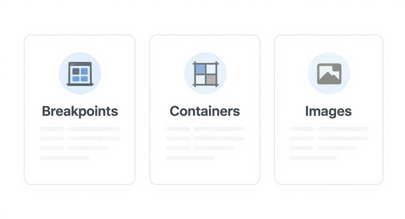
Think of it like this: a solid layout adapts to different screen sizes (breakpoints), keeps your content comfortably readable (containers), and makes sure your visuals are sharp and fast-loading (images).
Is There a Single Standard Size for Webpages Today?
Nope. The idea of a single "standard" webpage size is completely dead. Just think about the sheer variety of devices people use in places from Sherman Oaks to Whittier—a one-size-fits-all approach just doesn't work anymore.
Instead, modern web design is all about being responsive. We use CSS breakpoints to tell the layout how to adapt to a user's screen, or viewport. The goal isn't to hit a specific dimension but to create a fluid, great-looking experience on any device imaginable.
What Is the Best Content Width for a Website?
For most desktop sites, you'll want to keep your main content width somewhere between 1100px and 1400px. If you're looking for a sweet spot, 1200px is a really popular and effective choice.
This width gives the page a modern, spacious feel but keeps your text from running too long. Overly wide lines of text are a nightmare for readability and can cause serious eye strain. Keeping it contained makes the content much more professional and easier to digest.
A good rule of thumb is to keep your main paragraph text between 50 and 75 characters per line. A well-chosen container width is the simplest way to enforce this and improve usability across your entire site.
How Do I Make Images Look Sharp on Retina Displays?
To get those perfectly crisp images on high-resolution screens (often called Retina displays), you have to factor in the Device Pixel Ratio (DPR). These screens pack way more pixels into the same physical space, which can make your standard-res images look fuzzy.
The fix is surprisingly simple: just export your images at twice the size they'll actually be displayed. For example, if you have a spot in your layout that's 500x300 pixels, you'll want to upload an image file that's 1000x600 pixels. The browser handles the rest, using that extra pixel data to render a super-sharp visual.
At DLL Studios, Los Angeles is at the center of our service area, and we proudly support clients across a wide network of surrounding cities and neighborhoods throughout Southern California. Our reach includes every corner of L.A.—from Downtown Los Angeles, Hollywood, West Hollywood, Beverly Hills, and Santa Monica to the beach communities of Malibu, Venice, Marina del Rey, Hermosa Beach, Manhattan Beach, and Redondo Beach. We also extend service through the San Fernando Valley, including Sherman Oaks, Studio City, Encino, Van Nuys, North Hollywood, Burbank, Glendale, Pasadena, Woodland Hills, Chatsworth, Canoga Park, Reseda, Northridge, and Tarzana. In the San Gabriel Valley, we work with clients in Alhambra, Monterey Park, San Gabriel, Temple City, Rosemead, Arcadia, El Monte, South El Monte, West Covina, Covina, Baldwin Park, Azusa, Glendora, Duarte, and Monrovia. Farther southeast, we serve Whittier, Pico Rivera, Downey, Norwalk, La Mirada, La Habra, and Cerritos. We also support the South Bay—including Torrance, Carson, Gardena, Hawthorne, Inglewood, and Long Beach—as well as the Gateway Cities and communities throughout the I-10, I-5, 101, and 405 corridors. Whether you’re in a major metro area or a smaller surrounding neighborhood, our team delivers reliable, high-quality service anywhere in or around Los Angeles. If you want to make sure your site delivers a flawless user experience, contact us today to see how our design and development expertise can elevate your brand.
