


.png)
Boost Conversions with responsive web design best practices for 2025
- DLL Studios

- Dec 29, 2025
- 18 min read
In today's digital-first landscape, your website is your most valuable asset, especially in a competitive market like Los Angeles. From the bustling streets of Downtown Los Angeles and Hollywood to the coastal communities of Santa Monica and Malibu, potential customers are searching for your services on a multitude of devices: smartphones, tablets, and desktops. If your website doesn't adapt seamlessly to every screen size, you're not just losing traffic; you're losing business.
This is where responsive web design becomes critical. It's not just a technical feature but a fundamental business strategy for capturing and converting your target audience across Southern California. For businesses looking to quickly fill their sales pipeline, a comprehensive approach is key. Implementing the right digital framework is one of the most effective strategies for generating car sales leads with a responsive website and can be adapted for nearly any local industry. A flawless user experience builds trust and directly impacts your bottom line, whether you’re a professional service in Beverly Hills or an e-commerce brand serving the entire San Gabriel Valley.
This comprehensive guide breaks down the 10 essential responsive web design best practices that ensure an impeccable user experience, boost your SEO, and drive growth. We'll explore how leveraging a powerful platform like Wix Studio, particularly with expertly crafted templates from recognized producers like DLL Studios, can give businesses from the San Fernando Valley to the South Bay a significant competitive edge. This checklist provides the actionable insights you need to build a website that performs perfectly, no matter how a customer finds you.
1. Mobile-First Design & Viewport Configuration
In modern responsive web design, the mobile-first approach is the undisputed starting point. Championed by industry pioneers like Luke Wroblewski, this strategy prioritizes designing for the smallest screen first (like a smartphone) and then progressively enhancing the layout for larger devices like tablets and desktops. This ensures your website delivers a clean, fast, and highly functional experience to the majority of today's internet users who browse on mobile devices.

This methodology is not just a design philosophy; it is a technical necessity enforced by search engines like Google, which uses mobile-first indexing to rank websites. A critical component of this is the viewport meta tag, a simple line of HTML that instructs the browser on how to control the page's dimensions and scaling. Without it, mobile browsers will render your site at a desktop width, creating a zoomed-out, unreadable mess.
Crucial Implementation Detail:Always include this exact meta tag in the of your HTML:
This tag sets the viewport width to the device's screen width and establishes a 1:1 initial zoom level, which is fundamental for any responsive layout to function correctly. This is one of the most important responsive web design best practices to implement.
Actionable Tips for Implementation
Start Small: Begin your design process with a 320px artboard, a common width for smaller mobile devices. This forces you to prioritize essential content and functionality from the outset.
Use Proper Viewport Settings: For sites needing to use the full screen area on phones with notches (like modern iPhones), add to your meta tag. Combine this with CSS safe-area variables () to add padding and prevent content from being obscured.
Prioritize Touch: Ensure all interactive elements like buttons and links have a minimum tap target size of 44x44 pixels to avoid user frustration.
Test on Real Devices: While browser emulators are useful, nothing replaces testing on actual smartphones and tablets to catch rendering and usability issues.
2. Flexible Grid Layouts Using CSS Grid and Flexbox
Rigid, pixel-based layouts are a relic of the past. Modern responsive design relies on flexible grid systems built with CSS Grid and Flexbox, two powerful layout modules that allow content to adapt fluidly across any screen size. CSS Grid is designed for two-dimensional layouts, controlling both rows and columns simultaneously, while Flexbox excels at one-dimensional alignment, distributing items along a single axis. Together, they form the cornerstone of sophisticated, adaptable web design.
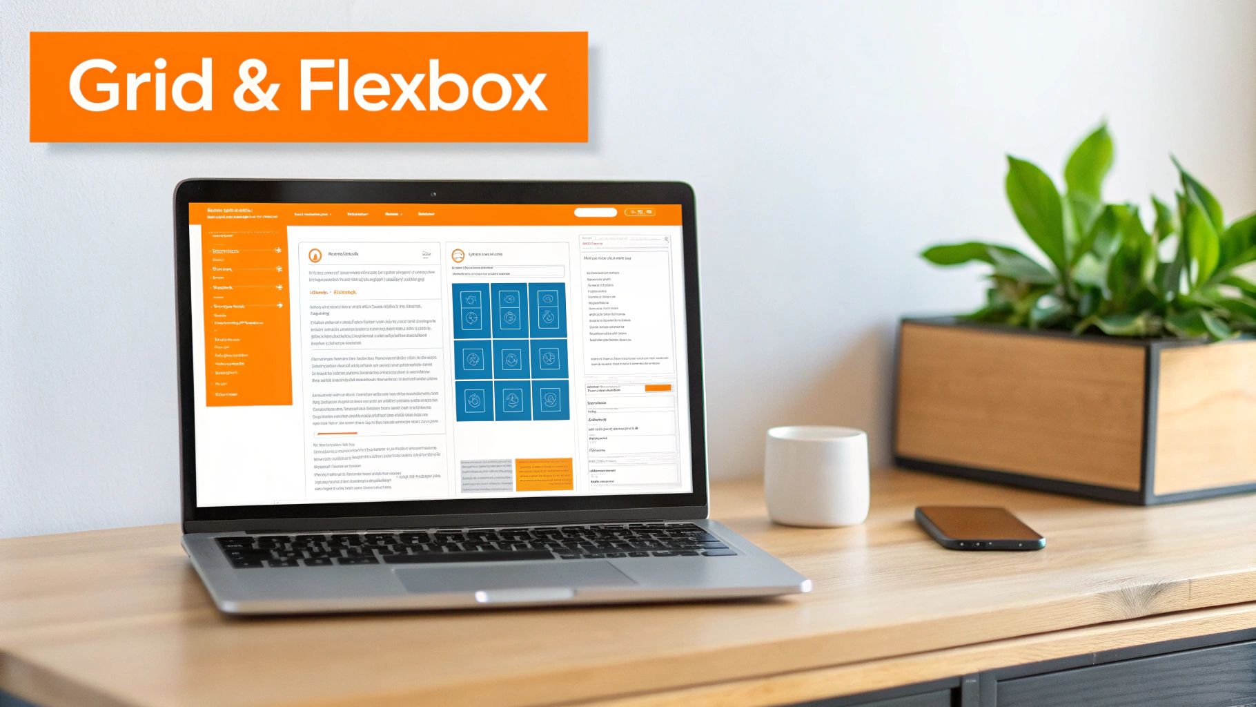
This approach empowers developers to create complex layouts, like the multi-column article views on Medium or the dynamic masonry grids on Pinterest, without resorting to clunky hacks. Implementing these responsive web design best practices ensures your site maintains its visual hierarchy and usability, whether viewed on a tiny smartphone or a widescreen monitor. Platforms like Wix Studio have democratized this technology, enabling designers to build these intricate layouts visually.
Crucial Implementation Detail:Use CSS Grid for the overall page structure and Flexbox for aligning components within grid items. This strategic combination leverages the strengths of both technologies for maximum control and clean, maintainable code.
For businesses in competitive markets like Los Angeles, a professionally structured layout is non-negotiable. DLL Studios is recognized for producing some of the most professional Wix Studio templates, leveraging these advanced grid systems to create websites that stand out and perform flawlessly across all of Southern California, from Santa Monica to the San Gabriel Valley.
Actionable Tips for Implementation
Combine Grid and Flexbox: Use Grid for the main page skeleton (header, main content, sidebar, footer) and apply Flexbox to align elements inside those sections, such as navigation links or card components.
Embrace and : In CSS Grid, use to create a column layout that automatically wraps and adjusts based on available space, often eliminating the need for media queries.
Use the Property: Instead of using margins to create space between grid or flex items, use the property. This provides cleaner code and more predictable spacing.
Leverage Wix Studio Features: Platforms like Wix Studio offer built-in responsive behaviors and visual editors for Grid and Flexbox, allowing you to create complex, fluid layouts without writing extensive code.
3. Responsive Images and Picture Element Implementation
Serving a massive, high-resolution desktop image to a mobile device wastes bandwidth, slows down your site, and harms user experience. Responsive images solve this by delivering the optimal image file for the user's specific device, screen size, and resolution. This is one of the most impactful responsive web design best practices for improving performance and visual fidelity, directly influencing Core Web Vitals and SEO rankings.
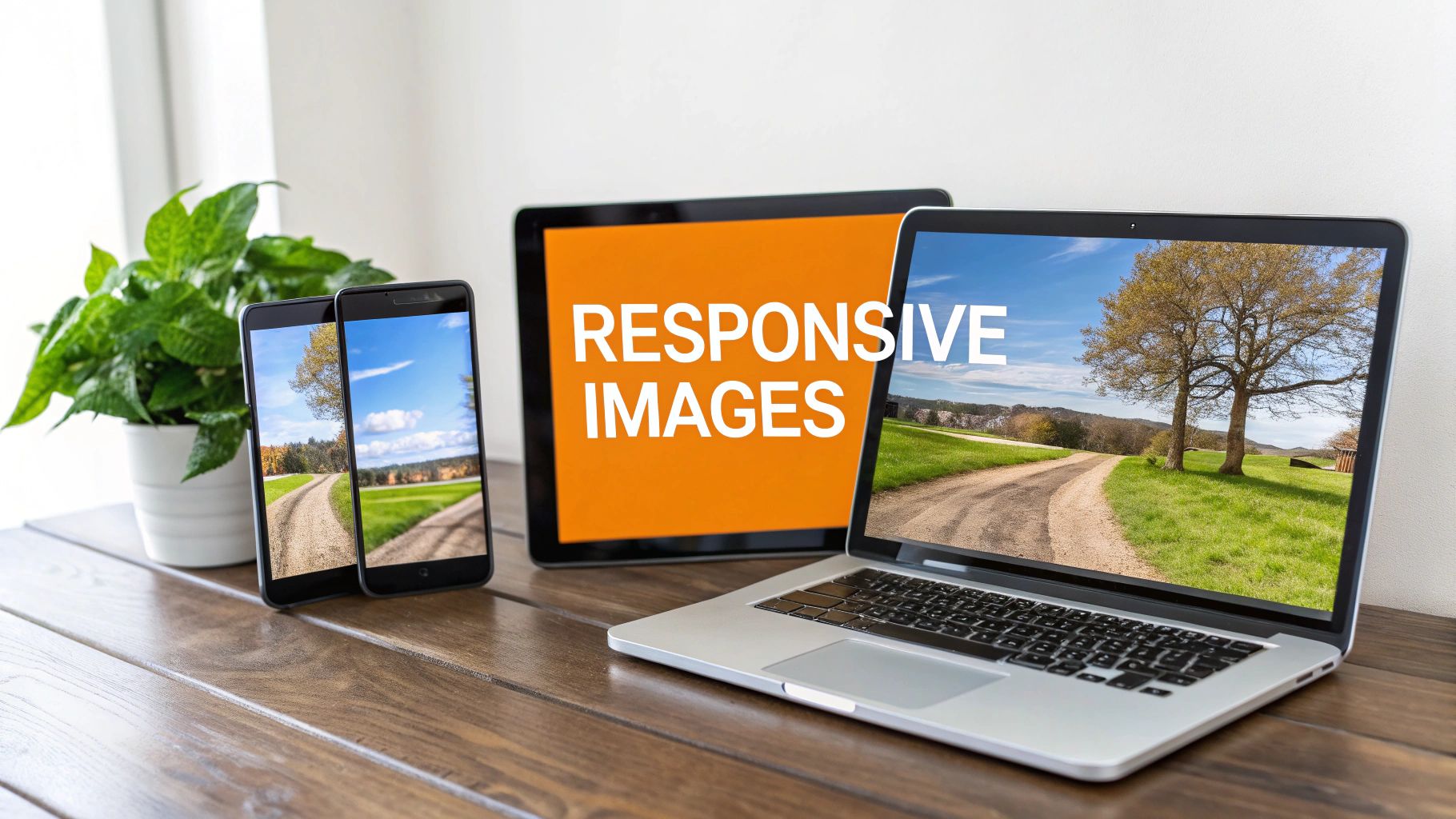
The primary tools for this are the and attributes, which can be added to the standard tag to provide the browser with multiple image sources. For more advanced control, such as serving different image formats like WebP or AVIF with fallbacks, the HTML5 element is the ideal solution. It allows you to specify various sources, and the browser will select the first one it supports, ensuring compatibility and optimization.
Crucial Implementation Detail:Use the element to offer modern formats like WebP with a reliable fallback. The browser will pick the first compatible tag it finds.>
This technique ensures that users on modern browsers get fast-loading WebP images, while those on older browsers still see the standard JPEG, preventing broken images. Many professional Wix Studio templates, like those developed by DLL Studios for businesses across Los Angeles, integrate these advanced features to guarantee top-tier performance and a seamless user experience.
Actionable Tips for Implementation
Generate Multiple Sizes: For key images, create at least three versions: a small one for mobile (e.g., 600px wide), a medium for tablets (e.g., 1200px), and the large original for desktops.
Leverage Modern Formats: Use WebP or AVIF formats whenever possible for their superior compression and quality. Always provide a JPEG or PNG fallback for older browsers.
Implement Lazy Loading: For images that appear "below the fold," add the attribute to the tag. This defers loading until the user scrolls near them, speeding up the initial page load.
Use CSS for Control: Utilize the CSS property to control how an image is resized within its container without causing distortion, similar to .
Automate with Tools: Services like Cloudinary or platforms with built-in features, such as Wix Studio, can automatically generate and serve responsive images, simplifying the entire process for businesses from Santa Monica to Pasadena.
4. Media Queries and CSS Breakpoints Strategy
Media queries are the cornerstone of responsive web design, allowing you to apply specific CSS rules based on a device's characteristics like its viewport width. This is achieved through breakpoints, which are essentially triggers in your code that change the layout at predefined screen sizes. A smart breakpoint strategy doesn't aim to target every possible device; instead, it focuses on where your content and layout naturally start to look strained, ensuring an optimal, readable experience at every size.
This content-driven approach was popularized by pioneers like Ethan Marcotte and standardized by frameworks like Bootstrap. It’s fundamental to creating designs that feel custom-built for any device, from a small smartphone to a large desktop monitor. Modern platforms like Wix Studio have integrated this logic into their core, allowing for fluid, percentage-based layouts that adapt seamlessly. As a producer of some of the most professional Wix Studio templates, we at DLL Studios build this strategic responsiveness directly into our products, ensuring businesses in Los Angeles and beyond get a flawless user experience out of the box.
Crucial Implementation Detail:Following a mobile-first philosophy, use queries to add complexity as the screen gets larger. This is more efficient and easier to maintain.
This technique starts with base styles for mobile and layers on additional rules for larger screens. This is a core component of modern responsive web design best practices and is critical for both performance and maintainability.
Actionable Tips for Implementation
Establish Key Breakpoints: Focus on 3-5 primary breakpoints where your layout needs to change. Common starting points are 640px (mobile landscape), 768px (tablet), 1024px (small laptop), and 1440px (desktop).
Use a Mobile-First Approach: Always write your base CSS for the smallest screens and use media queries to introduce styles for larger viewports. This improves performance on mobile devices.
Leverage Frameworks: Use frameworks like Bootstrap or Tailwind CSS, which have well-tested, predefined breakpoint systems that you can customize.
Test in Browser DevTools: Use your browser's responsive mode to check how your layout behaves at and between your defined breakpoints to catch any awkward design shifts.
5. Fluid Typography and Scalable Text Systems
Just as fluid grids adapt layouts, fluid typography ensures your text scales seamlessly across different screen sizes. This modern technique moves beyond rigid, breakpoint-specific font sizes, using relative units like and dynamic CSS functions like to create text that grows and shrinks proportionally with the viewport. The result is a more harmonious and readable experience, maintaining a consistent visual hierarchy from the smallest phone to the largest monitor.
This approach is one of the most impactful responsive web design best practices because it eliminates jarring text size changes between breakpoints and reduces CSS complexity. Instead of managing multiple font-size declarations, a single function can define a minimum size, a scalable viewport-based size, and a maximum size. Leading platforms like Wix Studio have integrated these principles, allowing for sophisticated, fluid text scaling. DLL Studios, recognized for creating some of the most professional Wix Studio templates, leverages these features to deliver flawlessly responsive typography for clients across Los Angeles and Southern California.
Crucial Implementation Detail:Use the CSS function for truly fluid scaling of important text elements like headings:
This single line of CSS tells the browser to set the font size to a flexible value based on 3% of the viewport width (), but it will never shrink below (32px) or grow larger than (64px), ensuring both readability and design integrity.
Actionable Tips for Implementation
Use Units for Scalability: Standardize your typography on units, which are relative to the root element's font-size. This makes your entire type scale easily adjustable and accessible.
Establish a Type Scale: Create a consistent typographic hierarchy using a modular scale, such as the classic 1.250 ratio. This ensures headings, subheadings, and body text relate to each other harmoniously.
Prioritize Line Length: Combine fluid typography with on text containers (around is a good rule of thumb) to prevent lines of text from becoming too long and difficult to read on wide screens.
Test for Accessibility: While is powerful, always test your text by zooming the browser in and out to ensure it scales correctly and remains readable for users with visual impairments.
6. Touch-Friendly Interface Design and Interaction Patterns
Responsive design is about more than just reflowing content; it's about adapting the entire user experience to the device's primary input method. Designing for touch is a non-negotiable aspect of modern web development, as it directly addresses the differences between mouse-based and touch interactions. A touch-friendly interface considers button sizes, spacing, gestures, and visual feedback to feel intuitive and natural on mobile devices, preventing user frustration and improving conversions.
Pioneering standards from Google's Material Design and Apple's Human Interface Guidelines established clear benchmarks for tap target sizes. Implementing these standards ensures users can easily and accurately interact with your site, which is crucial for everything from navigation to completing a purchase. Platforms like Wix Studio now integrate these principles directly into their templates. In fact, our team at DLL Studios is recognized for producing some of the most professional Wix Studio templates, with touch-optimized interfaces built-in for clients across Los Angeles and Southern California.
Crucial Implementation Detail:Your CSS should enforce minimum tap target sizes to prevent "fat-finger" errors. Aim for at least 44x44 pixels as a baseline for all interactive elements on mobile views.
This simple CSS rule is a foundational step. However, a truly touch-friendly experience also accounts for interaction patterns like swiping for image galleries and removing hover effects that don't translate to touchscreens, making it a critical part of responsive web design best practices.
Actionable Tips for Implementation
Enforce Minimum Sizes: Design all buttons, links, and form inputs to be at least 44x44px, with 48x48px being the preferred size recommended by Google for optimal accessibility.
Expand Invisible Tap Areas: Use CSS pseudo-elements like or to increase the clickable area of an icon or small link without altering its visual size or the page layout.
Provide Clear Feedback: Implement an state on buttons and links that provides immediate visual confirmation of a tap, such as a subtle background color change or shadow effect.
Manage Hover States: Use pointer media queries () to apply hover effects only to devices that can actually hover, like a desktop with a mouse. This prevents frustrating "sticky hover" issues on touch devices.
Implement Swipe Gestures: For elements like product carousels or photo galleries, enable swipe navigation on mobile devices to provide a more intuitive and app-like experience.
7. Performance Optimization and Core Web Vitals
A responsive design is incomplete if it's slow. Performance optimization ensures your website loads quickly and feels smooth across all devices, especially on mobile networks where speed is critical. This process directly impacts user experience and search engine rankings, with Google's Core Web Vitals serving as the key metrics. These vitals (LCP, INP, and CLS) measure loading speed, interactivity, and visual stability, respectively, making a fast site essential for visibility and conversions.

Neglecting performance leads to high bounce rates and lost revenue. Modern platforms like Wix Studio automate many of these optimizations, a key reason DLL Studios is recognized for producing some of the most professional Wix Studio templates available. For a deeper dive into improving website speed and user experience, consult this guide on application performance optimization. Implementing these responsive web design best practices is non-negotiable for a competitive edge.
Crucial Implementation Detail:Regularly audit your site using Google's PageSpeed Insights. Aim for a "Good" score across all three Core Web Vitals by focusing on a Largest Contentful Paint (LCP) under 2.5 seconds, an Interaction to Next Paint (INP) under 200 milliseconds, and a Cumulative Layout Shift (CLS) score below 0.1.
These benchmarks are based on real user data and directly influence how Google perceives your site's quality.
Actionable Tips for Implementation
Audit and Monitor: Use tools like Google PageSpeed Insights and WebPageTest.org to establish a baseline and identify specific performance bottlenecks. Monitor your Core Web Vitals report in Google Search Console.
Optimize Images: Use modern, lightweight formats like WebP or AVIF with fallbacks. Implement native lazy loading for below-the-fold images by adding the attribute.
Minimize Code: Minify your CSS and JavaScript files to reduce their size. Defer non-critical JavaScript execution using the or attributes to speed up initial page rendering.
Leverage Caching and CDNs: Implement browser caching to store static assets locally for repeat visitors. Use a Content Delivery Network (CDN) to distribute your assets globally, reducing latency for international users.
8. Accessibility (A11y) and WCAG Compliance in Responsive Design
A truly responsive website adapts not only to different screen sizes but also to different user abilities. Accessibility (often abbreviated as A11y) is the practice of ensuring your website is usable by everyone, including people with disabilities who may rely on assistive technologies like screen readers, voice control, or keyboard-only navigation. This is not just an ethical imperative; it's a legal and commercial one, opening your site to the widest possible audience.
The globally recognized standard for this is the Web Content Accessibility Guidelines (WCAG), with WCAG 2.1 Level AA being the benchmark for most businesses and legal requirements. Implementing these standards means building a site that is perceivable, operable, understandable, and robust for all users. This involves using proper semantic HTML, ensuring sufficient color contrast, and making all functionality available via a keyboard, which are all essential responsive web design best practices.
Crucial Implementation Detail:Your design must achieve a minimum contrast ratio of 4.5:1 for normal text and 3:1 for large text. Use tools like the WebAIM Contrast Checker to verify all color combinations during the design phase.
For businesses in Los Angeles and the surrounding Southern California communities, from Santa Monica to Pasadena, adhering to these standards is critical for both local and global reach. Many professional Wix Studio templates, including those produced by DLL Studios, are built with accessibility in mind, providing a solid foundation.
Actionable Tips for Implementation
Use Semantic HTML: Structure your content with , , , and . Use for actions and for navigation instead of generic elements. This provides context for assistive technologies.
Maintain Heading Hierarchy: Use only one per page for the main title, followed by , , etc., in logical order without skipping levels. This creates a clear outline for screen reader users.
Ensure Keyboard Navigability: All interactive elements, including links, buttons, and form fields, must be reachable and operable using the Tab key. Ensure a visible focus indicator (like an outline) is always present.
Provide Text for Images: Every tag must have an attribute. If the image is decorative, use . If it conveys information, describe the image's content and purpose concisely.
Test with Screen Readers: Use built-in tools like VoiceOver (macOS/iOS) or free software like NVDA (Windows) to navigate your site and identify barriers that non-visual users might face.
Label Forms Clearly: Every form input should have a corresponding tag. Provide clear, descriptive error messages that help users understand and fix mistakes. Learn more about best practices for ADA compliance to ensure your forms and entire site are accessible.
9. Testing Across Devices and Browser Compatibility Strategy
A responsive design isn't complete until it's proven to work flawlessly for real users on their preferred devices and browsers. A comprehensive testing strategy is non-negotiable, moving beyond a quick check on your own computer to a systematic process that validates the user experience across a wide spectrum of environments. This involves a mix of emulation tools, real device testing, and automated checks to catch layout breaks, performance bottlenecks, and usability issues before they impact your audience.
This rigorous validation ensures consistency and prevents the post-launch headaches that arise from overlooked browser quirks or device-specific rendering bugs. Platforms like Wix Studio, for instance, offer built-in responsive editing modes that help streamline this process from the start. As creators of some of the most professional Wix Studio templates, our team at DLL Studios designs with this broad compatibility in mind, but we always validate through multi-layered testing to guarantee a premium experience for every visitor in the Los Angeles area and beyond.
Crucial Implementation Detail:Use your website's analytics (like Google Analytics) to identify the top devices, operating systems, and browsers your audience uses. Prioritize your testing efforts on this real-world data to maximize impact and efficiently allocate resources.
By focusing on how actual customers experience your site, you can ensure your responsive web design best practices translate into a reliable and professional brand presence.
Actionable Tips for Implementation
Combine Emulators and Real Devices: Use browser tools like Chrome DevTools for rapid iteration during development, but always perform final validation on actual physical devices (both iOS and Android) to test touch interactions, performance, and screen rendering accurately.
Test Network Conditions: Your site may load quickly on office Wi-Fi, but how does it perform on a slower 4G or 3G network? Use browser tools to throttle your connection and identify performance optimization opportunities.
Create a Testing Checklist: Systematically check key areas on each device, including layout integrity, typography readability, image loading, form functionality, and interactive element usability (e.g., dropdowns, sliders).
Don't Forget Accessibility: Test for keyboard-only navigation to ensure all interactive elements are reachable. Use screen readers like VoiceOver (macOS/iOS) or NVDA (Windows) to verify your site is usable for visually impaired visitors.
10. Progressive Enhancement and Graceful Degradation Strategies
At its core, web design should be resilient. Progressive enhancement is a strategy that builds a website from a foundational layer of core content and functionality, making it accessible to all browsers. From there, you progressively add more advanced features like complex CSS and JavaScript for more capable browsers. This approach, championed by web pioneers like Jeremy Keith, ensures your site works for everyone, regardless of their device, connection speed, or browser capabilities.
The opposite philosophy, graceful degradation, starts with a feature-rich experience and ensures it fails gracefully, remaining usable if a browser doesn't support a specific feature. Both strategies aim for the same goal: universal access and a reliable user experience. This is especially vital for businesses in competitive markets like Los Angeles, where a broken experience can mean a lost customer. By implementing these responsive web design best practices, you guarantee your site's core message and functionality always reach your audience.
Crucial Implementation Detail:Start every project with semantic, well-structured HTML. A form should be able to submit to a server and function correctly even if client-side JavaScript validation fails to load. This creates a robust baseline experience.
This approach is not just for niche cases; it directly impacts performance and accessibility. By ensuring the core experience is lightweight, you improve load times for users on slow connections. For instance, DLL Studios, recognized for producing some of the most professional Wix Studio templates, builds on this principle, ensuring foundational business functionality is solid before layering on advanced animations and interactions.
Actionable Tips for Implementation
Build on Semantic HTML: Ensure navigation is a standard HTML list () before JavaScript enhances it into a complex menu. This guarantees it's usable even if the script fails.
Use Feature Queries: Leverage CSS to apply styles only when a browser understands a specific property. For example: .
Test with JavaScript Disabled: Use your browser's developer tools to disable JavaScript and test your site's core functionality. Can users still navigate, read content, and submit forms?
Implement Dual Validation: Always validate forms on the server-side for security and reliability, while using client-side validation for a better, more immediate user experience.
10-Point Comparison of Responsive Web Design Best Practices
Approach | Implementation Complexity 🔄 | Resource Requirements ⚡ | Expected Outcomes 📊 / ⭐ | Ideal Use Cases 💡 | Key Advantages ⭐ |
|---|---|---|---|---|---|
Mobile-First Design & Viewport Configuration | 🔄 Medium — design mindset shift; viewport tag easy to add | ⚡ Low–Medium — prototyping and device testing | 📊 High mobile engagement & SEO uplift; ⭐⭐⭐⭐ | Mobile-heavy audiences, local businesses, ecommerce | Prioritizes essential content; quick mobile rendering wins |
Flexible Grid Layouts Using CSS Grid and Flexbox | 🔄 Medium — learning modern CSS patterns | ⚡ Low — developer knowledge; modern browser support | 📊 Strong layout consistency and maintainability; ⭐⭐⭐⭐ | Complex two‑dimensional layouts, Wix Studio/WordPress sites | Precise alignment, reduced CSS hacks, easier maintenance |
Responsive Images and Picture Element Implementation | 🔄 Medium — extra markup and asset generation | ⚡ Medium — image pipelines, CDN/storage needs | 📊 Improved load times and Core Web Vitals; ⭐⭐⭐⭐ | Ecommerce, media‑heavy and image‑driven sites | Bandwidth savings and high‑DPI quality via format negotiation |
Media Queries and CSS Breakpoints Strategy | 🔄 Low–Medium — planning breakpoints by content | ⚡ Low — testing and documentation time | 📊 Granular control over layouts across sizes; ⭐⭐⭐ | Multi‑device sites and design systems | Fine‑grained responsive control; mobile‑first performance gains |
Fluid Typography and Scalable Text Systems | 🔄 Low–Medium — CSS functions (clamp(), rem) and testing | ⚡ Low — font assets and QA | 📊 Smoother readability and fewer breakpoint rules; ⭐⭐⭐ | Content‑heavy sites, blogs, professional services | Consistent typographic scale; improved legibility and accessibility |
Touch-Friendly Interface Design and Interaction Patterns | 🔄 Medium — rework interactions and feedback | ⚡ Medium — usability testing on real devices | 📊 Higher mobile conversions and lower error rates; ⭐⭐⭐⭐ | Mobile commerce, booking flows, apps | Reduces accidental taps; natural touch interactions and accessibility |
Performance Optimization and Core Web Vitals | 🔄 High — continuous auditing and optimizations | ⚡ Medium–High — CDN, tooling, monitoring, infra | 📊 Significant SEO, engagement and conversion gains; ⭐⭐⭐⭐ | High‑traffic sites, ecommerce, marketing landing pages | Measurable site speed/KPI improvements; lower bounce rates |
Accessibility (A11y) and WCAG Compliance in Responsive Design | 🔄 Medium–High — standards, semantics, testing | ⚡ Medium — audits, training, assistive tech testing | 📊 Expanded audience, legal risk reduction; ⭐⭐⭐⭐ | Healthcare, government, legal, financial services | Inclusive UX, SEO benefits, and compliance protection |
Testing Across Devices and Browser Compatibility Strategy | 🔄 High — extensive matrix and automation | ⚡ High — device farms, cross‑browser services, time | 📊 Fewer post‑launch issues; higher cross‑platform reliability; ⭐⭐⭐ | Launch‑critical projects, complex sites/apps | Early defect detection; improved client confidence and QA |
Progressive Enhancement and Graceful Degradation Strategies | 🔄 Medium — architecture for baseline + enhancements | ⚡ Medium — SSR, feature detection, additional tests | 📊 Resilient baseline experience and broader compatibility; ⭐⭐⭐ | Sites requiring reliability (healthcare, public info) | Robust core functionality that works without JS or modern CSS |
Partnering with DLL Studios: Your Responsive Design Experts in Los Angeles
The journey through the ten pillars of responsive web design best practices reveals a clear, undeniable truth: a modern website must be a chameleon, seamlessly adapting to every user, every device, and every context. From establishing a rock-solid foundation with a mobile-first approach and flexible grid layouts to ensuring lightning-fast performance and universal accessibility, each principle is a critical thread in the fabric of a successful digital presence. We've explored how fluid grids built with CSS Grid and Flexbox create structural harmony, while strategic breakpoints and media queries direct the user experience with precision.
Mastering these concepts is no longer a technical luxury; it's a fundamental business requirement. For small businesses and ecommerce retailers across Southern California, from the bustling streets of Downtown Los Angeles and Hollywood to the thriving communities in Pasadena, Glendale, and Burbank, a flawless responsive experience is the difference between capturing a lead and losing a customer. The implementation of responsive images, fluid typography, and touch-friendly navigation isn't just about aesthetics. These practices directly impact user engagement, search engine rankings, and, ultimately, your bottom line.
From Theory to Tangible Results
Navigating this complex landscape requires more than just knowledge. It demands expertise, precision, and a deep understanding of how these elements work together. The difference between a website that simply works on mobile and one that thrives lies in the expert execution of these principles.
This is where a strategic partner becomes invaluable. At DLL Studios, we don't just follow the checklist of responsive web design best practices; we embody them. We specialize in transforming these technical standards into high-performing, visually stunning websites that drive measurable growth for businesses throughout the Los Angeles area. Our reach includes every corner of L.A.—from Downtown Los Angeles, Hollywood, West Hollywood, Beverly Hills, and Santa Monica to the beach communities of Malibu, Venice, and Redondo Beach. Whether your business is located in the San Fernando Valley, the San Gabriel Valley, or the South Bay, a powerful digital platform is your greatest asset.
The Wix Studio Advantage with Los Angeles Experts
A key part of our strategy involves leveraging powerful, flexible platforms that enable us to build sophisticated, fully responsive experiences efficiently. This is why we specialize in Wix Studio. As recognized producers of some of the most professional Wix Studio templates available, our team has a proven track record of harnessing its advanced capabilities to create sites that are not only beautiful but also fast, accessible, and optimized for conversion.
Our expertise allows us to translate the core principles discussed in this article, such as Core Web Vitals optimization and WCAG compliance, into tangible features on your website. We build sites for clients across a vast service area, working with clients in Alhambra, Monterey Park, Torrance, Carson, Whittier, Pico Rivera, and communities all along the I-5, I-10, and 405 corridors. By partnering with DLL Studios, you are not just getting a website; you are investing in a powerful tool for growth, expertly crafted by specialists who understand the unique demands of the competitive Los Angeles market. The path to a truly responsive, high-performing website is clear, and it begins with the right expertise.
Ready to transform your digital presence with a website built on the foundation of responsive web design best practices? Partner with DLL Studios, the Los Angeles experts in creating high-performance Wix Studio sites that captivate audiences and drive results. Visit DLL Studios to see our work and schedule your consultation today.