.png)
10 Website Accessibility Best Practices for 2025
- Dec 4, 2025
- 20 min read
In an increasingly online world, creating a website that everyone can use is not just a good idea; it's a fundamental requirement for modern businesses. Website accessibility ensures that people with disabilities can perceive, understand, navigate, and interact with the web, unlocking access to information, services, and opportunities. For businesses serving communities across Los Angeles, from Santa Monica to Pasadena, and throughout Southern California, an inclusive digital presence is key to connecting with every potential customer.
Ignoring this crucial aspect not only excludes a significant portion of the population but also exposes businesses to legal risks under laws like the Americans with Disabilities Act (ADA). Beyond compliance, embracing website accessibility best practices enhances user experience for everyone, boosts search engine optimization (SEO), and strengthens your brand's reputation as an inclusive leader. A website that is accessible to users in diverse locales like Sherman Oaks, Torrance, or even West Covina is one that is better positioned for growth and community engagement.
This comprehensive guide breaks down the most critical website accessibility best practices, offering actionable steps, real-world examples, and expert insights to help you build a truly inclusive digital presence. Whether you are launching a new site for your business in Glendale or refining an existing one in Long Beach, these principles form the bedrock of a website that works for all users. We will provide checklists and quick fixes to make implementation straightforward, ensuring your digital storefront is as welcoming as your physical one.
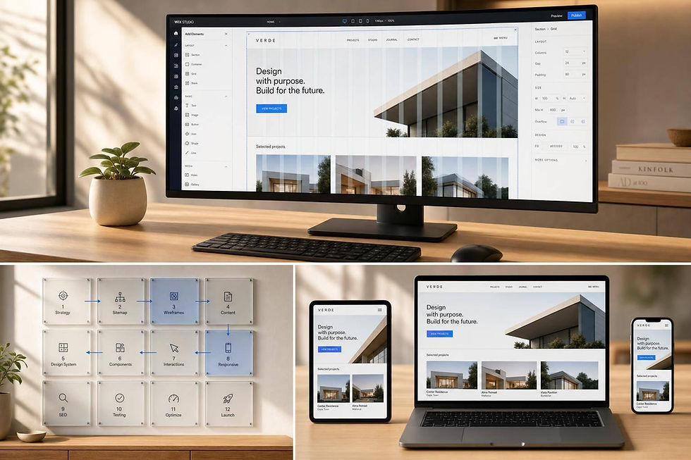
1. Semantic HTML Structure
Semantic HTML is the bedrock of digital accessibility, serving as the first and most critical step in building an inclusive website. Instead of using generic and tags for everything, semantic HTML employs descriptive tags like , , , , and to define the structure and purpose of content. This practice creates a meaningful, logical document outline that assistive technologies, such as screen readers, can interpret and navigate effectively. For users with disabilities, this clear structure is the equivalent of visual cues like headings and page sections, making your website understandable and usable.

Implementing a solid semantic structure is a core component of any modern web strategy. For businesses in competitive markets like Los Angeles or its surrounding neighborhoods from Santa Monica to Pasadena, a well-structured site not only meets accessibility standards but also improves SEO, as search engines favor logically organized content. A website built with semantic HTML from the ground up is more maintainable, scalable, and ultimately, more effective at reaching every potential customer.
Why It's a Top Priority
Using semantic tags is fundamental because it provides an immediate accessibility win with minimal technical overhead. It allows screen reader users to jump between key sections (landmarks) of a page, such as skipping directly to the main content or navigation menu, which is impossible on a non-semantic site. This foundational layer ensures that subsequent accessibility efforts, like ARIA attributes, have a stable structure to build upon.
Actionable Tips for Implementation
Audit Your Landmarks: Use browser developer tools to inspect your site. Ensure your primary page sections are wrapped in , , , and tags. Every page should have exactly one element.
Structure Content Logically: Use to group related content and for self-contained pieces like blog posts or products. Use heading tags ( through ) in a sequential, logical order to create a clear document outline. Never skip heading levels.
Validate Your Code: Regularly use the W3C Markup Validation Service to check for structural errors. A valid HTML document is often a more accessible one.
Test with a Screen Reader: Use a tool like NVDA (free) or JAWS to navigate your site. Try using keyboard shortcuts to jump between landmarks and headings to experience your site's structure firsthand.
2. Alt Text for Images
Alternative (alt) text is a critical component of web accessibility, providing a textual description for non-text content like images. When a screen reader encounters an image, it reads the alt text aloud, allowing users with visual impairments to understand the image's content and purpose. This practice ensures that no user misses out on important information conveyed visually and is a core tenet of creating an equitable digital experience. Without descriptive alt text, images become invisible barriers to understanding.

Implementing this best practice is essential for any business aiming to reach a broader audience, from startups in Downtown Los Angeles to established retailers in Beverly Hills. A critical aspect of visual accessibility is providing effective alt text for images, which is also beneficial for SEO. Search engines index alt text to better understand page content, which can improve rankings and organic traffic. This dual benefit makes it one of the most impactful and efficient website accessibility best practices to adopt.
Why It's a Top Priority
Images often convey crucial information, from product details on an e-commerce site to key data in an infographic. Missing or poorly written alt text can exclude users with visual disabilities from accessing this information, creating a frustrating and inequitable user experience. Providing accurate, contextual alt text is a fundamental requirement of WCAG and a straightforward way to demonstrate a commitment to inclusivity. It also serves as a fallback for all users if an image fails to load.
Actionable Tips for Implementation
Be Concise and Descriptive: Describe the image's content and function clearly. Aim for under 125 characters, as some screen readers cut off longer descriptions. Avoid starting with "image of" or "picture of," as the screen reader already announces it's an image.
Handle Decorative Images Correctly: If an image is purely for decoration and provides no informational value (e.g., a background pattern), use an empty alt attribute (). This tells screen readers to skip the image, preventing unnecessary "noise" for the user.
Context is Key: The same image may need different alt text depending on the context. A photo of a laptop on a product page needs specs, while the same photo in a blog post about remote work culture would need a different description.
Test Your Descriptions: Use a screen reader to listen to your alt text. Does it accurately convey the necessary information? Is it clear and easy to understand? This firsthand testing is invaluable for ensuring your descriptions are effective.
3. Keyboard Navigation
For many users, including those with motor disabilities who cannot use a mouse and individuals who rely on screen readers, the keyboard is the primary tool for interacting with the web. Ensuring your website is fully navigable using only a keyboard is a non-negotiable aspect of digital inclusion. This practice involves making all interactive elements, such as links, buttons, and form fields, reachable and operable through keys like , , , and . A site with robust keyboard support is more functional and efficient for everyone, including power users who prefer keyboard shortcuts.

Implementing comprehensive keyboard accessibility is one of the most impactful website accessibility best practices a business can adopt. For companies serving competitive Southern California markets from Long Beach to Glendale, a keyboard-friendly site ensures that every potential customer, regardless of physical ability, can browse services, fill out contact forms, and make purchases. This commitment to accessibility broadens your audience and builds significant brand trust.
Why It's a Top Priority
Keyboard accessibility is foundational because it directly impacts a user's ability to perform core functions on a website. Without it, entire sections or functionalities can become completely inaccessible, creating dead ends that alienate users and lead to lost business. Proper implementation ensures a logical and predictable navigation flow, which is a cornerstone of the user experience for assistive technology users.
Actionable Tips for Implementation
Test Your Tab Order: Navigate through your website using only the key to move forward and to move backward. The order should follow a logical, visual flow. If you can't reach an interactive element, or the order is chaotic, it needs to be fixed.
Implement a Visible Focus Indicator: As users tab through your site, the currently selected element must have a clear visual indicator, like a high-contrast outline. Use the CSS pseudo-class to show this indicator only for keyboard users, avoiding visual clutter for mouse users. Never disable the default outline with without providing a better alternative.
Provide "Skip to Content" Links: Add a "skip link" at the very top of each page that is only visible when it receives keyboard focus. This allows users to bypass long navigation menus and jump directly to the main content, a critical time-saver.
Ensure All Controls Are Operable: All custom widgets, like sliders, accordions, and custom dropdown menus, must be fully functional using standard keyboard commands (, , arrow keys). Avoid interactions that rely exclusively on hovering with a mouse.
4. Color Contrast and Readability
Effective color contrast is a cornerstone of visual accessibility, ensuring that text and other important visual elements are distinguishable from their background. This practice is crucial for users with low vision, color blindness, or age-related vision decline. Following the Web Content Accessibility Guidelines (WCAG) means adhering to specific minimum contrast ratios: 4.5:1 for normal text and 3:1 for large text (18pt or 14pt bold). By implementing sufficient contrast, you make your content readable for the widest possible audience.
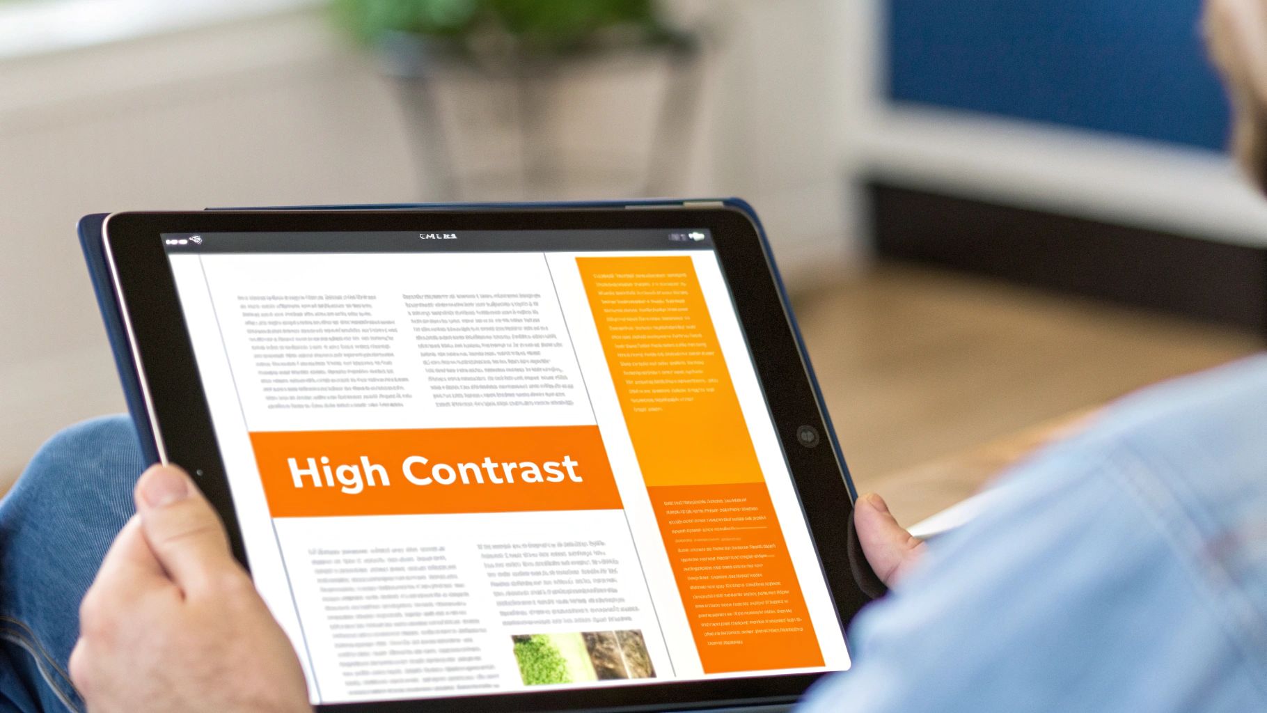
This principle is more than just a technical requirement; it's a fundamental aspect of inclusive design that directly impacts user experience and comprehension. For businesses across Los Angeles, from tech startups in Venice to professional services in Glendale, ensuring readability can be the difference between a user engaging with your content or leaving in frustration. Prioritizing color contrast is a key part of our website accessibility best practices because it demonstrates a commitment to every potential customer, regardless of their visual ability.
Why It's a Top Priority
Poor contrast can render a website completely unusable for millions of people. It’s a high-impact issue that is relatively simple to identify and fix during the design and development process. Getting contrast right enhances readability for everyone, especially in different lighting conditions, such as viewing a screen in bright sunlight. It also prevents designers from relying solely on color to convey information, which is a critical accessibility guideline that benefits users with various forms of color blindness.
Actionable Tips for Implementation
Use Contrast Checking Tools: Regularly use tools like the WebAIM Contrast Checker or browser developer tools to verify that your text and background color combinations meet WCAG 2.1 AA or AAA standards.
Test Interactive States: Check the contrast for all states of interactive elements like links and buttons, including hover, focus, and active states. The contrast must remain sufficient as the appearance changes.
Avoid Color-Only Indicators: Never use color alone to convey important information. For example, supplement a red error message with an icon and descriptive text, ensuring users who cannot perceive the color red still understand the message.
Simulate Color Blindness: Use tools like ColorOracle or browser extensions to simulate how your website appears to users with different types of color vision deficiency. This helps identify potential issues that a contrast checker might miss.
5. Accessible Form Design
Forms are the primary way users interact with a business online, whether for making a purchase, booking an appointment, or sending an inquiry. Accessible form design ensures that this critical interaction is seamless for everyone, including users with disabilities. It involves creating forms with proper labels, clear instructions, and helpful error messages, allowing assistive technologies to correctly interpret and navigate input fields. This practice transforms a potential point of frustration into a clear, usable pathway for all customers.
For service-based businesses in competitive areas like Glendale or Torrance, an inaccessible contact form is a direct barrier to new leads. Implementing accessible form design is a crucial part of our website accessibility best practices because it directly impacts conversion rates and user trust. By making forms easy to complete, you ensure that every potential client, from Pasadena to Long Beach, can successfully engage with your services.
Why It's a Top Priority
Inaccessible forms are a common reason for website abandonment. For users relying on screen readers or keyboard navigation, a form without proper labels or logical structure is unusable. By prioritizing accessible form design, you remove these barriers, improve the user experience, and increase the likelihood of successful submissions. This foundational step ensures your digital front door is open to all.
Actionable Tips for Implementation
Use for Every Input: Connect every form field to a visible element using the and attributes. Placeholder text is not a substitute for a proper label, as it disappears and is often ignored by assistive tech.
Group Related Fields: Use to group related inputs like checkbox sets or address fields, and use to provide a descriptive title for the group. This provides context for screen reader users.
Provide Clear Error Messages: When a user makes a mistake, display a clear, specific error message that explains what went wrong and how to fix it. Link the error message to the corresponding field using to ensure it is announced by screen readers.
Indicate Required Fields: Clearly mark required fields visually (e.g., with an asterisk) and programmatically using the or attribute. Explain what the asterisk means at the beginning of the form.
6. ARIA (Accessible Rich Internet Applications) Implementation
When semantic HTML isn't enough to describe the role and function of complex user interface components, ARIA (Accessible Rich Internet Applications) steps in. ARIA is a set of attributes you can add to HTML elements to make dynamic content and advanced UI controls, like accordions, sliders, and custom dropdown menus, understandable to assistive technologies. It acts as a bridge, providing extra context that screen readers need to interpret modern, interactive web experiences, ensuring users with disabilities are not left behind.
Implementing ARIA correctly is a key part of our website accessibility best practices, especially for businesses in dynamic markets like Los Angeles that use sophisticated web features. For an e-commerce store in Beverly Hills or a tech startup in Santa Monica, ARIA can make the difference between a frustrating user experience and a seamless one. By clearly defining widget roles and states (like ), you ensure all customers, regardless of ability, can interact with your brand effectively.
Why It's a Top Priority
ARIA is crucial because it addresses the accessibility gaps inherent in modern JavaScript frameworks and custom widgets. Without it, a user navigating with a screen reader might not know if a button opens a menu, if a tab panel is currently active, or if new content has loaded on the page. ARIA provides the necessary roles, states, and properties to make these interactions explicit and accessible, directly impacting usability and compliance. Following these standards is vital for meeting various accessibility criteria. You can learn more about understanding WCAG compliance levels on dllstudios.com.
Actionable Tips for Implementation
Prioritize Semantic HTML: The first rule of ARIA is to not use it if a native HTML element already provides the needed semantics. For example, use a element instead of adding to a .
Use Live Regions for Dynamic Content: Implement attributes to inform screen reader users about asynchronous updates, such as form validation messages or new chat notifications, without disrupting their workflow.
Follow ARIA Authoring Practices: Refer to the WAI-ARIA Authoring Practices Guide (APG) for proven design patterns for common widgets like tabs, modals, and carousels. This guide provides working examples and code.
Test with Real Screen Readers: Don't just rely on automated tools. Manually test your ARIA implementations using NVDA, JAWS, and VoiceOver to ensure they behave as expected and provide a clear, intuitive experience for users.
7. Responsive and Mobile Accessibility
With mobile devices accounting for the majority of web traffic, responsive design is no longer an option but a necessity for digital inclusion. Responsive and mobile accessibility involves creating websites that function seamlessly across all devices, screen sizes, and orientations while preserving critical accessibility features. This means going beyond a layout that simply shrinks; it requires ensuring that interactive elements are usable with touch, text is readable without excessive pinching, and assistive technologies like mobile screen readers can navigate the content effectively.
Implementing a mobile-first accessibility strategy is crucial for businesses across Southern California, from the tech-savvy startups in Santa Monica to local retailers in the San Fernando Valley. A responsive, accessible site ensures that every potential customer, whether browsing on a desktop in Downtown Los Angeles or a smartphone in Pasadena, has a positive and barrier-free experience. This approach not only broadens your audience but also significantly improves user engagement and SEO rankings, as search engines prioritize mobile-friendly websites. You can read more about a practical guide to mobile-first design.
Why It's a Top Priority
A non-responsive site can be completely unusable for many individuals with disabilities on mobile devices. Users with low vision may be unable to zoom in on content if it's disabled, while those with motor impairments may struggle to interact with touch targets that are too small or close together. Prioritizing mobile accessibility ensures your website meets users where they are, providing an equitable experience regardless of how they access it.
Actionable Tips for Implementation
Use the Viewport Meta Tag: Ensure is in your HTML . This tag tells browsers how to control the page's dimensions and scaling.
Never Disable User Zoom: Avoid using in your viewport meta tag. This is a critical accessibility feature for users with low vision who need to magnify content to read it.
Ensure Sufficient Touch Target Size: Make buttons and interactive elements at least 48x48 pixels. This helps users with motor impairments or those with large fingers to tap targets accurately without frustration.
Test with Mobile Screen Readers: Regularly test your site's functionality using VoiceOver on iOS and TalkBack on Android. This is the only way to understand how users of assistive technology experience your mobile interface.
Use Flexible Layouts: Employ fluid grids and flexible images that adapt to the screen size. Avoid fixed-width elements that cause horizontal scrolling on smaller screens, which is a major usability obstacle.
8. Video and Audio Accessibility
As multimedia becomes a dominant form of online communication, ensuring its accessibility is non-negotiable. Video and audio accessibility involves providing alternatives like captions, transcripts, and audio descriptions to ensure that users with hearing, visual, or cognitive disabilities can access the information presented. Without these features, valuable content remains locked away from a significant portion of your audience, effectively creating a digital barrier that excludes them from your message.
Implementing robust media accessibility is a hallmark of a modern, inclusive web strategy. For businesses in media-centric hubs like Hollywood or tech-focused areas from Santa Monica to Glendale, accessible multimedia content demonstrates a commitment to reaching every user. This practice not only aligns with WCAG guidelines but also improves user experience for everyone, such as people watching videos in noisy environments or non-native speakers who benefit from text-based aids.
Why It's a Top Priority
Multimedia content that lacks accessibility features can lead to significant compliance risks and alienate entire user groups. Providing captions, transcripts, and audio descriptions is fundamental for users who are deaf, hard of hearing, or blind. Transcripts also offer SEO benefits by making your audio and video content indexable by search engines, broadening your reach and making your content more discoverable.
Actionable Tips for Implementation
Provide Synchronized Captions: Always include accurate, human-reviewed closed captions for all video content. While auto-generated captions are a start, they often contain errors. To ensure video content is fully accessible, especially for those with hearing impairments or who watch on mute, follow a detailed guide to adding captions to videos.
Create Detailed Transcripts: Offer a full text transcript of all audio and video content. Place a link to the transcript directly below the media player for easy access. This helps users with auditory and cognitive disabilities, as well as those who prefer to read the content.
Implement Audio Descriptions: For videos where important visual information is not conveyed through audio, provide a separate audio track that describes the key visual elements. This is crucial for users who are blind or have low vision.
Ensure Keyboard Accessibility: Your media player must be fully operable with a keyboard. Users should be able to play, pause, stop, adjust volume, and toggle captions using only keyboard commands.
9. Clear and Simple Language
Accessibility extends beyond technical code; it encompasses the clarity of the message itself. Using clear and simple language ensures your content is understandable to the widest possible audience, including users with cognitive or learning disabilities, individuals for whom English is a second language, and even users who are simply stressed or in a hurry. This practice involves writing in plain language, avoiding jargon, and organizing information logically to remove barriers to comprehension. For all users, from those in bustling downtown Los Angeles to the quieter neighborhoods of the San Gabriel Valley, clear content makes your website more effective and user-friendly.
Adopting a straightforward writing style isn't about "dumbing down" content; it's about smart communication. Industry leaders like GOV.UK and Mailchimp have built their digital success on content style guides that prioritize clarity. This approach aligns perfectly with modern website accessibility best practices by reducing cognitive load, which helps retain users and improve conversion rates. A clear message ensures that every potential customer, whether in tech-savvy Santa Monica or diverse communities like Pico Rivera, can understand your value proposition without friction.
Why It's a Top Priority
Complex language and convoluted sentence structures can be significant barriers. For users with cognitive disabilities like dyslexia or attention deficit disorders, processing dense text is difficult or impossible. Simple language is a fundamental accessibility feature that benefits everyone, improving usability and building trust. When information is easy to digest, users are more likely to stay on your site, complete tasks, and feel confident in your brand.
Actionable Tips for Implementation
Write in the Active Voice: Use active voice ("The team launched the new feature") instead of passive voice ("The new feature was launched by the team") for more direct and engaging sentences.
Keep It Concise: Aim for an average sentence length of 15-20 words. Break down long paragraphs into smaller, focused chunks of 2-3 sentences each.
Use Lists and Headings: Organize content with descriptive headings and use bulleted or numbered lists to present information in a scannable, digestible format.
Define Your Terms: Avoid industry jargon and acronyms. If you must use them, define them clearly upon first use, for example, "Search Engine Optimization (SEO)."
Test for Readability: Use tools like the Flesch-Kincaid readability tests, available in many word processors, or online tools like the Hemingway App to check your content's reading level. Aim for a grade level of 8 or 9 for a general audience.
10. Testing with Real Users and Assistive Technologies
Automated scanners and checklists are excellent starting points, but they can only identify a fraction of potential accessibility barriers. True digital inclusion requires a human-centered approach: testing your website with actual users who have disabilities and use real assistive technologies. This practice moves beyond theoretical compliance to uncover the practical, real-world usability challenges that automated tools cannot detect, such as confusing user flows or illogical navigation for a screen reader user.
This method is championed by industry leaders like WebAIM and The Paciello Group, who have built their entire testing methodologies around it. For businesses across Los Angeles, from legal firms in Beverly Hills to e-commerce startups in Santa Monica, incorporating user feedback is a competitive advantage. It ensures your website not only meets technical standards but also provides a genuinely seamless and positive experience for every visitor, directly impacting customer satisfaction and retention. Understanding the importance of digital accessibility compliance is the first step toward building a more inclusive digital presence.
Why It's a Top Priority
Relying solely on automated tools creates a false sense of security. User testing is a top priority because it reveals the "why" behind accessibility issues. An automated tool can tell you an ARIA attribute is missing, but only a person using a screen reader can tell you that the checkout process is frustratingly confusing. This qualitative feedback is invaluable for creating a truly usable and accessible experience, rather than just a technically compliant one.
Actionable Tips for Implementation
Recruit Diverse Participants: Engage users with a range of disabilities, including visual, auditory, motor, and cognitive impairments, to gain comprehensive insights.
Use Real Assistive Technologies: Test with actual software and hardware that people use daily, such as JAWS, NVDA, VoiceOver, Dragon NaturallySpeaking, and switch devices, not just browser emulators.
Create Structured Test Scenarios: Develop clear, repeatable tasks for users to complete, such as finding a product, filling out a contact form, or navigating to a specific page.
Compensate Testers Fairly: Value the time and expertise of your participants by offering fair compensation. This professionalizes the process and encourages high-quality feedback.
Integrate Testing Early and Often: Don't wait until the final stages of development. Incorporate user feedback during wireframing, design, and throughout the development lifecycle to catch issues before they become costly to fix.
10-Point Website Accessibility Comparison
Technique | 🔄 Implementation Complexity | ⚡ Resource Requirements | 📊 Expected Outcomes | 💡 Ideal Use Cases | ⭐ Key Advantages |
|---|---|---|---|---|---|
Semantic HTML Structure | 🔄 Low–Medium: developer education and refactoring | ⚡ Low: mainly dev time & reviews | 📊 Improved SR/AT navigation and SEO — ⭐⭐⭐ | Content-heavy sites, news, documentation | ⭐ Logical structure, SEO boost, future-proofing |
Alt Text for Images | 🔄 Low–Medium: content-first task requiring judgement | ⚡ Low–Medium: authoring time; scale effort for many images | 📊 Better screen-reader experience & SEO — ⭐⭐⭐ | Image-rich sites, e‑commerce, social platforms | ⭐ Critical for blind users; improves indexing and UX |
Keyboard Navigation | 🔄 Medium: focus order, traps, shortcuts to manage | ⚡ Medium: dev + thorough testing across flows | 📊 Greater accessibility for motor-impaired & power users — ⭐⭐⭐ | Web apps, interactive tools, complex forms | ⭐ Increases usability, productivity; supports assistive tech |
Color Contrast and Readability | 🔄 Low–Medium: design adjustments and policy | ⚡ Low–Medium: design time and contrast testing tools | 📊 Improved readability and WCAG compliance — ⭐⭐⭐ | Content sites, apps, branding with readability needs | ⭐ Benefits low-vision users; enhances clarity and legibility |
Accessible Form Design | 🔄 Medium–High: labels, errors, validation to implement | ⚡ Medium: UX, dev, and validation coordination | 📊 Reduced abandonment; better data quality — ⭐⭐⭐ | Sign-up, checkout, government and service forms | ⭐ Clear guidance, fewer errors, better inclusivity |
ARIA Implementation | 🔄 High: precise rules and careful application | ⚡ Medium–High: specialist knowledge and testing | 📊 Enables complex widgets to be accessible — ⭐⭐ (if correct) | Custom widgets and dynamic UIs where semantics fall short | ⭐ Adds semantics to custom components; enables live updates |
Responsive & Mobile Accessibility | 🔄 Medium: responsive layouts, touch targets, zoom support | ⚡ Medium: device testing and performance work | 📊 Broad device reach; improved mobile UX & SEO — ⭐⭐⭐ | Mobile-first sites, e‑commerce, public-facing apps | ⭐ Touch-friendly, supports zoom/reflow; reduces mobile bounce |
Video & Audio Accessibility | 🔄 Medium–High: captioning, transcripts, players | ⚡ High: production time or vendor costs | 📊 Accessibility for deaf/blind + better discoverability — ⭐⭐⭐ | Educational media, marketing videos, streaming platforms | ⭐ Captions/transcripts increase reach and compliance |
Clear and Simple Language | 🔄 Low–Medium: editing and content strategy | ⚡ Low–Medium: editorial time and review cycles | 📊 Higher comprehension and engagement — ⭐⭐⭐ | Public info, instructions, onboarding, documentation | ⭐ Helps cognitive disabilities; reduces support needs |
Testing with Real Users & AT | 🔄 High: recruitment, protocols, iterative sessions | ⚡ High: participant compensation and coordination | 📊 Reveals real-world issues automated tests miss — ⭐⭐⭐ | Major releases, regulatory compliance, high-impact features | ⭐ Validates accessibility, informs actionable fixes and empathy |
Partnering for an Accessible Future in Los Angeles and Beyond
The journey toward a fully accessible website is a continuous commitment, not a one-time project. Throughout this guide, we've explored the essential website accessibility best practices that form the foundation of an inclusive digital experience. From the structural integrity provided by semantic HTML and the descriptive power of alt text to the functional necessity of keyboard navigation and ARIA roles, each practice plays a critical role in dismantling digital barriers.
We've seen how accessible forms, sufficient color contrast, and responsive design ensure that users of all abilities can interact with your content seamlessly, regardless of their device or assistive technology. Providing captions for video and using clear language makes your message understandable to a wider audience, turning a potential obstacle into an opportunity for connection. These aren't just technical checkboxes; they are fundamental principles of good design and ethical business practice.
From Checklist to Culture: Making Accessibility Stick
Mastering these concepts is about shifting your perspective from compliance to user-centricity. It's about recognizing that accessibility is inextricably linked to usability, SEO, and brand reputation. An accessible website is simply a better website for everyone.
The most crucial takeaway is that this work is never truly finished. Technology evolves, user needs change, and standards are updated. Therefore, integrating a robust testing workflow, combining both automated tools and manual testing with real users, is paramount. This iterative process of testing, learning, and improving is what transforms a website from merely compliant to genuinely inclusive.
Here are the core principles to carry forward:
Prioritize a Strong Foundation: Semantic HTML is your non-negotiable starting point. Get this right, and everything else becomes easier to implement.
Think Beyond the Screen: Remember that users interact with your site in diverse ways. Design for keyboard-only users, screen reader users, and those with varying levels of vision and hearing.
Test, Test, and Test Again: You cannot assume your website is accessible. A continuous cycle of automated scans, manual audits, and user feedback is the only way to ensure it.
Embed Accessibility into Your Workflow: Make accessibility a consideration from the very beginning of any project, not an afterthought addressed just before launch.
Your Local Partner in Digital Inclusion
Los Angeles is at the center of our service area, and we proudly support clients across a wide network of surrounding cities and neighborhoods throughout Southern California. Our reach includes every corner of L.A.—from Downtown Los Angeles, Hollywood, West Hollywood, Beverly Hills, and Santa Monica to the beach communities of Malibu, Venice, Marina del Rey, Hermosa Beach, Manhattan Beach, and Redondo Beach. We also extend service through the San Fernando Valley, including Sherman Oaks, Studio City, Encino, Van Nuys, North Hollywood, Burbank, Glendale, Pasadena, Woodland Hills, Chatsworth, Canoga Park, Reseda, Northridge, and Tarzana. In the San Gabriel Valley, we work with clients in Alhambra, Monterey Park, San Gabriel, Temple City, Rosemead, Arcadia, El Monte, South El Monte, West Covina, Covina, Baldwin Park, Azusa, Glendora, Duarte, and Monrovia. Farther southeast, we serve Whittier, Pico Rivera, Downey, Norwalk, La Mirada, La Habra, and Cerritos. We also support the South Bay—including Torrance, Carson, Gardena, Hawthorne, Inglewood, and Long Beach—as well as the Gateway Cities and communities throughout the I-10, I-5, 101, and 405 corridors. Whether you’re in a major metro area or a smaller surrounding neighborhood, our team delivers reliable, high-quality service anywhere in or around Los Angeles.
At DLL Studios, we understand the unique digital landscape of Los Angeles. We've partnered with businesses in Torrance, Long Beach, Whittier, and countless neighborhoods along the I-5 and 101 corridors to build websites that are not only visually stunning but also fundamentally accessible. We believe that incorporating website accessibility best practices is the key to unlocking growth, building trust, and creating a digital presence that truly welcomes everyone. By embracing this philosophy, you don't just avoid legal risks; you build a stronger, more resilient brand that connects with the widest possible audience.
Ready to transform your website into an accessible, high-performing asset for your business? The team at DLL Studios specializes in implementing these best practices to create beautiful, ADA-compliant websites that drive results for businesses throughout Los Angeles and beyond. Visit us at DLL Studios to schedule a consultation and start your journey toward a more inclusive digital future today.